第 53 章 貝葉斯廣義線性回歸 Bayesian GLM
- Bayesian updating is entropy maximization…. Information entropy is a way of counting how many unique arrangements correspond to a distribution.
- Richard McElreath
A sensitivity analysis explores how changes in assumptions influence inference. If none of the alternative assumptions you consider have much impact on inference, that’s worth reporting. Likewise, if the alternatives you consider to have an important impact on inference, that’s also worth reporting.
53.1 二項式回歸模型 binomial regression
二項分佈通常標記爲:
\[ y \sim \text{Binomial}(n, p) \]
其中,
- \(y\) 是一個計數結果,可以是 0,或者其他正整數;
- \(p\) 是每個試驗 (trial) 成功(或者失敗)的概率;
- \(n\) 是實施試驗的總次數。
一共有兩種類型的廣義線性回歸模型會使用到二項分佈的概率方程,他們本身其實也是同一種模型,只是由於數據被歸納成了不同的形式:
- 邏輯回歸 logistic regression,適應的數據是把每一次的試驗結果單獨列出來的格式,此時結果變量只有兩個取值,0 或 1。
- 歸納數據的二項回歸模型 aggregated binomial regression,適應的數據類型是,把相同共變量的試驗歸納之後的數據,此時結果變量可以取 0 至 n 之間的任意正整數。
不論是上述哪種二項式回歸,使用的鏈接方程都是邏輯函數 logit function。
53.1.1 邏輯回歸模型數據實例:prosocial chimpanzees
## 'data.frame':    504 obs. of  8 variables:
##  $ actor       : int  1 1 1 1 1 1 1 1 1 1 ...
##  $ recipient   : int  NA NA NA NA NA NA NA NA NA NA ...
##  $ condition   : int  0 0 0 0 0 0 0 0 0 0 ...
##  $ block       : int  1 1 1 1 1 1 2 2 2 2 ...
##  $ trial       : int  2 4 6 8 10 12 14 16 18 20 ...
##  $ prosoc_left : int  0 0 1 0 1 1 1 1 0 0 ...
##  $ chose_prosoc: int  1 0 0 1 1 1 0 0 1 1 ...
##  $ pulled_left : int  0 1 0 0 1 1 0 0 0 0 ...
上述數據其實來自 (Silk et al. 2005) ,該實驗講的是針對類人猿或者黑猩猩做的社會學實驗。設計是這樣的,在一張桌子上擺了四個盤子和兩個槓桿。其中東側槓桿,西側槓桿的功能是相同的,就是分別把放在槓桿裝置上的兩個盤子送往桌子的南北兩側。其中一側槓桿控制的兩個盤子裏只有一個裝有食物,另一側槓桿控制的兩個盤子都裝有食物。社會學研究做的實驗是,讓參加實驗的黑猩猩自行選擇搖動東側還是西側的槓桿。但是有的黑猩猩的對面會坐另外一只不能控制槓桿的同類。當相同的實驗在人類學生羣體中實施的時候,幾乎所有對面還坐有另一名學生的實驗學生都選擇了去搖動能夠控制兩盤食物的槓桿,也就是傾向於讓對面的同類也能獲得食物而不是只選擇自己有食物。這被叫做社會傾向化 (prosocial option)。於是我們的疑問是,是否類人猿黑猩猩也會有相似的行爲呢?也就是當對面也坐有同類時會作出社會傾向化的選擇呢?
上述數據中的兩個變量是特別關鍵的,
prosoc_left: 二進制變量,0 表示右側槓桿是社會傾向化,1 表示左側槓桿是社會傾向化。condition: 二進制變量,0 表示對面沒有同伴,1 表示對面坐有同伴。
也就是說,在我們的模型中,我們希望研究這兩個變量之間是不是存在交互作用。我們希望分析下列四種情況下,類人猿黑猩猩作出的選擇:
prosoc_left = 0andcondition = 0,右側槓桿有兩份食物,對面沒有同伴;prosoc_left = 1andcondition = 0,左側槓桿有兩份食物,對面沒有同伴;prosoc_left = 0andcondition = 1,右側槓桿有兩份食物,對面有同伴;prosoc_left = 1andcondition = 1,左側槓桿有兩份食物,對面有同伴;
熟悉廣義線性回歸模型,比如邏輯回歸模型的朋友可能最開始想到的方法是用上述啞變量來建立簡單的交互作用項放在模型結構裏就可以解決問題了。但是我們知道使用啞變量的缺點是使得先驗概率分佈的設定變得困難,所以我們希望不要使用啞變量的方法,轉而使用更加靈活的索引變量法 (index variable):
## , , condition = 0
##
##          prosoc_left
## treatment   0   1
##         1 126   0
##         2   0 126
##         3   0   0
##         4   0   0
##
## , , condition = 1
##
##          prosoc_left
## treatment   0   1
##         1   0   0
##         2   0   0
##         3 126   0
##         4   0 126
於是,我們現在可以把這個實驗蘊含的數學模型寫下來:
\[ \begin{aligned} L_i & \sim \text{Binomial}(1, p_i) \\ \text{logit}(p_i) & = \alpha_{\text{ACTOR}[i]} + \beta_{\text{TREATMENT}[i]} \\ \alpha_j & \sim \text{To be determined} \\ \beta_k & \sim \text{To be determined} \\ \end{aligned} \]
這裏的 \(L_i \sim \text{Binomial}(1, p_i)\) 其實等價於 \(L_i \sim \text{Bernoulli}(p_i)\)。同時我們還需要決定每個參數的先驗概率分佈。其中有七隻黑猩猩,所以有 7 個 \(\alpha\) 的先驗概率,還有 4 個回歸係數 \(\beta\) 屬於上面描述的四種不同的條件。
在思考如何給這些參數設定先驗概率分佈時,我們先從最簡單的一個邏輯回歸模型出發:
\[ \begin{aligned} L_i & \sim \text{Binomial}(1, p_i) \\ \text{logit}(p_i) & = \alpha \\ \alpha & \sim \text{Normal}(0, \omega) \end{aligned} \]
這時,我們需要先決定這個 \(\omega\) 作爲一個合理的先驗概率分佈。我們先從相當平坦的一個分佈開始,例如 \(\omega = 10\)。
接下來,我們從 m11.1 中的先驗概率採集一些樣本:
接下來還有一步,就是要把數據通過鏈接函數的逆函數轉換回去原來的 0-1 之間的概率尺度。對於邏輯回歸來說,鏈接函數就是 logit 函數,其逆函數就是 inv_logit。
p <- inv_logit( prior$a )
dens( p, adj = 0.1 ,
bty = "n",
xlab = "prior prob pull left")
m11.1 <- quap(
alist(
pulled_left ~ dbinom( 1, p ),
logit(p) <- a,
a ~ dnorm( 0, 1.5 )
), data = d
)
set.seed(1999)
prior <- extract.prior( m11.1, n = 10000)
p1 <- inv_logit( prior$a )
lines( density(p1), adj = 0.1,
col = rangi2)
text(0.15, 9, "a ~ dnorm(0, 10)")
text(0.5, 1.8, "a ~ dnorm(0, 1.5)", col = rangi2)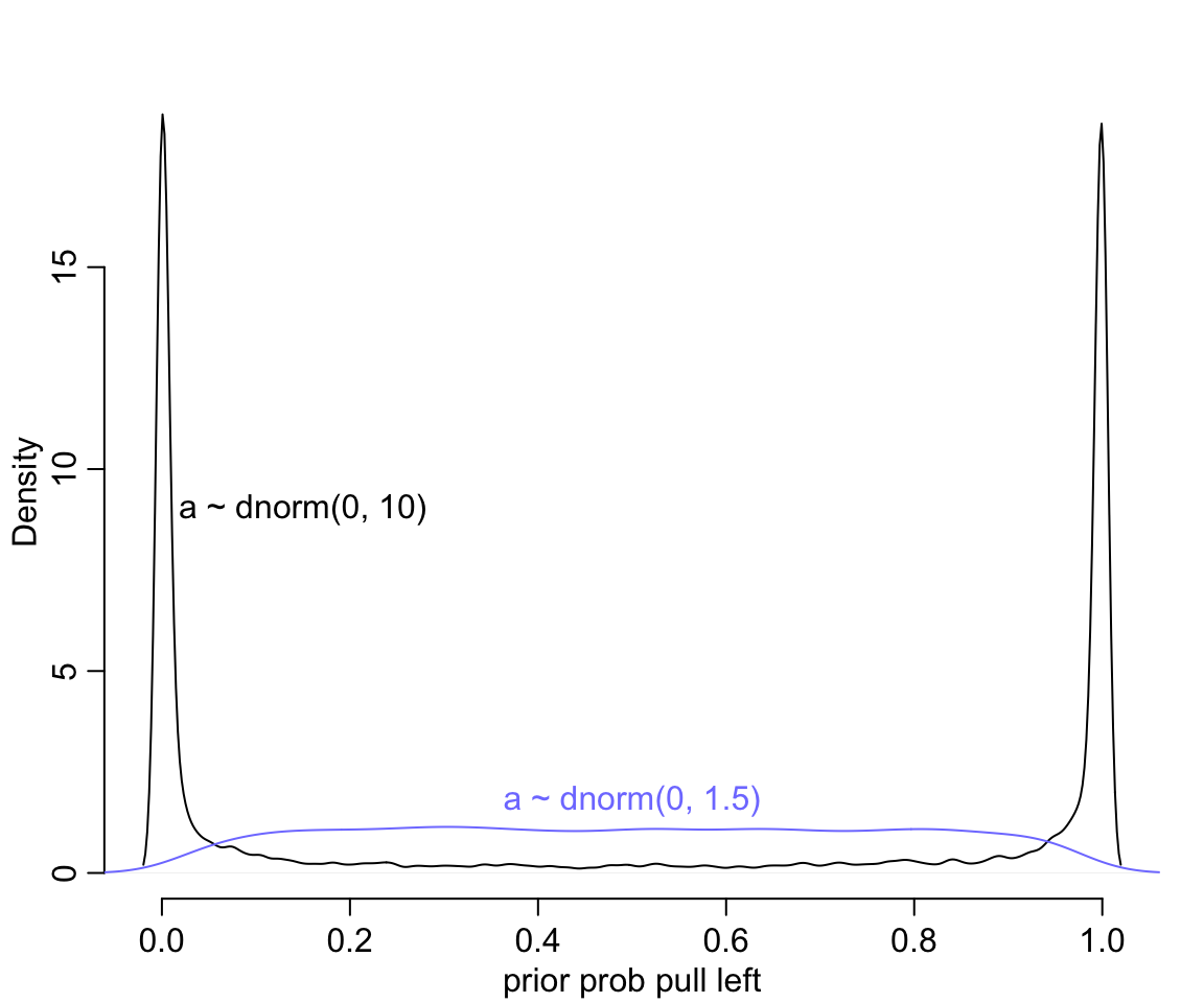
圖 53.1: Prior predictive simulations for the most basic logistic regression. A flat Normal(0, 10) prior on the intercept produces a very non-flat prior distribution on the outcome scale. A more concentrated Normal(0, 1.5) prior produces something more reasonable (blue).
圖 53.1 給出的先驗概率是多麼地不合理,它把大部分的概率權重都分配給了0,或者1附近的概率。這代表什麼含義呢? 如果你使用 \(\alpha \sim \text{Normal}(0,10)\) 作爲截距的先驗概率分佈,代表你初期的設定是,在還沒有開始進行實驗之前,我們認爲實驗對象的黑猩猩要麼總是去拉左手的槓桿,要麼永遠都不去拉左手槓桿。這其實不用說也知道是十分不合理的。如果我們把 \(\omega = 1.5\) 作爲先驗概率分佈的方差的話,給出的圖形,會合理地多 (圖 53.1 中藍色概率密度曲線)。
這裏告訴我們的是,一個先驗概率分佈在 logit 尺度上的平坦分佈,在回到原來的概率尺度上的時候,會給出事與願違的非平坦分佈結果。
接下來我們再來考慮不同條件下的回歸係數 \(\beta\),在這裏,術語可以使用治療效果 (treatment effect) 來表達。假如我們再次自作聰明地使用平坦的分佈 \(\text{Normal}(0,10)\) 作先驗概率分佈,看它會給出怎樣的結果:
m11.2 <- quap(
  alist(
    pulled_left ~ dbinom( 1, p ),
    logit(p) <- a + b[treatment],
    a ~ dnorm( 0, 1.5 ),
    b[treatment] ~ dnorm( 0, 10 )
  ), data = d
)
set.seed(1999)
prior <- extract.prior( m11.2, n = 10000)
p <- sapply( 1:4, function(k) inv_logit(prior$a + prior$b[, k]))
dens(abs(p[,1] - p[,2]), adj = 0.1,
      bty = "n",
      xlab = "prior diff between treatments")
text(0.8, 9, "b ~ dnorm(0, 10)")

m11.2.1 <- quap(
  alist(
    pulled_left ~ dbinom( 1, p ),
    logit(p) <- a + b[treatment],
    a ~ dnorm( 0, 1.5 ),
    b[treatment] ~ dnorm( 0, 0.5 )
  ), data = d
)
set.seed(1999)
prior <- extract.prior( m11.2.1, n = 10000)
p1 <- sapply( 1:4, function(k) inv_logit(prior$a + prior$b[, k]))
lines(density(abs(p1[,1] - p1[,2])), adj = 0.1,
       col = rangi2)
text(0.3, 4, "b ~ dnorm(0, 0.5)", col = rangi2)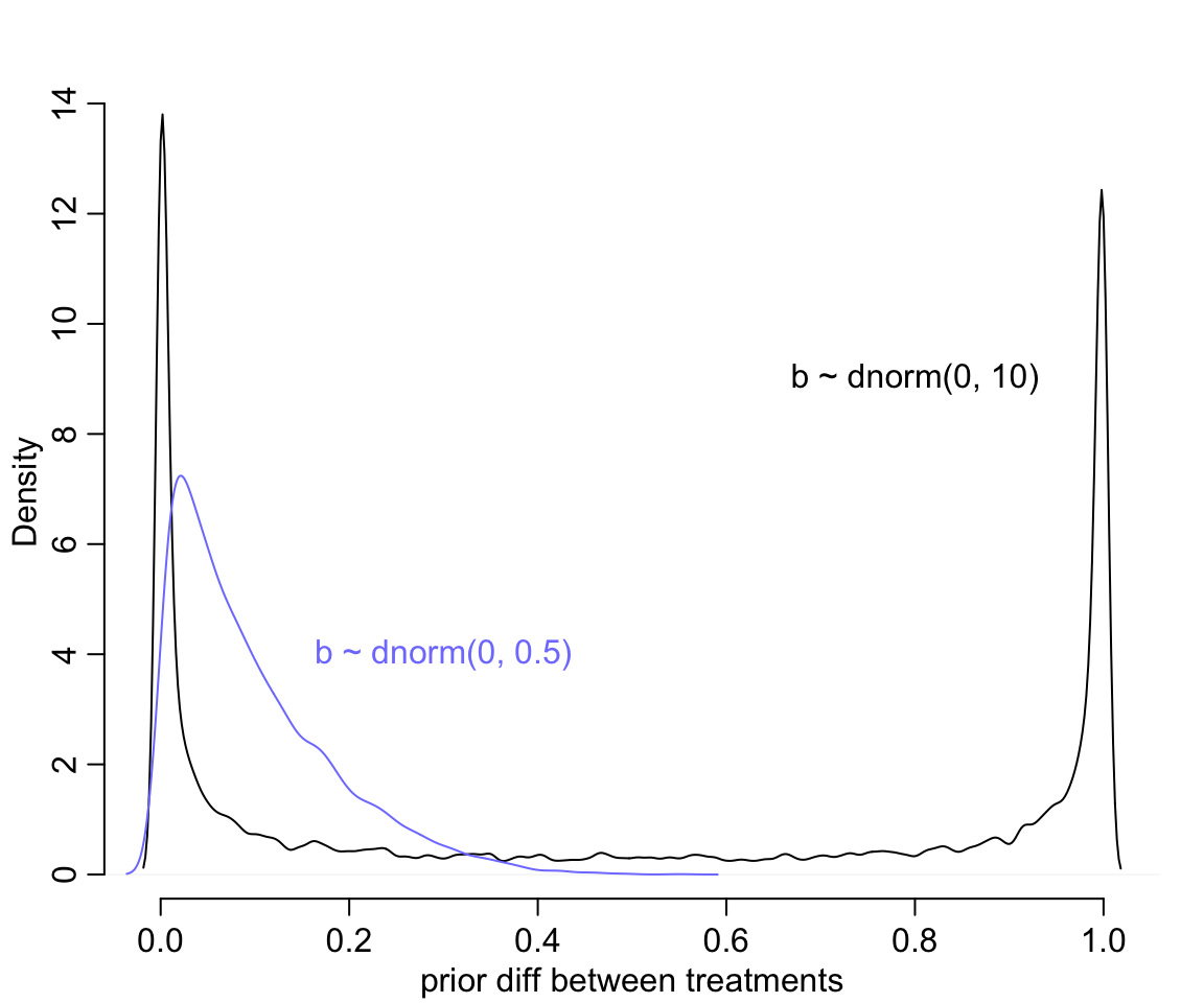
圖 53.2: Prior predictive simulations for the most basic logistic regression. A flat Normal(0, 10) prior on the treatment effect also produces a very non-flat prior distribution on the outcome scale. A more concentrated Normal(0, 0.5) prior produces something more reasonable (blue).
修改了先驗概率分佈的方差 \(\omega = 0.5\) 之後,我們發現大部分的概率密度被分配到了 0 附近而不是原來的非 0 即 1。但是此時的先驗療效差的平均值是:
## [1] 0.098386632也就是 10% 左右的療效差,也就是不同條件下的概率不至於變得非常大。
於是我們搞定了該怎樣設定先驗概率的問題之後,進入數據準備,和模型的運行階段:
# trimmed data list
dat_list <- list(
  pulled_left = d$pulled_left,
  actor = d$actor,
  treatment = as.integer(d$treatment)
)
數據準備好了以後,讓我們來使用 Markov Chain 運行這個邏輯回歸模型:
m11.4 <- ulam(
  alist(
    pulled_left ~ dbinom( 1, p ),
    logit(p) <- a[actor] + b[treatment],
    a[actor] ~ dnorm( 0, 1.5 ),
    b[treatment] ~ dnorm( 0, 0.5 )
  ), data = dat_list, chains = 4, log_lik = TRUE, cmdstan = TRUE
)

saveRDS(m11.4, "../Stanfits/m11_4.rds")## mean sd 5.5% 94.5% n_eff Rhat4
## a[1] -0.429942287 0.32559257 -0.946149825 0.104632565 832.88104 1.00258538
## a[2] 3.892282215 0.72040443 2.860756100 5.111318250 1661.26882 0.99943327
## a[3] -0.739816999 0.32292436 -1.264098750 -0.221254185 737.34692 1.00083906
## a[4] -0.734329668 0.31720925 -1.242542250 -0.229930505 738.26644 1.00081553
## a[5] -0.435195703 0.32629350 -0.947177970 0.092516450 770.97726 1.00122673
## a[6] 0.496271511 0.32303636 -0.014015981 1.027858700 740.59441 1.00383901
## a[7] 1.966138568 0.42321369 1.305282550 2.660314500 1132.59230 0.99981816
## b[1] -0.052332863 0.27477956 -0.492390840 0.375459205 703.79445 1.00129414
## b[2] 0.467946661 0.27569364 0.025882383 0.918256995 651.08788 1.00594527
## b[3] -0.401369705 0.27283765 -0.831073830 0.027599697 736.85875 1.00230582
## b[4] 0.356327179 0.27327018 -0.079038555 0.791810265 701.55693 1.00334895這個模型 m11.4 的實際 Stan 代碼是:
## data{
##     int pulled_left[504];
##     int treatment[504];
##     int actor[504];
## }
## parameters{
##     vector[7] a;
##     vector[4] b;
## }
## model{
##     vector[504] p;
##     b ~ normal( 0 , 0.5 );
##     a ~ normal( 0 , 1.5 );
##     for ( i in 1:504 ) {
##         p[i] = a[actor[i]] + b[treatment[i]];
##         p[i] = inv_logit(p[i]);
##     }
##     pulled_left ~ binomial( 1 , p );
## }
## generated quantities{
##     vector[504] log_lik;
##     vector[504] p;
##     for ( i in 1:504 ) {
##         p[i] = a[actor[i]] + b[treatment[i]];
##         p[i] = inv_logit(p[i]);
##     }
##     for ( i in 1:504 ) log_lik[i] = binomial_lpmf( pulled_left[i] | 1 , p[i] );
## }
上述模型運行的結果中,前面 7 個每隻黑猩猩的截距,也就是代表了每隻黑猩猩本身會主動去拉動左邊槓桿的傾向性。我們來把這個數據轉換到它本身應該有的數據尺度上來看:
post <- extract.samples(m11.4)
p_left <- inv_logit( post$a )
plot( precis(as.data.frame(p_left)), xlim = c(0,1))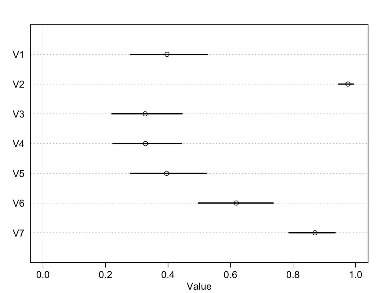
圖 53.3: The intercepts unique to each chimpanzee, on the probability scale.
可以看到,比較明顯的傾向於去拉右側槓桿的是1,3,4,5這四隻黑猩猩。2號和7號黑猩猩則體現出了相反的興趣。這是每隻黑猩猩本身對於拉左右兩側哪隻槓桿的最基本的傾向性分析。接下來我們來看不同的條件下的效果差別:
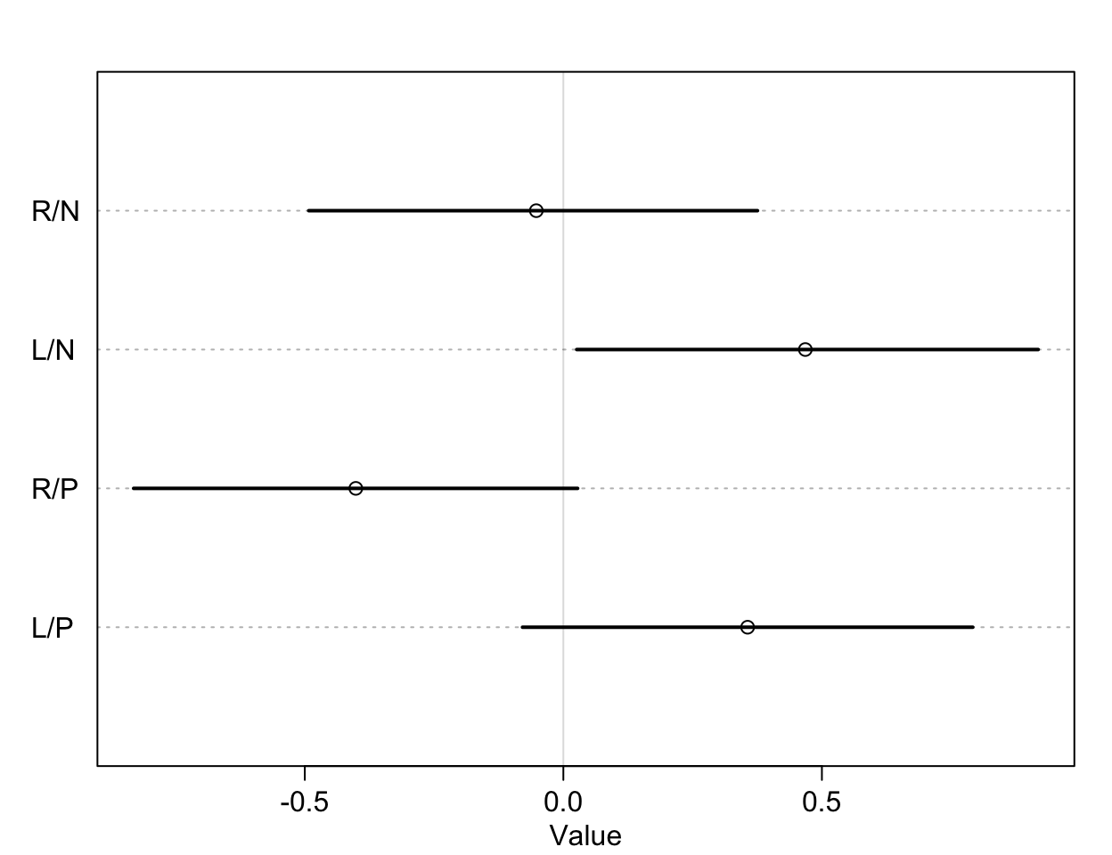
圖 53.4: The treatment effect by different conditions, on the log-odds scale.
我們通過該實驗希望獲得的分析結果是,到底桌子對面坐與不坐同類,黑猩猩是否會作出不同的社會化傾向選擇?也就是黑猩猩是否會根據對面有沒有同類而去拉那個有兩個食物那一側的槓桿。這意味着我們希望比較的是第一行和第三行,也就是當兩份食物都在右側槓桿時,對面有沒有同類是否會改變黑猩猩拉動右側槓桿的選擇;同時我們也希望比較第二行和第四行的結果,也就是兩份食物都在左側槓桿時,對面有沒有同類是否會改變黑猩猩拉動左側槓桿的選擇。其實我們看圖 53.4 已經能夠猜出大概沒有差異的的結果了。但是我們是可以對這兩個條件下的差異作出比較,並計算其可信區間的:
diffs <- list(
  db13 = post$b[, 1] - post$b[, 3],
  db24 = post$b[, 2] - post$b[, 4]
)

plot(precis(diffs))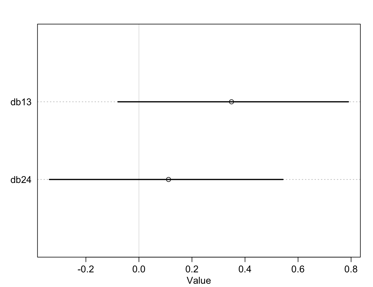
圖 53.5: The treatment effect difference compared between R/N R/P, and L/N L/P, on the log-odds scale.
db13, db14 就是我們希望求的比較有/沒有同伴坐在桌子對面是否影響黑猩猩作出社會化傾向選擇的療效差異 (the contrast between the no-partner/partner treatments)。db13 的準確解釋是,當右側槓桿控制兩份食物時,對面有同伴/沒有同伴的情況下,黑猩猩會傾向於去使用左側槓桿的療效差異 (treatment effect difference)。所以,如果有證據證明有同伴的情況下,黑猩猩會傾向於作出社會化選擇,那麼我們應該會看到不等於零的療效差異,也就是會在有同伴的時候更多的去拉右邊的槓桿。但其實 db13 的結果似乎顯示有微弱的證據證明,當沒有同伴時,黑猩猩會略微更多的傾向於拉左邊槓桿(沒有社會化傾向),當然這個證據很微弱,可信區間也包括沒有療效差異的 0。相似地,db24 比較的是,當兩份食物出現在左側槓桿時,對面有同伴/沒有同伴情況之間拉動左側槓桿的療效差異。如果我們期待黑猩猩會作出會社會化傾向選擇當對面坐有同伴的話,我們會希望這個 db24 的取值會顯著小於零,但事實上卻沒有符合這樣期待的結果。
我們可以利用上述運行好的模型結果來進行事後的預測,爲每一只黑猩猩估計它在四種條件下主動去拉左側槓桿的概率。同時我們還可以把它們和每隻黑猩猩實際觀察到的拉動左側槓桿概率作直觀的比較:
下面的代碼計算出的是一個 \(7\times 4\) 的矩陣,每一行有四列結果,代表7只黑猩猩在4中條件下實際觀察到拉動左側槓桿的概率,其中第一只黑猩猩的四種條件下拉動左側槓桿的概率分別是:0.3333 0.5000 0.2778 0.5556。
##          1          2          3          4
## 0.33333333 0.50000000 0.27777778 0.55555556## 'by' num [1:7, 1:4] 0.333 1 0.278 0.333 0.333 ...
## - attr(*, "dimnames")=List of 2
## ..$ : chr [1:7] "1" "2" "3" "4" ...
## ..$ : chr [1:4] "1" "2" "3" "4"
## - attr(*, "call")= language by.default(data = d$pulled_left, INDICES = list(d$actor, d$treatment), FUN = mean)把每隻猩猩的四個條件下的觀察值散點圖繪製如下圖 53.6:
plot(NULL, xlim = c(1, 28), ylim = c(0, 1), xlab = "",
     ylab = "proportion left lever", xaxt = "n", yaxt = "n")
axis(2, at = seq(0, 1, by = 0.2), labels = seq(0, 1, by = 0.2))
abline( h = 0.5, lty = 2 )
for (j in 1:7 ) abline( v = (j - 1) * 4 + 4.5, lwd = 0.5 )
for (j in 1:7 ) text( (j - 1) * 4 + 2.5, 1.1, concat("actor ", j), xpd = TRUE)
for (j in (1:7)[-2] ) {
  lines( (j - 1)*4 + c(1,3), pl[j, c(1,3)], lwd = 2, col = rangi2)
  lines( (j - 1)*4 + c(2,4), pl[j, c(2,4)], lwd = 2, col = rangi2)
}
points( 1:28, t(pl), pch = 16, col = "white", cex =  1.7)
points( 1:28, t(pl), pch = c(1,1,16,16), col = rangi2, lwd = 2)
yoff <- 0.01
text( 1, pl[1,1] - yoff, "R/N", pos = 1, cex = 0.8)
text( 2, pl[1,2] + yoff, "L/N", pos = 3, cex = 0.8)
text( 3, pl[1,3] - yoff, "R/P", pos = 1, cex = 0.8)
text( 4, pl[1,4] + yoff, "L/P", pos = 3, cex = 0.8)
mtext( "observed proportions\n")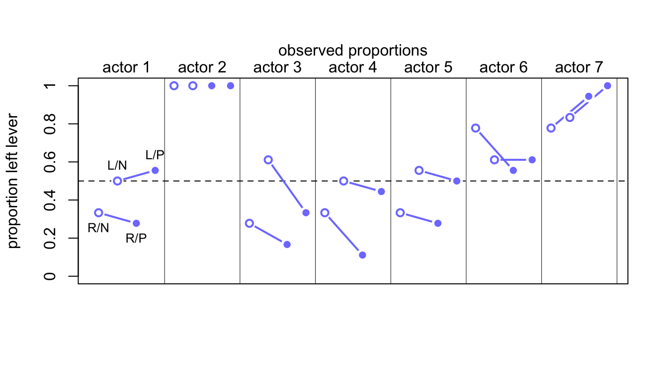
圖 53.6: Observed data for the chimpanzee data. Data are grouped by actor. Open points are non-partner treatments. Filled points are partner treatments. The right R and left L sides of the prosocial options are labeled in the figure.
接下來我們來計算模型運行之後的這些概率的預測值。圖 53.7 生成的代碼如下。模型本身告訴我們,有沒有同伴坐在桌子對面,基本上不會影響黑猩猩的選擇。(The model expects no change when adding a partner.) 大部分的選擇變化取決於黑猩猩本身,也就是每隻黑猩猩自己的模型截距。
dat <- list( actor = rep(1:7, each = 4),
             treatment = rep(1:4, times = 7))
p_post <- link( m11.4, data = dat )
p_mu <- apply( p_post, 2, mean )
p_ci <- apply( p_post, 2, PI )

p_mu <- matrix(p_mu, nrow = 7, ncol = 4, byrow = TRUE)

plot(NULL, xlim = c(1, 28), ylim = c(0, 1), xlab = "",
     ylab = "proportion left lever", xaxt = "n", yaxt = "n")
axis(2, at = seq(0, 1, by = 0.2), labels = seq(0, 1, by = 0.2))
abline( h = 0.5, lty = 2 )
for (j in 1:7 ) abline( v = (j - 1) * 4 + 4.5, lwd = 0.5 )
for (j in 1:7 ) text( (j - 1) * 4 + 2.5, 1.1, concat("actor ", j), xpd = TRUE)
for (j in (1:7)[-2] ) {
  lines( (j - 1)*4 + c(1,3), p_mu[j, c(1,3)], lwd = 2)
  lines( (j - 1)*4 + c(2,4), p_mu[j, c(2,4)], lwd = 2)
}
for (j in 1:28) {
  lines( c(j, j), p_ci[c(1, 2), j], lwd = 2)
}
points( 1:28, t(p_mu), pch = 16, col = "white", cex =  1.7)
points( 1:28, t(p_mu), pch = c(1,1,16,16), lwd = 2)
yoff <- 0.07
text( 1, p_mu[1,1] - yoff, "R/N", pos = 1, cex = 0.8)
text( 2, p_mu[1,2] + yoff, "L/N", pos = 3, cex = 0.8)
text( 3, p_mu[1,3] - yoff, "R/P", pos = 1, cex = 0.8)
text( 4, p_mu[1,4] + yoff, "L/P", pos = 3, cex = 0.8)
mtext( "posterior prediction proportions\n")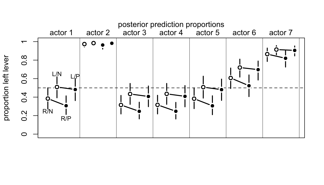
圖 53.7: Posterior predictions for the chimpanzee data. Data are grouped by actor. Open points are non-partner treatments. Filled points are partner treatments. The right R and left L sides of the prosocial options are labeled in the figure. 89% compatibility intervals for each proportion for each actor are shown as well.
m11.4 模型實際上直接跳過了只有 procosial option 和 partner 兩個變量時的模型直接加了交互作用項的模型。下面的代碼運行的模型是沒有交互作用項的版本,我麼來比較一下兩個模型的擬合度:
d$side <- d$prosoc_left + 1 # right = 1, left = 2
d$cond <- d$condition + 1 # no partner = 1, with partner = 2

dat_list2 <- list(
  pulled_left = d$pulled_left,
  actor = d$actor,
  side = d$side,
  cond = d$cond
)

m11.5 <- ulam(
  alist(
    pulled_left  ~ dbinom( 1, p ),
    logit(p) <- a[actor] + bs[side] + bc[cond] ,
    a[actor] ~ dnorm( 0, 1.5 ),
    bs[side] ~ dnorm( 0, 0.5 ),
    bc[cond] ~ dnorm( 0, 0.5 )
  ), data = dat_list2, chains = 4, log_lik = TRUE, cmdstan = TRUE
)
## Compiling Stan program...## mean sd 5.5% 94.5% n_eff Rhat4
## a[1] -0.655770413 0.43535605 -1.359676900 0.022933406 710.00083 1.0045239
## a[2] 3.743865885 0.79650038 2.538768700 5.084815100 1142.22454 1.0007099
## a[3] -0.951412794 0.43147243 -1.620515350 -0.277939290 738.32519 1.0030614
## a[4] -0.966171614 0.43224075 -1.649405200 -0.284136425 795.58057 1.0036848
## a[5] -0.655961462 0.42790668 -1.339657200 0.026944903 739.66497 1.0043577
## a[6] 0.272662554 0.42780637 -0.434731340 0.951514435 769.85407 1.0024592
## a[7] 1.756695293 0.50582298 0.972839695 2.550957250 840.14229 1.0028437
## bs[1] -0.180166983 0.33200510 -0.727985335 0.356886305 771.91278 1.0032280
## bs[2] 0.503903317 0.33198302 -0.031784743 1.043773600 826.00366 1.0034213
## bc[1] 0.278262385 0.33353433 -0.248087980 0.823398375 730.26640 1.0055826
## bc[2] 0.038256826 0.33203543 -0.488788280 0.561857315 728.94709 1.0047022## WAIC SE dWAIC dSE pWAIC weight
## m11.5 531.00132 19.112666 0.0000000 NA 7.8710514 0.66681879
## m11.4 532.38899 18.937857 1.3876636 1.2797982 8.5576211 0.33318121我們可以看到無論是 m11.5 本身給出的模型運行結果,還是從模型比較給出的報告,我們都認爲加不加這個交互作用項其實沒有太大的影響。這裏只是把如何進行模型之間的比較拿來做示範而已。但是這裏我們需要用到有交互作用項的模型 m11.4,因爲這是該實驗設計的初衷和目的之一。
53.1.2 相對還是絕對?
Consider for example the parable of relative shark and absolute deer. People are very afraid of shark, but not so afraid of deer. But each year, deer kill many more people than sharks do. In this comparison, absolute risks are being compared: the lifetime risk of death from deer vastly exceeds the lifetime risk death from shark bite.
53.1.3 歸納後的二進制數據:繼續使用黑猩猩數據
前面黑猩猩數據的邏輯回歸模型實例中,我們使用的數據是每一隻黑猩猩,在每次以實驗作出的是否拉動左側槓桿的單個實驗數據 individual data。但是事實上很多數據在獲取的時候是已經被整理彙總過的。相同的信息可以被整理成更加簡約的數據形式。我們可以從原始數據計算每隻黑猩猩,在不同的實驗條件下拉動左側槓桿的次數:
d_aggregated <- aggregate(
  d$pulled_left,
  list( treatment = d$treatment,
        actor = d$actor,
        side = d$side,
        cond = d$cond),
  sum
)
colnames(d_aggregated)[5] <- "left_pulls"
head(d_aggregated, 10)
## treatment actor side cond left_pulls
## 1 1 1 1 1 6
## 2 1 2 1 1 18
## 3 1 3 1 1 5
## 4 1 4 1 1 6
## 5 1 5 1 1 6
## 6 1 6 1 1 14
## 7 1 7 1 1 14
## 8 2 1 2 1 9
## 9 2 2 2 1 18
## 10 2 3 2 1 11彙總後的數據中 left_pulls 就是不同條件下每隻黑猩猩拉動左側槓桿的次數彙總。記得2號黑猩猩始終都拉左側槓桿,所以你看 actor = 2 的時候 left_pulls = 18 都是保持不變的。也就是說,每隻黑猩猩在每種條件下都進行了總共18次的測試。接下來我們可以使用這個歸納彙總過的數據來做和 m11.4 完全相同的統計推斷:
dat <- with(d_aggregated,
            list(
              left_pulls = left_pulls,
              treatment = treatment,
              actor = actor,
              side = side,
              cond = cond
            ))

m11.6 <- ulam(
  alist(
    left_pulls ~ dbinom( 18, p ), # it used to be dbinom( 1, p )
    logit(p) <- a[actor] + b[treatment],
    a[actor] ~ dnorm( 0, 1.5 ),
    b[treatment] ~ dnorm( 0 , 0.5 )
  ), data =  dat, chains = 4, log_lik = TRUE, cmdstan = TRUE
)
## Compiling Stan program...## mean sd 5.5% 94.5% n_eff Rhat4
## a[1] -0.424329845 0.33225455 -0.9717962800 0.107563840 751.25275 1.0010184
## a[2] 3.905644780 0.73365840 2.8015572000 5.092984400 1175.40498 1.0040630
## a[3] -0.718862381 0.33942253 -1.2509039000 -0.176636505 656.31617 1.0034022
## a[4] -0.725620187 0.34207384 -1.2725226000 -0.199060145 729.12027 1.0020010
## a[5] -0.415109948 0.33281305 -0.9350171550 0.108374340 682.90898 1.0020564
## a[6] 0.517620115 0.33489927 -0.0177663795 1.053053200 748.53099 1.0005144
## a[7] 1.990939258 0.42751276 1.3124323500 2.691393600 939.21031 1.0017960
## b[1] -0.072113997 0.28635069 -0.5296995400 0.387299215 643.53631 1.0034820
## b[2] 0.448618561 0.29380027 -0.0050808559 0.914412720 573.56020 1.0031237
## b[3] -0.410367007 0.29251328 -0.9085838250 0.051336309 621.61493 1.0028349
## b[4] 0.340992596 0.29000128 -0.1277295450 0.807177990 629.44879 1.0026665運行結果和 m11.4 是完全一致的。但是,如果你比較 m11.6, m11.4 兩個模型之間卻給出了差異很大的模型特徵值:
## Warning in compare(m11.6, m11.4, func = PSIS): Different numbers of observations found for at least two models.
## Model comparison is valid only for models fit to exactly the same observations.
## Number of observations for each model:
## m11.6 28
## m11.4 504
## Some Pareto k values are high (>0.5). Set pointwise=TRUE to inspect individual points.## PSIS SE dPSIS dSE pPSIS weight
## m11.6 114.22180 8.4288808 0.00000 NA 8.3931986 1.0000000e+00
## m11.4 532.45095 18.9595761 418.22915 9.4536509 8.5886007 1.5229787e-91## Warning in compare(m11.6, m11.4): Different numbers of observations found for at least two models.
## Model comparison is valid only for models fit to exactly the same observations.
## Number of observations for each model:
## m11.6 28
## m11.4 504## WAIC SE dWAIC dSE pWAIC weight
## m11.6 112.78542 8.0166453 0.00000 NA 7.6750096 1.0000000e+00
## m11.4 532.38899 18.9378572 419.60357 9.2283331 8.5576211 7.6602436e-92你看見比較之後給出很多的結果。這主要是由於數據被彙總之後和沒有被彙總之前的產生差異很大的對數概率。例如同樣是計算 dbinom(6, 9, 0.2),如果是彙總型數據,它計算的概率公式還包含一個複雜的常數項:
\[ \begin{aligned} \text{Pr}(6|9, p) = \frac{6!}{6!(9 - 6)!}p^6 (1-p)^{9-6} \end{aligned} \]
計算概率的公式的前半部分 \(\frac{6!}{6!(9 - 6)!}\) 雖然很醜陋,但是它是計算所有 9 次試驗中出現 6 次成功的全部可能的組合。但是當我們把數據分割成 9 個單獨的實驗數據的話,這部分醜陋的相乘項就不見了:
\[ \begin{aligned} \text{Pr}(1,1,1,1,1,1,0,0,0 | p) = p^6 (1 - p)^{9 - 6} \end{aligned} \]
所以兩種數據形式,兩種模型給出的參數估計結果完全一致,但是他們兩個模型之間的特徵值差異很大。簡單地看下列計算比較兩種數據形式給出的對數概率和的結果差異有多大:
## [1] 11.790483## [1] 20.652116但我們其實根本不用在乎這兩者之間模型的特徵值差異。所有模型參數的事後概率分佈估計都會是完全一致的。另外還有一個警報:Model comparison is valid only for models fit to exactly the same observations. 提示我們這兩個模型之間的觀察值個數不同。
53.1.4 彙總型二進制數據:大學錄取數據
有時候不同的彙總數據,他們各自的試驗總次數不一定總是像黑猩猩數據那樣都是相同的。例如下面的大學錄取數據,一共只有12行:
##    dept applicant.gender admit reject applications
## 1     A             male   512    313          825
## 2     A           female    89     19          108
## 3     B             male   353    207          560
## 4     B           female    17      8           25
## 5     C             male   120    205          325
## 6     C           female   202    391          593
## 7     D             male   138    279          417
## 8     D           female   131    244          375
## 9     E             male    53    138          191
## 10    E           female    94    299          393
## 11    F             male    22    351          373
## 12    F           female    24    317          341
該數據是某大學的6個研究生院的申請人數,被拒人數,合格人數的彙總。雖然每個申請人都有單獨的數據,但是上面的彙總後數據把這些申請數據根據每個學院,和申請人的性別進行了彙總,所以最後只剩下12行,但是這12行的數據其實包含了總數爲 4526 個學生的研究生院申請結果。我們來使用這個數據分析一下性別是否在錄取結果上造成了影響。爲了回答這個問題,我們希望建立一個結果變量是錄取結果 admit ,預測變量是申請人性別 applicant.gender 的邏輯回歸模型。用數學模型可以描述爲:
\[ \begin{aligned} A_i & \sim \text{Binomial}(N_i, p_i) \\ \text{logit}(p_i) & = \alpha_{\text{GID}[i]} \\ \alpha_j & \sim \text{Normal}(0, 1.5) \end{aligned} \]
其中,
- \(N_i\) 是第 \(i\) 行數據的申請人數
applications[i] - \(\text{GID}[i]\) 表示申請人的性別,1 是男性,2 是女性
我們來把該數學模型描述成代碼:
dat_list <- list(
  admit = d$admit,
  applications = d$applications,
  gid = ifelse( d$applicant.gender == "male", 1, 2)
)

m11.7 <- ulam(
  alist(
    admit ~ dbinom( applications, p ),
    logit(p) <-  a[gid],
    a[gid] ~ dnorm( 0, 1.5 )
  ), data = dat_list, chains = 4, cmdstan = TRUE
)
## Compiling Stan program...## mean sd 5.5% 94.5% n_eff Rhat4
## a[1] -0.21799527 0.038609347 -0.27828884 -0.15524484 1329.7855 1.0002221
## a[2] -0.83073316 0.051198072 -0.91216751 -0.74711818 1474.2676 1.0012582我們可以看到表示男性申請學生的數據 a[1] 是大於女性申請人的 a[2] 的事後概率分佈的。我們還需要計算這兩個羣體之間被錄取的概率差的事後分佈:
post <- extract.samples(m11.7)
diff_a <- post$a[,1] - post$a[,2]
diff_p <- inv_logit(post$a[,1]) - inv_logit(post$a[,2])
precis( list( diff_a = diff_a, diff_p = diff_p ))
## mean sd 5.5% 94.5% histogram
## diff_a 0.61273789 0.064198934 0.50690328 0.71635773 ▁▁▂▅▇▃▂▁
## diff_p 0.14213727 0.014442389 0.11831688 0.16503298 ▁▁▁▃▅▇▃▂▁▁可以看到男生平均要比女生被錄取的概率高 12% ~ 16%。在我們開始懷疑是不是有“系統性性別歧視”之前,讓我們先把觀察值和模型推測值繪製成圖來實際觀察到底有沒有男女錄取概率的差別 (圖 53.8):
postcheck( m11.7 )
# draw lines connecting points from same dept

for( i in 1:6 ) {
  x <- 1 + 2*(i - 1)
  y1 <- d$admit[x] / d$applications[x]
  y2 <- d$admit[x + 1] / d$applications[x + 1]
  lines(c(x, x + 1), c(y1, y2), col = rangi2, lwd = 2)
  text(x + 0.5, (y1 + y2)/2 + 0.05,
       d$dept[x], cex = 0.8, col = rangi2)
}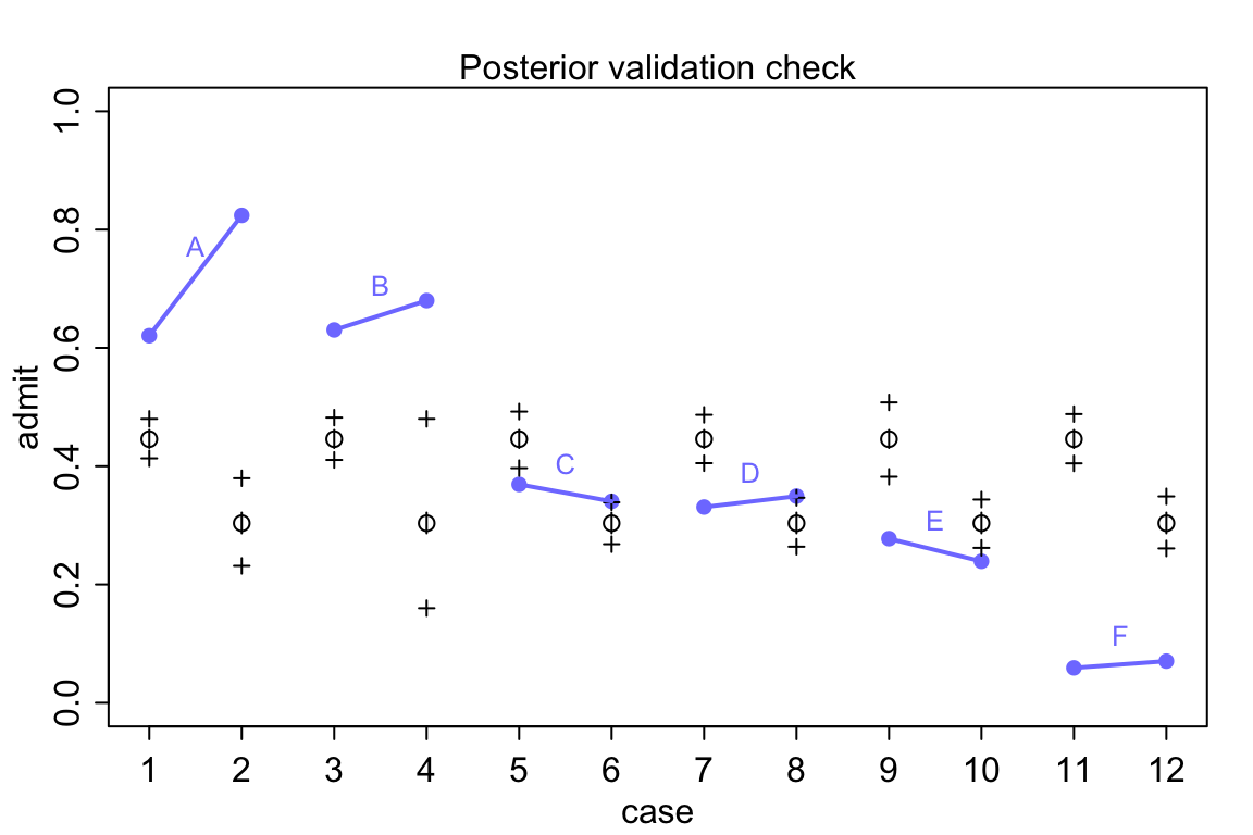
圖 53.8: Posterior check for model m11.7. Blue points are observed proportions admitted for each row in the data, with points from the same department connected by a blue line. Open points, the tiny vertical black lines within them, and the crosses are expected proportions, 89% inervals of the expectation, and 89% interval of simulated samples, respectively.
看圖 53.8 中的模型推測錄取率和實際觀察的錄取率之間差別有多大,模型簡直預測能力差到難以置信。在實際觀察的數據中,有且僅有兩個學院(C,E)有女性申請者的被錄取率略低於男性申請人。但是不知道爲什麼模型卻給出了男性申請人錄取率要高於女性申請人這樣歪曲事實的結果。通常情況下,這樣離譜的模型推測結果是由於代碼編寫的錯誤才會造成的。但是真的是這樣嗎?我們用的模型 m11.7 其實是在問,在這個大學裏平均的男性申請者錄取率和女性申請錄取率之差。但事實上我們看男性申請者和女性申請者並不同時申請不同的學院。從 A 學院到 F 學院的男女的錄取率都在遞減。你去看實際申請人數就知道女性申請者中申請A,B學院的實際人數非常地少,女性申請者傾向於申請錄取率特別低(< 10%)的F學院。
所以說,儘管從整所大學的錄取率來說,女性似乎要普遍低於男性,但是你仔細看每個學院各自的錄取率的話就知道這並不是事實。此時我們可能面對的選擇是應該適當地修改我們的研究問題,我們實際上應該提的問題是:“在這個大學的不同學院內,平均地講男性和女性申請人的錄取率有沒有顯著差別?”回答這個問題的模型,應該表達成爲:
\[ \begin{aligned} A_i & \sim \text{Binomial}(N_i, p_i) \\ \text{logit}(p_i) & = \alpha_{\text{GID}[i]} + \delta_{\text{DEPT}[i]}\\ \alpha_j & \sim \text{Normal}(0, 1.5) \\ \delta_k & \sim \text{Normal}(0, 1.5) \end{aligned} \]
修改了模型表達之後,我們賦予了每個學院自己各自的平均錄取率的對數比值(log-odds = logit),\(\delta_{\text{DEPT}[i]}\)。修改之後的模型同樣也能推算整個大學的錄取率,只是增加了對不同學院各自錄取傾向的考量。下面的代碼運行修改之後的模型。
dat_list$dept_id <- rep(1:6, each = 2)
m11.8 <- ulam(
  alist(
    admit ~ dbinom( applications, p ) ,
    logit(p) <- a[gid] + delta[dept_id] ,
    a[gid] ~ dnorm( 0, 1.5 ),
    delta[dept_id] ~ dnorm( 0, 1.5 )
  ), data = dat_list, chains = 4, iter = 4000, cmdstan = TRUE
)
## Compiling Stan program...## mean sd 5.5% 94.5% n_eff Rhat4
## a[1] -0.55241217 0.53502170 -1.42285985 0.29370854 497.09874 1.0041825
## a[2] -0.45587536 0.53579666 -1.33097415 0.39548288 498.97989 1.0040298
## delta[1] 1.13369072 0.53717936 0.28470695 2.01043990 510.00362 1.0041563
## delta[2] 1.08904322 0.53999395 0.23450630 1.97474550 502.94401 1.0040980
## delta[3] -0.12601480 0.53721575 -0.98518882 0.75291238 501.31768 1.0040519
## delta[4] -0.16114238 0.53661354 -1.00723155 0.71233847 502.31853 1.0038995
## delta[5] -0.60329272 0.54034012 -1.44947110 0.27341613 501.16575 1.0040989
## delta[6] -2.15898561 0.54957237 -3.03302310 -1.26824285 532.73534 1.0037547模型 m11.8 的運行結果就矯正了我們之前可能存在的性別歧視的誤解。考慮了不同學院各自的平均錄取率之後,男女申請人之間的平均錄取率的對數比值就變得很接近了。有了模型 m11.8 的事後概率分佈樣本,我們可以簡單的計算男女錄取率的學院調整後之差:
post <- extract.samples(m11.8)
diff_a <- post$a[, 1] - post$a[, 2]
diff_p <- inv_logit(post$a[, 1]) - inv_logit(post$a[, 2])
precis(list(diff_a = diff_a, diff_p = diff_p))
## mean sd 5.5% 94.5% histogram
## diff_a -0.096536806 0.081479856 -0.22490943 0.0332588200 ▁▁▁▂▅▇▇▅▂▁▁▁▁
## diff_p -0.021483864 0.018472127 -0.05116369 0.0072051079 ▁▁▂▇▇▂▁▁所以,當考慮了不同學院各自本身的錄取率差異之後,沒有證據表明在申請人錄取率上有顯著的性別歧視。我們來回到原始數據去看看這個過程實際是怎樣的。簡單歸納一下每個學院各自的實際男女申請人的比例:
pg <- with( dat_list, sapply(1:6, function(k)
  applications[dept_id == k]/sum(applications[dept_id == k])))
rownames(pg) <- c("male", "female")
colnames(pg) <- unique(d$dept)
round(pg, 3)
## A B C D E F
## male 0.884 0.957 0.354 0.527 0.327 0.522
## female 0.116 0.043 0.646 0.473 0.673 0.478# simpler version:
d %>%
group_by(dept) %>%
mutate( rel.freq = paste0(round(applications * 100/sum(applications), 2), "%"))## # A tibble: 12 × 6
## # Groups: dept [6]
## dept applicant.gender admit reject applications rel.freq
## <fct> <fct> <int> <int> <int> <chr>
## 1 A male 512 313 825 88.42%
## 2 A female 89 19 108 11.58%
## 3 B male 353 207 560 95.73%
## 4 B female 17 8 25 4.27%
## 5 C male 120 205 325 35.4%
## 6 C female 202 391 593 64.6%
## 7 D male 138 279 417 52.65%
## 8 D female 131 244 375 47.35%
## 9 E male 53 138 191 32.71%
## 10 E female 94 299 393 67.29%
## 11 F male 22 351 373 52.24%
## 12 F female 24 317 341 47.76%所以實際男性申請人佔比例在 A 學院達到了 88.4% 以上,像 E 學院的男性申請人的比例則僅僅只有 32.7% 左右。也就從另一個角度解釋了我們觀察到的現象,也就是說,錄取率較低的學院中女性申請人比例相當地高。模型 m11.8 給出的各個學院錄取率的推測值也和實際觀測值十分地接近 (圖 53.9)。
postcheck( m11.8 )
# draw lines connecting points from same dept

for( i in 1:6 ) {
  x <- 1 + 2*(i - 1)
  y1 <- d$admit[x] / d$applications[x]
  y2 <- d$admit[x + 1] / d$applications[x + 1]
  lines(c(x, x + 1), c(y1, y2), col = rangi2, lwd = 2)
  text(x + 0.5, (y1 + y2)/2 + 0.05,
       d$dept[x], cex = 0.8, col = rangi2)
}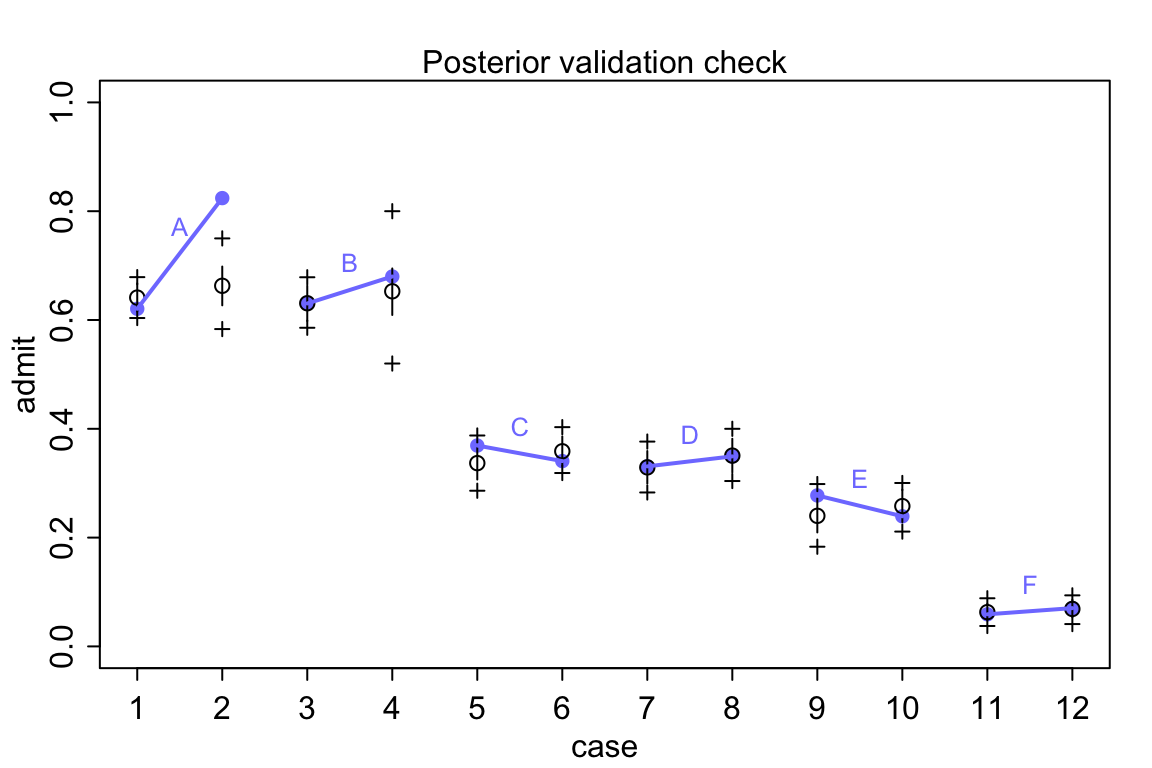
圖 53.9: Posterior check for model m11.8. Blue points are observed proportions admitted for each row in the data, with points from the same department connected by a blue line. Open points, the tiny vertical black lines within them, and the crosses are expected proportions, 89% inervals of the expectation, and 89% interval of simulated samples, respectively.
53.2 泊松回歸模型 Poisson regression
假如有某種試驗,成功的概率很低(接近零),當這樣的試驗實施的次數越來越多時,該試驗成功概率的概率分佈就會從二項分佈慢慢變成一個叫做泊松分佈的東西。二項分佈的均值(期望值)是試驗次數和成功概率的乘積 \(Np\),方差是 \(Np(1-p)\)。所以,當 \(N\) 很大,\(p\) 很小的時候,均值和方差其實幾乎可以認爲是相等的。例如一個試驗成功的概率只有 0.001,那麼進行1000次試驗可能也只出現一次成功,這是均值,其方差是 \(1000 \times 0.001 \times (1 - 0.001) = 0.999 \approx 1\)。也就是這時候雖然嚴格來說還是一個服從二項分佈的概率分佈,但是它的均值和方差幾乎是相同的。這樣的分佈被命名爲泊松分佈 (Poisson distribution)。
\[ y_i \sim \text{Poisson}(\lambda) \]
其中 \(\lambda\) 是結果 \(y\) 的期望值,也是結果 \(y\) 的方差。一般地,會使用對數函數作爲泊松模型的鏈接方程。
\[ \begin{aligned} y_i & \sim \text{Poisson}(\lambda_i) \\ \log(\lambda_i) & = \alpha + \beta (x_i - \bar{x}) \end{aligned} \]
對數鏈接函數確保了結果全部都是正的。我們始終要記住,當我們使用對數函數作爲鏈接方程的時候,我們默認的是預測變量和結果變量之間的關係是指數型關係。但是事實上我們觀察到的自然界的數據和現象很少會總是呈現指數型關係。所以當我們使用它的時候我們需要總是惦記這個指數關係是否成立,而且設定它的先驗概率分佈會更加的棘手。
53.2.1 泊松回歸實例:太平洋島國居民使用的工具
太平洋島國的原住民使用的各種不同工具給人類學家提供了非常好的研究人類工具和技術進化的過程。有些理論認爲較大的人口規模會產生較爲複雜精密的工具。於是自然地,太平洋島國的島嶼大小面積各不相同,也就天然地限制了每個島嶼原住民人口規模,可以用來分析上述理論。另外不同族羣之間接觸的頻率也會影響族羣的人口規模,從而和工具的技術進化相關。我們使用這個太平洋島國工具數據來分析這個話題。
##       culture population contact total_tools mean_TU
## 1    Malekula       1100     low          13     3.2
## 2     Tikopia       1500     low          22     4.7
## 3  Santa Cruz       3600     low          24     4.0
## 4         Yap       4791    high          43     5.0
## 5    Lau Fiji       7400    high          33     5.0
## 6   Trobriand       8000    high          19     4.0
## 7       Chuuk       9200    high          40     3.8
## 8       Manus      13000     low          28     6.6
## 9       Tonga      17500    high          55     5.4
## 10     Hawaii     275000     low          71     6.6
我們思考的研究模型是這樣的:
- 模型的結果變量是
total_tools。我們決定使用泊松回歸模型,用對數函數鏈接方程來分析這個數據。 - 我們實際上認爲
total_tools和人口population的對數(對數就是指的人口規模, the magnitude of the population)之間是正關係。 - 使用的工具的種類數量
total_tools同時被認爲和族羣之間接觸的頻率contact應該呈現正關係,因爲多數人認爲增加不同島嶼族羣之間的交流和接觸會顯然增加原住民部落本身獲取更加多種類的生產工具。 - 另外還有人認爲,人口規模大小
population還會通過部落族羣之間的交流頻率contact作爲媒介影響到結果變量total_tools。
接下來我們給數據中增加幾個需要使用的轉換後的變量:
d$P <- scale( log(d$population) ) # standardize the log(population) into mean = 0, sd = 1
d$contact_id <- ifelse( d$contact == "high", 2, 1)
我們把符合上述思考和假設的模型描述爲含有交互作用項的數學模型:
\[ \begin{aligned} T_i & \sim \text{Poisson}(\lambda_i) \\ \log \lambda_i & = \alpha_{\text{CID}[i]} + \beta_{\text{CID}[i]} \log P_i \\ \alpha_i & \sim \text{ to be determined } \\ \beta_j & \sim \text{ to be determined } \end{aligned} \]
其中,
- \(P_i\) 是人口規模,
- \(\text{CID}[i]\) 是
contact_id。
接下來我們考慮怎樣爲 \(\alpha_i, \beta_j\) 設置合適的先驗概率分佈。和二項分佈數據使用的邏輯回歸模型類似,當我們選擇使用對數鏈接函數把數據進行轉換之後,原先在簡單線性回歸模型中適合使用的平坦分佈會變得不合適。爲了更直觀的說明這個現象,我們先使用最簡單的只有截距的泊松回歸模型,給該截距的先驗概率分佈使用平坦分佈 \(\text{Normal}(0,10)\)。
\[ \begin{aligned} T_i & \sim \text{Poisson}(\lambda_i) \\ \log \lambda_i & = \alpha \\ \alpha & \sim \text{Normal}(0, 10) \\ \end{aligned} \]
當我們給截距設定的先驗概率分佈設定成 \(\text{Normal}(0,10)\) 會對時間發生率 \(\lambda\) 在它原本的尺度上有怎樣的體現呢?如果截距 \(\alpha\) 是服從正(常)態分佈的話,那麼 \(\lambda\) 就會服從對數正(常)態分佈。我們來繪製一下這兩個分佈的概率密度分佈:
curve( dlnorm(x, 0, 10), from = 0, to = 100, n = 200,
       bty = "n",
       xlab = "mean numbber of tools (lambda)",
       ylab = "Density")
text(20, 0.06, "a ~ dnorm(0, 10)")
curve( dlnorm(x, 3, 0.5), add = TRUE,
       col = rangi2, lwd = 2)
text(50, 0.03, "a ~ dnorm(3, 0.5)", col = rangi2)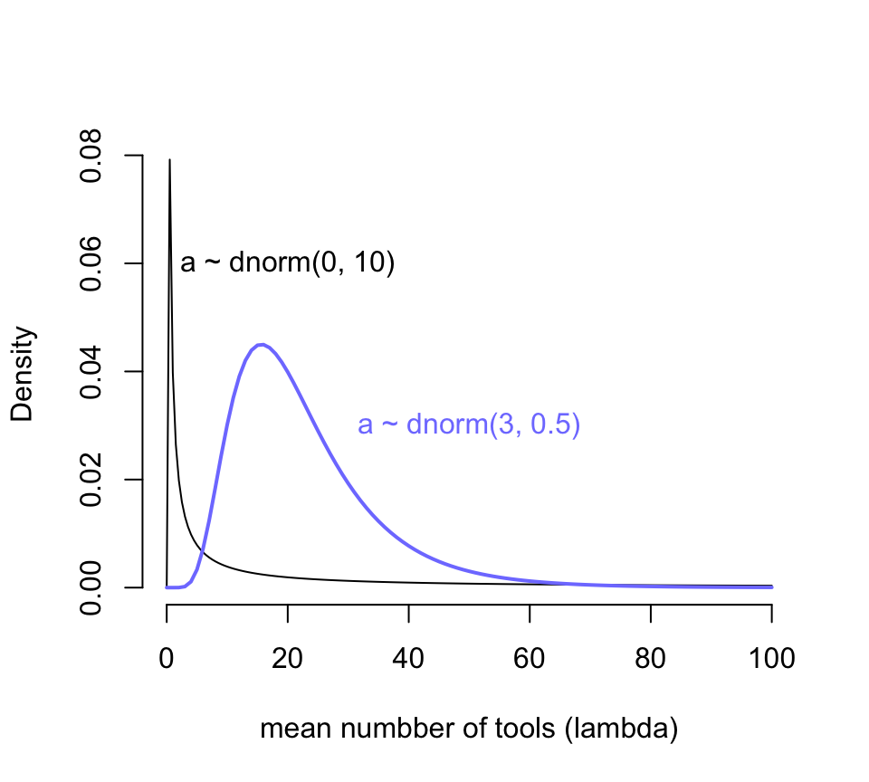
圖 53.10: Prior predictive distribution of the mean lambda of a simple Poisson GLM, considering only the intercept alpha. A flat conventional prior (black) creates absurd expecations on the outcome scale. The mean of this distribution is exp(50) stupidly large. It is easy to do better by shifting prior mass above zero (blue).
圖 53.10 顯示,當我們使用 \(\alpha \sim \text{Normal}(0, 10)\) 作爲截距的先驗概率分佈時,我們看到結果變量使用工具的數量竟然出現了一個特別接近零的尖峯,這其實意味着我們的先驗概率分佈認爲不論是哪個島嶼哪個部落的居民使用的工具數量基本上是 0,這顯然是不合理的。而且你看它右邊的尾巴特別的長,有多長呢?對數正(常)態分佈的期望值計算公式是 \(\exp(\mu + \sigma^2/2)\),也就是說現在設定的先驗概率分佈 \(\alpha \sim \text{Normal}(0, 10)\) 的均值其實達到了 \(\exp(50) = 5.185e+21\)。我們隨便模擬一個對數正(常)態分佈看它的均值會是怎樣的不可思議地大:
## [1] 1.5502546e+14於是我們修改了一下預期,把截距的先驗概率分佈修改成 \(\text{Normal}(3, 0.5)\),展示在圖 53.10 中藍色的曲線。此時的新對數正(常)態分佈的均值是 \(\exp(3 + 0.5^2/2) \approx 22.8\),也就是說這個先驗概率認爲在沒有分析數據之前,我們估計平均來說每個部落的族羣平均的生產工具的數量在20個左右。這樣的假設是不是會合理很多?用相似的邏輯我們用來給人口規模 (\(\log\) population) 回歸係數 \(\beta\) 設定合理的先驗概率分佈,目標是希望把數據限制在合適的範圍內以免採樣效率太低。先用一個我們傳統上認爲的平坦分佈 \(\text{Normal}(0,10)\) 來看看它的戲劇性效果。
N <- 100
a <- rnorm(N, 3, 0.5)
b <- rnorm(N, 0, 10)
plot(NULL,
      bty = "n",
     xlim = c(-2, 2),
     ylim = c(0, 100),
     main = "b ~ dnorm(0, 10)",
     ylab = "total tools",
     xlab = "log population (std)")
for(i in 1:N) curve(exp( a[i] + b[i]*x), add = TRUE, col = grau())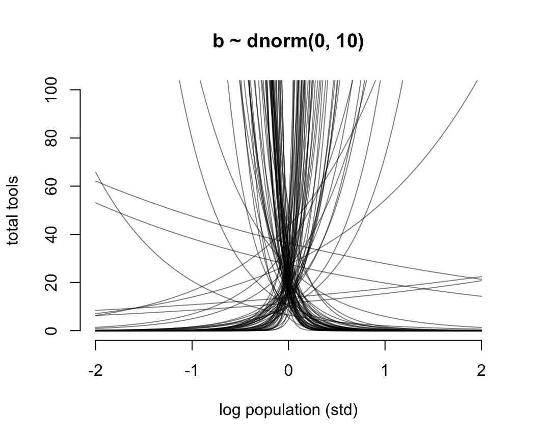
圖 53.11: Struggling with slope priors in a Poisson GLM. A flat prior produces explosive trends on the outcome scale.
圖 53.11 就是當截距是合理的先驗概率分佈,但是斜率是常用的“平坦分佈”時給出的人口規模和工具數量之間的可怕的關係。它其實是在說,當我們還沒見到實際數據時,我們認爲在平均人口規模(因爲橫軸的人口規模被標準化了)的部落族羣附近,使用的工具種類數量要麼就是暴增,要麼是暴減。這是非常不合常理的。我們需要不那麼“平坦”的先驗概率分佈,給我們合理的結果。經過多種嘗試,我們認爲 \(\beta \sim \text{Normal}(0, 0.2)\) 會是一個理性的選擇(圖53.12)。在實際分析數據之前,我們認爲不論是哪個部落,最多的生產工具種類也不會超過100種之多。
N <- 100
a <- rnorm(N, 3, 0.5)
b <- rnorm(N, 0, 0.2)
plot(NULL,
      bty = "n",
     xlim = c(-2, 2),
     ylim = c(0, 100),
     main = "b ~ dnorm(0, 0.2)",
     ylab = "total tools",
     xlab = "log population (std)")
for(i in 1:N) curve(exp( a[i] + b[i]*x), add = TRUE, col = grau())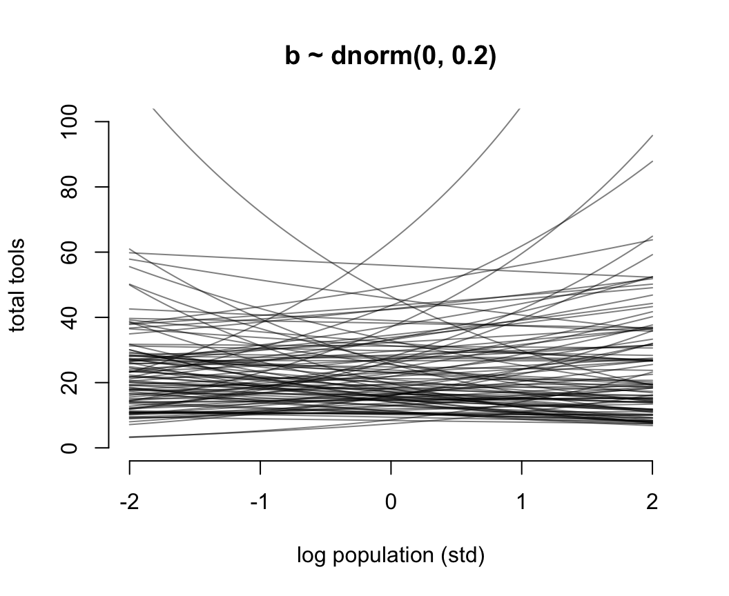
圖 53.12: Struggling with slope priors in a Poisson GLM. A regularizing prior remains mostly within the space of outcomes.
我們把橫軸修改成爲沒有被標準化的 log population 之後,先驗概率分佈之間的關係如圖 53.13。
N <- 100
a <- rnorm(N, 3, 0.5)
b <- rnorm(N, 0, 0.2)

x_seq <- seq( from = log(100), to = log(200000), length.out = 100)
lambda <- sapply( x_seq, function(x) exp(a + b*x))
plot(NULL,
      bty = "n",
     xlim = range(x_seq),
     ylim = c(0, 500),
     main = "a ~ dnorm(3, 0.5); b ~ dnorm(0, 0.2)",
     ylab = "total tools",
     xlab = "log population (un-std)")
for(i in 1:N) lines(x_seq, lambda[i, ], col = grau(), lwd = 1.5)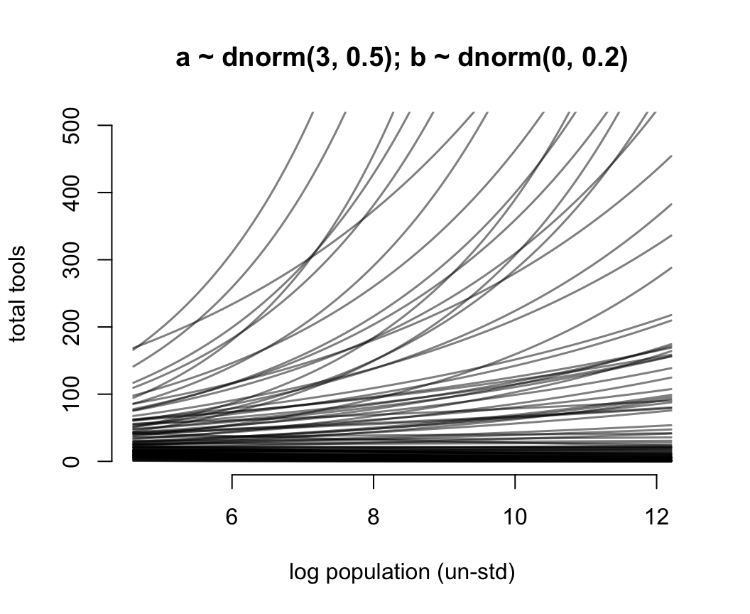
圖 53.13: Struggling with slope priors in a Poisson GLM. A regularizing prior remains mostly within the space of outcomes. Now horizontal axis on unstandardized scale.
最後我們再把橫軸的人口重新轉換到最原始的尺度上來,成爲圖 53.14 顯示的
plot(NULL,  bty = "n",
     xlim = range(exp(x_seq)),
     ylim = c(0, 500),
     main = "a ~ dnorm(3, 0.5); b ~ dnorm(0, 0.2)",
     ylab = "total tools",
     xlab = "population (un-std)")
for(i in 1:N) lines(exp(x_seq), lambda[i, ], col = grau(), lwd = 1.5)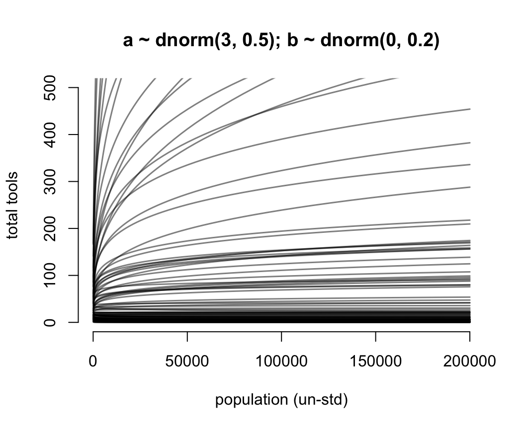
圖 53.14: Struggling with slope priors in a Poisson GLM. A regularizing prior remains mostly within the space of outcomes. Now horizontal axis on unstandardized original scale for population.
可以看到這是泊松回歸模型認爲的真實的預測變量和結果變量之間存在的關係,這是一種對數線性(log-linear)關係。自然地解釋就是,人口數量本身數值的增加,只能對工具種類的增加造成微弱的影響。許多的預測變量,都應該被取了對數之後再放入你的回歸模型中去,因爲這才是真實的關係。接下來終於到了模型本身的運行了:
dat <- list(
  T = d$total_tools,
  P = d$P,
  cid = d$contact_id
)

# intercept only
 m11.9 <- ulam(
   alist(
     T ~ dpois( lambda ),
     log(lambda) <- a,
     a ~ dnorm( 3, 0.5 )
   ), data = dat, chains = 4, log_lik = TRUE, cmdstan = TRUE
 )
## Compiling Stan program...# interaction model
m11.10 <- ulam(
alist(
T ~ dpois( lambda ),
log(lambda) <- a[cid] + b[cid] * P,
a[cid] ~ dnorm( 3, 0.5 ),
b[cid] ~ dnorm( 0, 0.2 )
), data = dat, chains = 4, log_lik = TRUE, cmdstan = TRUE
)## Compiling Stan program...## mean sd 5.5% 94.5% n_eff Rhat4
## a 3.5417773 0.054827606 3.4537819 3.6290206 754.24347 1.0034536## mean sd 5.5% 94.5% n_eff Rhat4
## a[1] 3.31991004 0.089108961 3.174423050 3.45588055 1770.7538 0.99917200
## a[2] 3.61204930 0.073722794 3.492463400 3.72909585 2220.5610 1.00022684
## b[1] 0.37615682 0.053043988 0.290144160 0.45832048 1724.7594 0.99949672
## b[2] 0.18447760 0.158530213 -0.058991431 0.43852981 1921.9132 0.99937162## Some Pareto k values are high (>0.5). Set pointwise=TRUE to inspect individual points.## Some Pareto k values are very high (>1). Set pointwise=TRUE to inspect individual points.## PSIS SE dPSIS dSE pPSIS weight
## m11.10 86.077059 13.298851 0.00000 NA 7.2911759 1.0000000e+00
## m11.9 141.446629 33.480083 55.36957 32.228886 8.3639525 9.4765567e-13我們又一次看見了關於 Pareto k 的警報。這提示我們數據種存在一些對模型結果影響較大的觀察值。具體可以通過繪製PSIS圖來觀察模型的事後概率分佈。
k <- PSIS( m11.10, pointwise = TRUE)$k
plot(dat$P, dat$T,
     xlab = "log population (std)",
     ylab = "total tolls",
     col = rangi2,
      bty = "n",
     pch = ifelse( dat$cid == 1, 1, 16),
     lwd = 2,
     ylim = c(0, 75),
     cex = 1 + normalize(k))

# set up the horizontal axis values to compute predictions at

ns <- 100
P_seq <- seq( from = -1.4, to = 3, length.out = ns)

# Predictions for cid = 1 (low contact)
lambda <- link( m11.10, data = data.frame( P = P_seq, cid = 1 ) )
lmu <- apply(lambda, 2, mean)
lci <- apply(lambda, 2, PI)
lines( P_seq, lmu, lty = 2, lwd = 1.5)
shade(lci, P_seq, xpd = FALSE)

# Predictions for cid = 2 (high contact)
lambda <- link( m11.10, data = data.frame( P = P_seq, cid = 2 ))
lmu <- apply( lambda, 2, mean)
lci <- apply( lambda, 2, PI)
lines( P_seq, lmu, lty = 1, lwd = 1.5)
shade( lci, P_seq, xpd = FALSE
       )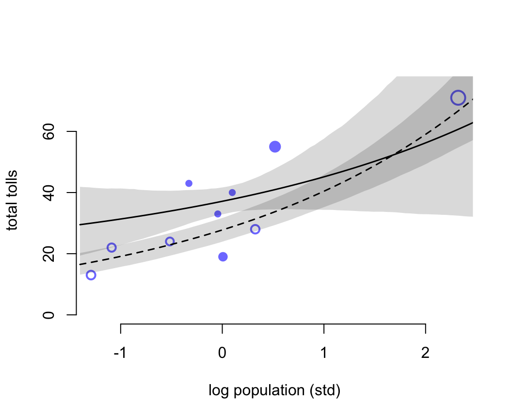
圖 53.15: Posterior predictions for the Oceanic tools model. Filled points are societies with historically high contact. Open points are those with low contact. Point size is scaled by relative PSIS Pareto’s k values. Larger points are more influential. The solid curve is the posterior mean for high contact societies. The dashed curve is the same for low contact societies. 89% compatibility intervals are shown by the shaded regions. (Standardized log population scale, as in the model code)
圖 53.15 中空心的點表示與其他族羣部落交流較少的島嶼,實心點是與其他族羣部落交流較頻繁的島嶼。點的大小個 Pareto K 值成正比例。下面的代碼把橫軸人口還原到原始的尺度上。
plot( d$population, d$total_tools,
            bty = "n",
      xlab = "population",
      ylab = "total tools",
      col = rangi2, pch = ifelse( dat$cid == 1, 1, 16), lwd = 2,
      ylim = c(0, 75), cex = 1 + normalize(k))

ns <- 100

P_seq <- seq( from = -5, to = 3, length.out = ns )
# 1.53 is sd of log(population)
# 9 is mean of log(population)

pop_seq <- exp( P_seq*1.53 + 9 )

lambda <- link( m11.10, data = data.frame( P = P_seq, cid = 1 ))
lmu <- apply( lambda, 2, mean)
lci <- apply( lambda, 2, PI)

lines( pop_seq, lmu, lty = 2, lwd = 1.5 )
shade( lci, pop_seq, xpd = FALSE )

lambda <- link( m11.10, data = data.frame( P = P_seq, cid = 2 ))
lmu <- apply( lambda, 2, mean )
lci <- apply( lambda, 2, PI )
lines( pop_seq, lmu, lty = 1, lwd = 1.5 )
shade( lci, pop_seq, xpd = FALSE )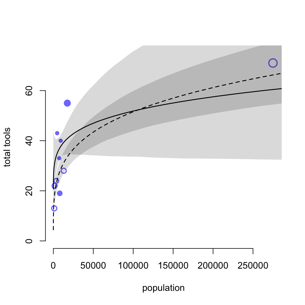
圖 53.16: Posterior predictions for the Oceanic tools model. Filled points are societies with historically high contact. Open points are those with low contact. Point size is scaled by relative PSIS Pareto’s k values. Larger points are more influential. The solid curve is the posterior mean for high contact societies. The dashed curve is the same for low contact societies. 89% compatibility intervals are shown by the shaded regions. (Same predictions on the natural population scale.)
檢查 k 值我們發現,夏威夷 (k = 1.01) 是對模型結果影響最大的點。夏威夷擁有最多的人口,和種類數量最多的生產工具。