第 49 章 有向無環圖 DAG & 可怕的因果 Causal Terror
- The most newsworthy scientific studies are the least trustworthy. Maybe popular topics attract more and worse researchers, like flies drawn to the smell of honey?
- Richard McElreath
Berkson’s paradox, 又被叫做是選擇性扭曲現象(selection-distortion effect)。
set.seed(1914)
N <- 200 # num grant proposals
p <- 0.1 # proportion to select

# uncorrelated newsworthiness and trustworthiness
nw <- rnorm(N)
tw <- rnorm(N)

# select top 10 of combined scores
s <- nw + tw # total score
q <- quantile( s, 1-p ) # top 10% threshold

selected <- ifelse( s >= q, TRUE, FALSE)
cor(tw[selected], nw[selected])
## [1] -0.76800831proposal <- data.frame(nw, tw, selected)
with(proposal, plot(nw[!selected], tw[!selected], col=c("black"),
xlim = c(-3,3.5), ylim = c(-3.5,3),
bty="n",
xlab = "newsworthiness",
ylab = "trustworthiness"))
points(proposal$nw[proposal$selected],
proposal$tw[proposal$selected],
col = c("blue"),
pch = 16)
abline(lm(proposal$nw[proposal$selected] ~ proposal$tw[proposal$selected]),
lty = 2, lwd = 2, col = c("blue"))
text(1, -2.8, "rejected")
text(2, 2.5, "selected", col = c("blue"))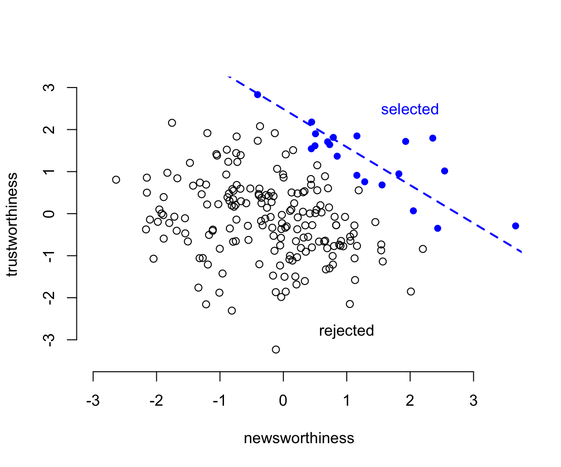
圖 49.1: Why the most newsworthy studies might be least trustworthy. 200 research proposals are ranked by combined trustworthiness and news worthiness. The top 10% are selected for funding. While there is no correlation before selection, the two criteria are strongly negatively correlated after selection. The correlation here is -0.77.
49.1 多重共線性問題 multicollinearity
多重共線性,通常當模型的預測變量之間有較強的相互關係的時候會出現。它造成的結果是你的模型給出的事後概率分佈會表現的似乎和任何一個預測變量之間都沒什麼關係,即便事實上其中的一個甚至幾個都可能和結果變量存在著相互依賴的關係。這樣的模型對於研究目的是使用模型來做預測的情形下沒有什麼本質的影響。
想像一下我們想使用一個人的腿長度來預測他/她的身高。你覺得模型中同時放入左右兩條腿的長度作為預測變量的話,事情會變成怎樣的呢?
下面的代碼是通過計算機模擬生成100個人的身高和腿長度。
N <- 100                        # number of individuals
set.seed(909)
height <- rnorm(N, 10, 2)       # sim total height for each
leg_prop <- runif(N, 0.4, 0.5)  # leg as proportion of height
leg_left <- leg_prop * height + # sim left leg as proportion + error
  rnorm( N, 0, 0.02 )
leg_right <- leg_prop * height + # sim right leg as proportion + error
  rnorm( N, 0, 0.02 )
                                  # combine into data frame
d <- data.frame(height, leg_left, leg_right)
head(d)
## height leg_left leg_right
## 1 5.9314170 2.6794115 2.7092861
## 2 6.5129833 2.6764277 2.6800068
## 3 9.3466279 3.9271549 3.9849467
## 4 9.2330335 3.9641911 3.9933889
## 5 10.3571282 4.4275932 4.4187658
## 6 10.0889226 4.9566406 4.9718779如果我們同時使用兩腿的長度作為預測身高的變量建立簡單線性回歸模型的話,我們會期待獲得怎樣的結果?從生成數據的過程我們已知平均地,腿長度佔身高的比例是45%。所以我們其實會期待腿長度的回歸係數應該在 \(10/4.5 \approx 2.2\) 左右。但事實是怎樣呢?
m6.1 <- quap(
  alist(
    height ~ dnorm( mu, sigma ),
    mu <- a + bl * leg_left + br * leg_right,
    a ~ dnorm( 10, 100 ),
    bl ~ dnorm(2, 10),
    br ~ dnorm(2, 10),
    sigma ~ dexp( 1 )
  ), data = d
)
precis(m6.1)
## mean sd 5.5% 94.5%
## a 0.98119382 0.28396068 0.52736981 1.43501783
## bl 0.21384749 2.52707954 -3.82491370 4.25260868
## br 1.78170461 2.53129314 -2.26379072 5.82719994
## sigma 0.61711409 0.04343629 0.54769451 0.68653367左右腿的數據同時放到一個模型裡給出的結果似乎是令人困惑的。
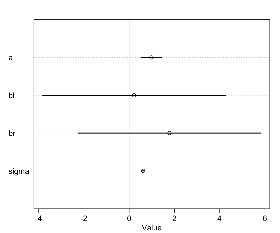
圖 49.2: If both legs have almost identical lengths, and height is so strongly associated with leg length, then why is this posterior distribution so weird?
我們看模型 m6.1 給出的 bl, br 的事後聯合分佈 (joint posterior distribution):
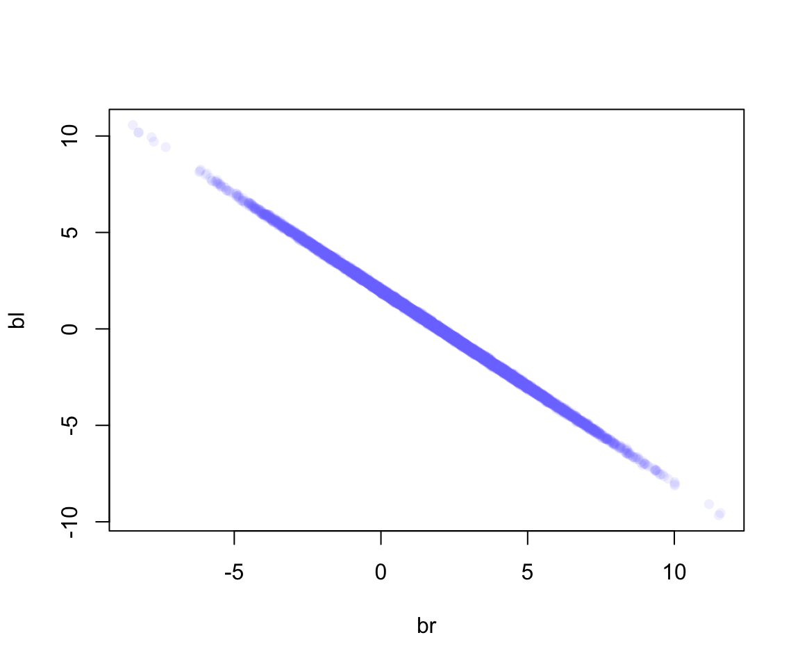
圖 49.3: Posterior distribution of the association of each leg with hegiht, from model m6.1. Since both variables contain almost identical information, the posterior is a narrow ridge of negatively correlated values.
如圖 49.3 顯示的那樣,當 bl 很大時,br 就很小,反之亦然。
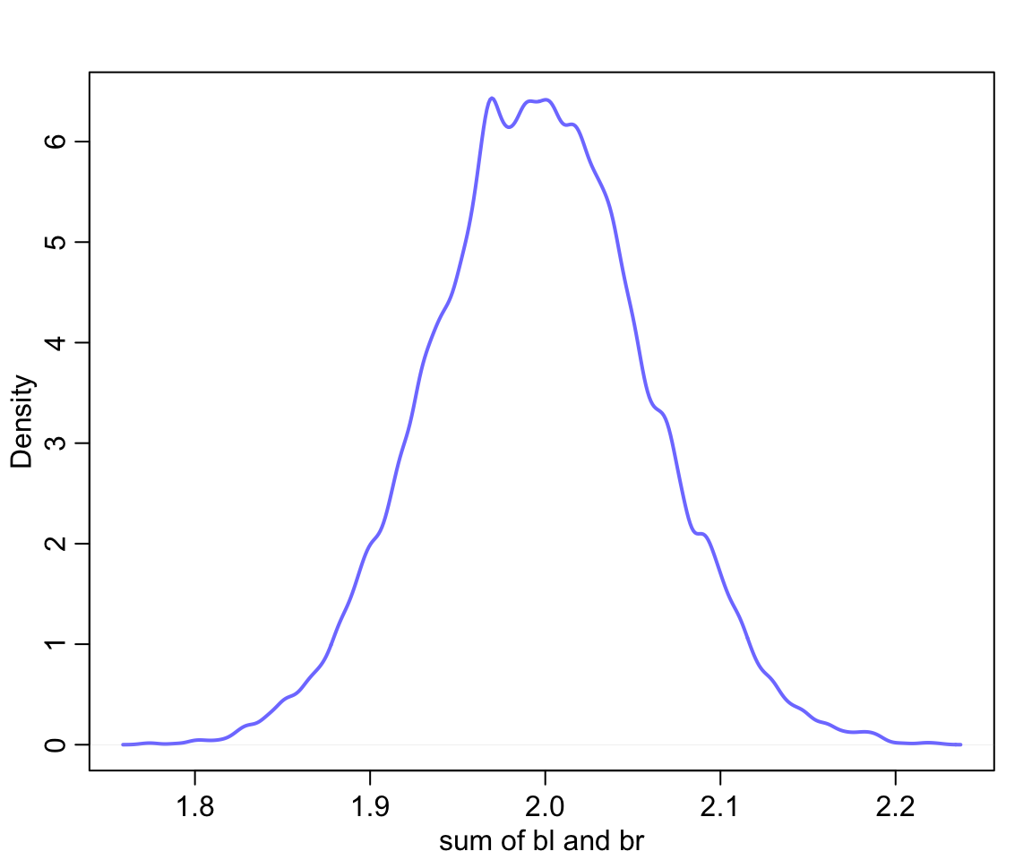
圖 49.4: The posterior distribution of the sum of the two parameters is cnetered on the proper association of eight leg with height.
於是我們知道我們應該從模型中去掉其中一個腿的信息,從而獲得正確的模型和計算結果:
m6.2 <- quap(
  alist(
    height ~ dnorm( mu, sigma ),
    mu <- a + bl * leg_left,
    a ~ dnorm( 10, 100 ),
    bl ~ dnorm(2, 10),
    sigma ~ dexp( 1 )
  ), data = d
)
## Caution, model may not have converged.## Code 1: Maximum iterations reached.## mean sd 5.5% 94.5%
## a 0.79529830 0.295561841 0.32293340 1.2676632
## bl 2.03356681 0.063693716 1.93177195 2.1353617
## sigma 0.64122746 0.047734243 0.56493892 0.717516049.1.1 哺乳動物奶質量數據中的共線性
重新打開哺乳動物奶質量數據。我們看其中的含脂肪百分比和含乳糖百分比這兩個變量。把他們標準化:
data(milk)
d <- milk
d$K <- standardize( d$kcal.per.g )
d$F <- standardize( d$perc.fat )
d$L <- standardize( d$perc.lactose )
下面的模型使用標準化的脂肪百分比和乳糖百分比兩個變量作為預測變量來預測奶的能量密度:
# kcal.per.g regressed on perc.fat
m6.3 <- quap(
  alist(
    K ~ dnorm( mu, sigma ),
    mu <- a + bF * F,
    a ~ dnorm( 0, 0.2 ),
    bF ~ dnorm( 0, 0.5 ),
    sigma ~ dexp(1)
  ), data = d
)

# kcal.per.g regressed on perc.lactose
m6.4 <- quap(
  alist(
    K ~ dnorm( mu, sigma ),
    mu <- a + bL * L,
    a ~ dnorm( 0, 0.2 ),
    bL ~ dnorm( 0, 0.5 ),
    sigma ~ dexp(1)
  ), data =  d
)


precis( m6.3 )
## mean sd 5.5% 94.5%
## a 1.5355260e-07 0.077251946 -0.12346338 0.12346368
## bF 8.6189697e-01 0.084260876 0.72723181 0.99656212
## sigma 4.5101794e-01 0.058707561 0.35719192 0.54484396## mean sd 5.5% 94.5%
## a 7.4388174e-07 0.066616333 -0.10646502 0.10646651
## bL -9.0245498e-01 0.071328484 -1.01645167 -0.78845828
## sigma 3.8046526e-01 0.049582594 0.30122270 0.45970783當單獨使用其中之一作為能量密度的預測變量時,我們發現他們各自的回歸係數似乎互相成鏡像數據,一個是正的,另一個是負的。而且二者的回歸係屬的事後概率分佈都很精確,我們認為這兩個單獨變量都是可以用來預測奶能量密度的極佳預測變量。因為脂肪百分比越高,能量密度越高,反之,乳糖含量比例越高,那麼能量密度則越低。我們來看把他們兩個同時加入模型中會發生什麼現象:
m6.5 <- quap(
  alist(
    K ~ dnorm( mu, sigma ),
    mu <- a + bF * F + bL * L,
    a ~ dnorm( 0, 0.2 ),
    bF ~ dnorm( 0, 0.5 ),
    bL ~ dnorm( 0, 0.5 ),
    sigma ~ dexp( 1 )
  ), data = d
)
precis( m6.5 )
## mean sd 5.5% 94.5%
## a -3.1721684e-07 0.066035771 -0.10553823 0.10553760
## bF 2.4349835e-01 0.183578648 -0.04989579 0.53689248
## bL -6.7808254e-01 0.183776698 -0.97179320 -0.38437188
## sigma 3.7674180e-01 0.049183935 0.29813637 0.45534722你看現在 m6.5 模型中同時加入了脂肪百分比,和乳糖百分比的兩個變量。都比單獨使用時給出的回歸係屬更接近 0。而且各自的事後概率分佈的標準差都比單獨使用時大了許多(幾乎兩倍)。這並非是來自計算機模擬的數據,而是真正現實中存在的奶製品測量之後的數據。脂肪百分比和乳糖百分比二者之間存在的很強的互相預測的關係。我們從他們的三點圖可以看出其中的奧妙:
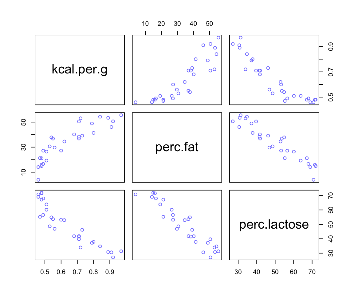
圖 49.5: A pairs plot of the total energy, percent fat, and percent lactose variables from the primate milk data. Percent fat and percent lactose are strongly negatively correlated with one another, providing mostly the same information.
49.2 治療後偏倚 post-treatment bias
set.seed(71)
 # number of plants
N <- 100

# simulate initial heights
h0 <- rnorm(N, 10, 2)

# assign treatments and simulate fungus and growth
treatment <- rep(0:1, each = N/2)
fungus <- rbinom( N, size = 1, prob = 0.5 - treatment * 0.4)
h1 <- h0 + rnorm( N, 5 - 3*fungus )

# compose a clean data frame
d <- data.frame( h0 = h0, h1 = h1, treatment = treatment, fungus = fungus)
head(d)
## h0 h1 treatment fungus
## 1 9.1363156 14.345788 0 0
## 2 9.1056256 15.623924 0 0
## 3 9.0428548 14.386665 0 0
## 4 10.8342908 15.837422 0 0
## 5 9.1641987 11.469124 0 1
## 6 7.6256722 11.107757 0 0## mean sd 5.5% 94.5% histogram
## h0 9.959780 2.10116231 6.5703278 13.078737 ▁▂▂▂▇▃▂▃▁▁▁▁
## h1 14.399204 2.68808705 10.6180024 17.933694 ▁▁▃▇▇▇▁▁
## treatment 0.500000 0.50251891 0.0000000 1.000000 ▇▁▁▁▁▁▁▁▁▇
## fungus 0.230000 0.42295258 0.0000000 1.000000 ▇▁▁▁▁▁▁▁▁▂49.2.1 設定模型
\[ \begin{aligned} h_{1,i} & \sim \text{Normal}(\mu_i, \sigma) \\ \mu_i & = h_{0,i} \times p \end{aligned} \]
其中,
- \(h_{0,i}\) 是在時間 \(t = 0\) 時的植物高度;
- \(h_{1,i}\) 是在時間 \(t = 1\) 時植物的高度;
- \(p\) 是比例係數,也就是 \(h_{1,i}\) 和 \(h_{0,i}\) 之間的比值,\(p = \frac{h_{1,i}}{h_{0,i}}\)。如果 \(p = 1\) 說明在時間 \(t = 1\) 時植物並沒有比在時間 \(t = 0\) 時有長高。
這裡我們對 \(p\) 使用的先驗概率分佈,應該會集中在 1 的附近,因為無信息表示我們認為植物的高度不會隨時間發生變化。但是這個比例 \(p\) 不能為負數。因為它是一個值和另一個值的比值。我們之前使用過相似特質的先驗概率分佈,也就是對數正(常)態分佈(Log-Normal distribution):
\[ \beta \sim \text{Log-Normal}(0, 0.25) \]
看看這個先驗概率分佈的密度曲線是什麼樣子:
##          mean         sd       5.5%     94.5%    histogram
## sim_p 1.03699 0.26298937 0.67068301 1.4963969 ▁▁▃▇▇▃▁▁▁▁▁▁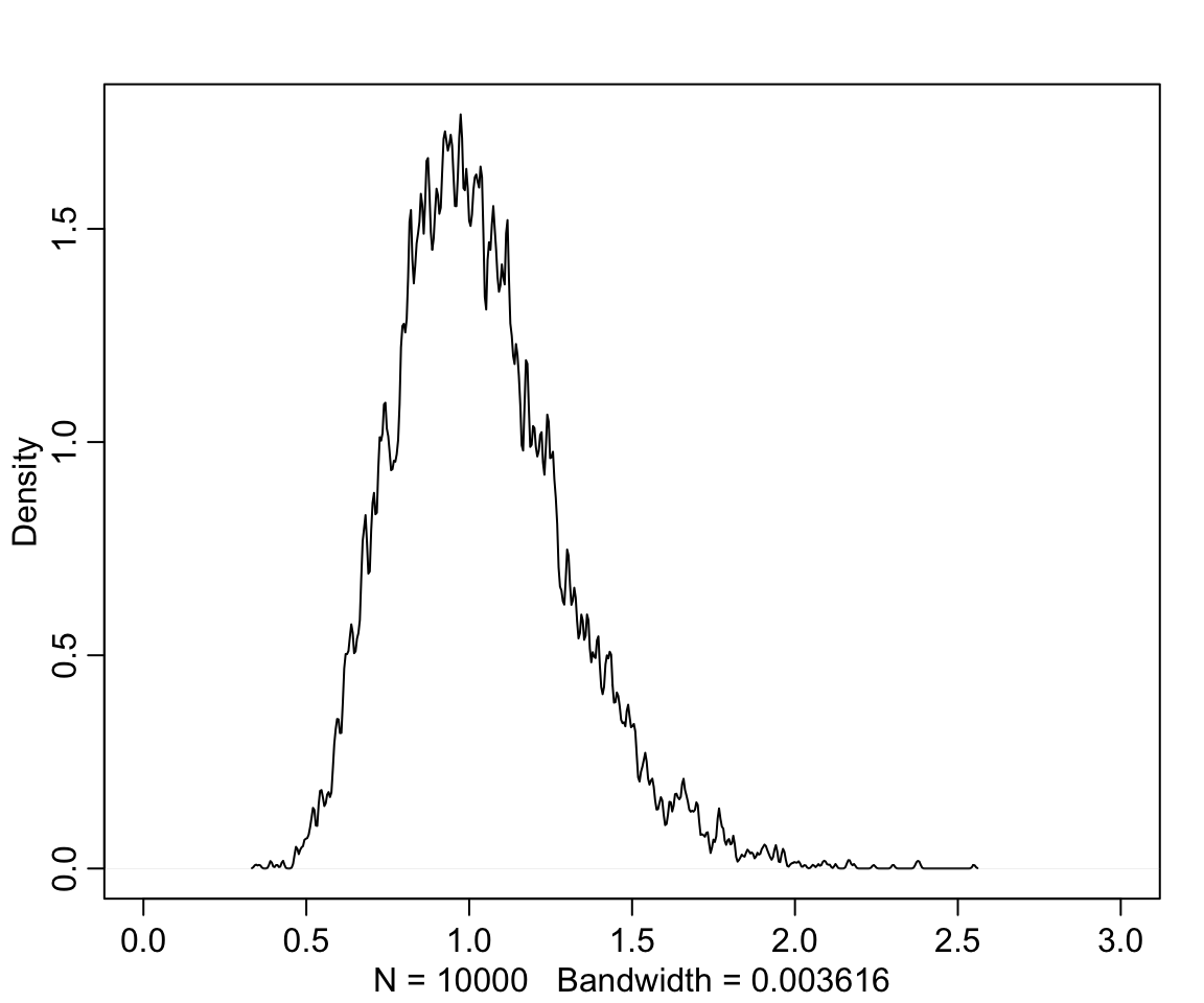
圖 49.6: Distribution density funciton of Log-Normal(0,0.25)
也就是說,我們給出的這個先驗概率分佈認為,植物在不同時間點之間的生長比例範圍在 0.67 和 1.49 之間,也就是要麼縮水33%,或者最多長高50%。
建立該模型:
m6.6 <- quap(
  alist(
    h1 ~ dnorm(mu, sigma),
    mu <- h0 * p ,
    p ~ dlnorm( 0, 0.25 ),
    sigma ~ dexp(1)
  ), data  = d
)
precis(m6.6)
## mean sd 5.5% 94.5%
## p 1.4266259 0.017609916 1.3984818 1.4547699
## sigma 1.7932857 0.125172622 1.5932357 1.9933357\(p\) 的事後概率分佈均值是 1.43,也就是預估平均每單位時間植物會長高大約 40%。接下來如果加入另外兩個變量,治療組,和是否出現菌落。我們會把這兩個變量對植物施加的影響使用線性回歸模型的方式加到 \(p\) 上去:
\[ \begin{aligned} h_{1, i} & \sim \text{Normal}(\mu_i, \sigma) \\ \mu_i & = h_{0,i} \times p \\ p & = \alpha + \beta_T T_i + \beta_F F_i \\ \alpha & \sim \text{Log-Normal}(0, 0.25) \\ \beta_T & \sim \text{Normal}(0, 0.5) \\ \beta_F & \sim \text{Normal}(0, 0.5) \\ \sigma & \sim \text{Exponential}(1) \end{aligned} \]
上述模型的R代碼如下:
m6.7 <- quap(
  alist(
    h1 ~ dnorm(mu, sigma),
    mu <- h0 * p ,
    p <- a + bt * treatment + bf * fungus,
    a ~ dlnorm( 0, 0.2 ),
    bt  ~ dnorm(0, 0.5),
    bf  ~ dnorm(0, 0.5),
    sigma ~ dexp(1)
  ), data = d
)
precis(m6.7)
## mean sd 5.5% 94.5%
## a 1.4813914677 0.024510693 1.442218647 1.520564289
## bt 0.0024122219 0.029869649 -0.045325247 0.050149691
## bf -0.2667189147 0.036547721 -0.325129231 -0.208308598
## sigma 1.4087974415 0.098620704 1.251182509 1.566412374這裡似乎在說,治療本身對植物生長速度並無效果,但是有菌落卻對生長比例造成了負影響。可是我們明明知道菌落是否存在,是取決於治療本身的,也就是菌落是治療對土壤造成的結果之一。上述模型似乎在告訴我們,當我們知道了治療造成的結果之一 – 是否有菌落,那麼治療本身對植物生長比例的影響就消失了。正確的模型是,我們應該把菌落這個變量從模型中拿掉,從而尋找治療對植物生長率的效果:
m6.8 <- quap(
  alist(
    h1 ~ dnorm(mu, sigma),
    mu <- h0 * p,
    p <- a + bt * treatment,
    a ~ dlnorm(0, 0.25),
    bt ~ dnorm(0, 0.5),
    sigma ~ dexp(1)
  ), data = d
)
precis(m6.8)
## mean sd 5.5% 94.5%
## a 1.381693513 0.025197600 1.341422882 1.4219641
## bt 0.083654229 0.034313231 0.028815059 0.1384934
## sigma 1.746295968 0.121908002 1.551463435 1.9411285上述的分析過程和結果告訴我們,如果我們把由於治療本身造成的結果之一也錯誤地放進預測變量中的話,治療本身的效果會消失。
這些變量之間的關係還可以用下面的DAG圖來輔助理解:
plant_dag <- dagitty("dag{
      H_0 -> H_1
      F -> H_1
      T -> F
}")
coordinates( plant_dag ) <- list(x = c(H_0 = 0 , T = 2, F = 1.5, H_1 = 1),
                                 y = c(H_0 = 0 , T = 0, F = 0, H_1 = 0))
drawdag(plant_dag)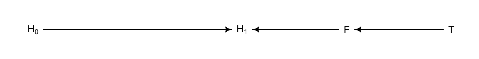
圖 49.7: The DAG of the fungus and treatment effect on the grow of plant.
如果我們錯誤地把 \(F\) 也放入預測變量中去的話,就把實際治療變量的效果這條通路給堵住了。這在因果推斷中被叫做,由於控制了 F 變量,我們錯誤地在模型中引入了 D - separation。這裡的 D,指的是 directional(方向)。D-separation 在因果推斷中指的是,某個變量在DAG圖中和其他所有變量都獨立。在本例中, 由於控制了 \(F\) 而導致從治療變量 \(T\) 通往結果變量 \(H_1\) 之間的的通路被阻斷了 (\(T \rightarrow F \rightarrow H_1\)),使得 \(H_1\) 和 \(T\) 之間變得失去了依賴關係(相互獨立)。
事實上,錯誤地在預測變量中放入治療結果造成的結果不只是可能使我麼誤認為治療無效,也可能使我們誤認為原本無效的治療是有效的。看如下圖 49.8 所提示的因果關係。它的涵義是,該治療土壤的方法確實導致了某些奇怪的菌落的生長,但是,我們種的那個植物並不會被菌落的生長所影響。但是假設有一個未知未測量的變量 “M”,它會同時影響植物和菌落的生長(例如空氣濕度)。這時如果我們建立一個簡單線型回歸模型來尋找治療 \(T\) 和植物生長 \(H_1\) 之間的關係的話,不小心加入了菌落這一變量會導致本來沒有關係的二者突然出現了治療效果一樣的聯繫。我們來試著模擬一下這個現象。
# define our coordinates
dag_coords <-
  tibble(name = c("H0", "H1", "M", "F", "T"),
         x    = c(1, 2, 2.5, 3, 4),
         y    = c(2, 2, 1, 2, 2))

# save our DAG
dag <-
  dagify(F ~ M + T,
         H1 ~ H0 + M,
         coords = dag_coords)

# plot
dag %>%
  ggplot(aes(x = x, y = y, xend = xend, yend = yend)) +
  geom_dag_point(aes(color = name == "M"),
                 alpha = 1/2, size = 6.5, show.legend = F) +
  geom_point(x = 2.5, y = 1,
             size = 6.5, shape = 1, stroke = 1, color = "orange") +
  geom_dag_text(color = "black") +
  geom_dag_edges() +
  scale_color_manual(values = c("steelblue", "orange")) +
  theme_dag()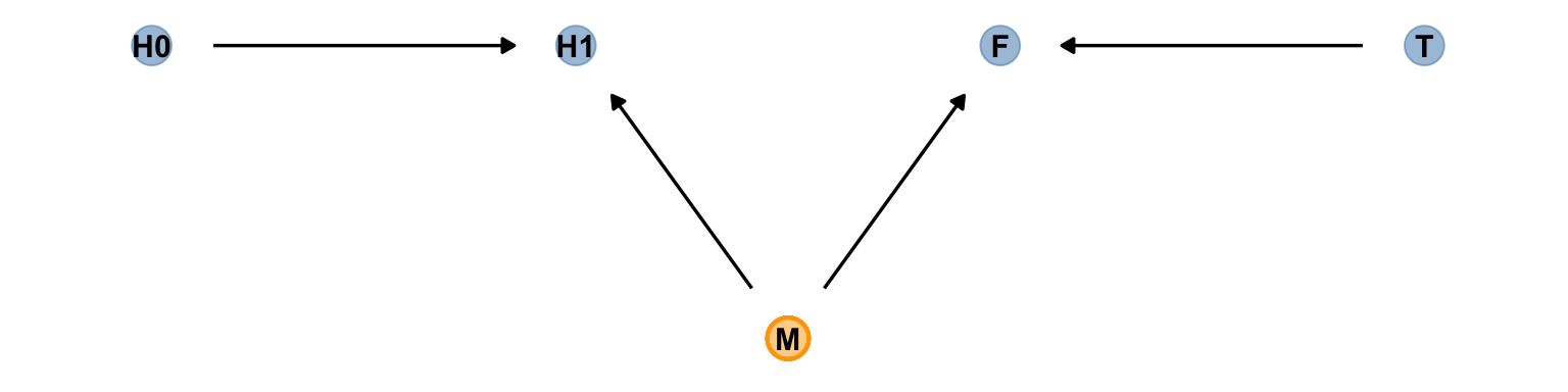
圖 49.8: The other DAG of the fungus and treatment effect on the grow of plant.
set.seed(71)
N <- 1000
h0 <- rnorm(N, 10, 2)
treatment <- rep(0:1, each = N/2)
M <- rbern(N)
fungus <- rbinom( N, size = 1, prob = 0.5 - treatment * 0.5 + 0.4 * M)
h1 <- h0 + rnorm( N, 5 + 3 * M)
d2 <- data.frame( h0 = h0, h1 = h1, treatment = treatment, fungus = fungus)
precis(d2)
## mean sd 5.5% 94.5% histogram
## h0 10.123143 1.99233421 6.9383408 13.428682 ▁▁▂▂▅▇▇▅▃▂▁▁▁▁
## h1 16.627464 2.64352784 12.3803465 20.692560 ▁▁▃▇▇▇▂▁▁
## treatment 0.500000 0.50025019 0.0000000 1.000000 ▇▁▁▁▁▁▁▁▁▇
## fungus 0.461000 0.49872610 0.0000000 1.000000 ▇▁▁▁▁▁▁▁▁▇# incorrectly included fugus
m6.7 <- quap(
alist(
h1 ~ dnorm(mu, sigma),
mu <- h0 * p ,
p <- a + bt * treatment + bf * fungus,
a ~ dlnorm( 0, 0.2 ),
bt ~ dnorm(0, 0.5),
bf ~ dnorm(0, 0.5),
sigma ~ dexp(1)
), data = d2
)
precis(m6.7)## mean sd 5.5% 94.5%
## a 1.510467260 0.014175421 1.487812200 1.53312232
## bt 0.066780015 0.015124908 0.042607491 0.09095254
## bf 0.160977251 0.015183925 0.136710406 0.18524410
## sigma 2.109488131 0.047098656 2.034215382 2.18476088# the correct model to see the treatment effect
m6.8 <- quap(
alist(
h1 ~ dnorm(mu, sigma),
mu <- h0 * p,
p <- a + bt * treatment,
a ~ dlnorm(0, 0.25),
bt ~ dnorm(0, 0.5),
sigma ~ dexp(1)
), data = d2
)
precis(m6.8)## mean sd 5.5% 94.5%
## a 1.625584183 0.009623561 1.61020387 1.6409644919
## bt -0.016667949 0.013620282 -0.03843579 0.0050998921
## sigma 2.222813048 0.049621079 2.14350898 2.3021171159此時你發現加入 fungus 變量依然對正確的對斷造成了干擾。使得本來不應該出現的治療效果似乎突然成了有效的促進植物生長的治療。
49.3 對撞因子偏倚 collider bias
使用本章節開頭的申請研究經費的例子,我們認為研究的可靠性 (Trustworthiness, T),和新穎程度 (Newsworthiness, N) 之間是無關聯性的(圖 49.1)。但是,他們二者都會對是否該科研項目被選中 (Selected, S) 造成影響。這樣的關係可以使用下面的 DAG 來表達:
grant_dag <- dagitty("dag{
      T -> S
      N -> S
}")
coordinates( grant_dag ) <- list(x = c(T = 0.5, S = 1, N = 1.5),
                                 y = c(T = 0, S = 0, N = 0))
drawdag(grant_dag)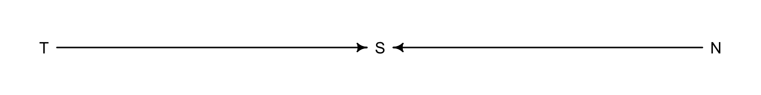
圖 49.9: The DAG of the grant selection problem: two unrelated variables (T and N) influence S, a collider example.
對撞因子偏倚的現象很有趣,當上述模型中加入對撞因子 S,就會在統計學上給出影響該對撞因子的變量之間的錯誤的關聯性,這裡就是本不該有關聯的 N 和 T 之間會出現統計學上的關聯性。因為,從邏輯上來說,當你知道了某個項目被選中了,也就是圖 49.1 中藍色的部分,那麼本來不相關的兩個變量之間就存在了互相可以預測的掛係,即,如果此時你又對該科研項目的可信度或者是新穎度之一有所了解的話,你就可以大致猜測它的新穎度或者是可信度。也就是說,在這些被選中接受科研經費贊助的藍色項目中,如果你知道某項目的新穎程度很高很高,那麼你大概可以認為它給出的科研成果的可信度會比較低。同樣的,如果你知道某個科研項目並不是特別新穎的內容,但是它既然被選中了,這就說明該項目本身將會給出的科研成果會是十分令人信服的。
49.3.1 虛假的傷心對撞因子 collider of false sorrow
思考年齡和信服感之間的關係。年齡是否會和幸福感有關係呢?如果有關係,他們之間的關係能算作是因果關係嗎?這裡我們大膽假定每個人出生時幸福感就已被定格,不會隨著年齡而變化。我們已知幸福感會影響一個人是否結婚的概率,大概天天比較樂觀開心表現的有幸福感的人,結婚的概率也相對高一些。另一個可能影響結婚與否的變量一般認為是年齡。很顯然,存活的時間越長,越有機會結婚。這三者之間的關係類似地也可以表達成為 DAG 因果關係圖:
marriage_dag <- dagitty("dag{
      H -> M
      A -> M
}")
coordinates( marriage_dag ) <- list(x = c(H = 0.5, M = 1, A = 1.5),
                                 y = c(H = 0, M = 0, A = 0))
drawdag(marriage_dag)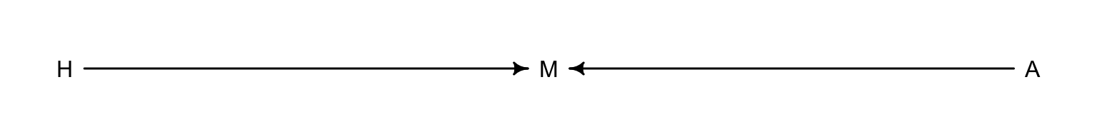
圖 49.10: The DAG of the happiniess problem: two unrelated variables (H and A) influence marriage.
根據我們理解的理論,年齡和幸福感各自都會影響結婚與否。結婚這個變量就是一個對撞因子 (collider)。即使我們知道年齡和幸福感之間不應該存在直接的關係,但是假如我們有一個模型,結果變量是幸福感,預測變量是年齡(或者反過來)的話,在預測變量裡增加結婚這個變量會導致本來沒有關係的二者變得有“統計學關係”。這就顯然會誤導我們認為年齡增加和幸福感的增加或者減少是有關聯的(而事實上應該是無關的)。
我們用一個較為極端的例子來做一次計算機模擬:
- 每年有20名實驗對象出生,且他們擁有符合均一分佈特徵的幸福感。
- 每年,實驗對象年齡自然會增加一歲。然而幸福感並不會因年齡的增加而增加或減少。
- 當實驗對象18歲時,有些人會結婚。結婚本身的比值 (odds) 則於該實驗對象的幸福感成一定的比例關係 (proportional)。
- 當一名實驗對象結婚了以後,她/他保持結婚的狀態,不會離婚。
- 年齡到65歲之後,該實驗對象離開本次研究。
##                    mean         sd       5.5%      94.5%     histogram
## age       3.3000000e+01 18.7688832  4.0000000 62.0000000 ▇▇▇▇▇▇▇▇▇▇▇▇▇
## married   3.0076923e-01  0.4587690  0.0000000  1.0000000    ▇▁▁▁▁▁▁▁▁▃
## happiness 6.8321417e-19  1.2144211 -1.7894737  1.7894737      ▇▅▇▅▅▇▅▇
這個實驗性的計算機模擬數據本身包含了0-65歲的1300名實驗對象的幸福感和結婚與否的數據。
d %>%
  mutate(married = factor(married,
                          labels = c("unmarried", "married"))) %>%

  ggplot(aes(x = age, y = happiness)) +
  geom_point(aes(color = married), size = 1.75) +
  scale_color_manual(NULL, values = c("grey85", "forestgreen")) +
  scale_x_continuous(expand = c(.015, .015)) +
  theme(panel.grid = element_blank())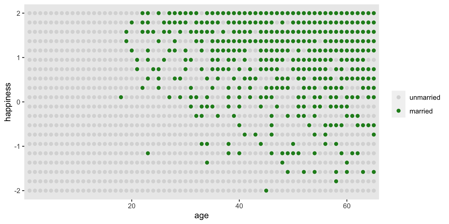
圖 49.11: Simulated data, assuming that happiness is uniformly distributed and never changes. Each point is a person. Married individuals are shown with filled blue points. At each age after 18, the happiest individuals are more likely to be married. At later ages, more individuals tend to be married. Marriage status is a collider of age and happiness: A -> M <- H. If we condition on marriage in a regression, it will mislead us to believe that happiness declines with age.
這時,我們希望用這個數據來回答:“年齡是否和幸福感有關係?”這樣的問題。假設你不知道我們在生成這組數據時遵循的上述 1 - 5 條原則。所以你在建立模型的時候很可能自然而然的認為婚姻本身是年齡和幸福感之間關係的混雜因子。也就是你大概會認為結婚的人莫名其妙地就應該比相對更加(不)幸福。這樣的模型應該是這樣子的;
\[ \mu_i = \alpha_{\text{MID}[i]} + \beta_A A_i \]
其中,
- \(\text{MID}[i]\) 是實驗對象 \(i\) 是否已經結婚的索引變量 (index variable),當它等於1時表示單身,等於2時表示已婚。
- 這其實是我們人為地給已婚者和單身者的幸福感和年齡之間關係的直線設定了各自的截距。
這時,由於18歲以後才可以結婚,我們把該數據的人口年齡限定在18歲及以上者。另外我們再把年齡的尺度縮放一下使得 18-65 歲之間的比例是1:
經過上述的數據處理,我們使得年齡變量 A 的範圍控制在 0-1 之間,其中 0 代表 18 歲,1 代表 65 歲。幸福感則是一個範圍在 -2, 2 之間的數值。這樣的話,假定年齡和幸福感之間呈現的是極其強烈的正關係,那麼這最極端的斜率也就是 \((2 - (-2)) / 1 = 4\)。所以,一個較為合理的斜率的先驗概率分佈,可以是95%的斜率取值分佈在小於極端斜率之內的範圍。其次是為截距 \(\alpha\) 設定合理的先驗概率分佈。因為 \(\alpha\) 本身是年齡等於零,也就是18歲時的幸福感,我們需要這個數據能夠覆蓋所有可能的幸福感取值,-2,2 之間。那麼,標準正(常)態分佈是一個不錯的選擇。
d2$mid <- d2$married + 1 # construct the marriage status index variable
m6.9 <- quap(
  alist(
    happiness ~ dnorm(mu, sigma),
    mu <- a[mid] + bA * A,
    a[mid] ~ dnorm(0, 1),
    bA ~ dnorm(0, 2),
    sigma ~ dexp(1)
  ), data = d2
)
precis(m6.9, depth = 2)
## mean sd 5.5% 94.5%
## a[1] -0.23508769 0.063489864 -0.33655675 -0.13361862
## a[2] 1.25855173 0.084959885 1.12276943 1.39433404
## bA -0.74902744 0.113201124 -0.92994470 -0.56811018
## sigma 0.98970796 0.022557999 0.95365592 1.02576000看,這個模型似乎很確定,年齡和幸福感是呈現負關係的。對比一下沒有假如婚姻狀態的變量的模型給出的估計結果:
m6.10 <- quap(
  alist(
    happiness ~ dnorm(mu, sigma),
    mu <- a + bA * A,
    a ~ dnorm( 0, 1 ),
    bA ~ dnorm(0, 2),
    sigma ~ dexp(1)
  ), data = d2
)
precis(m6.10)
## mean sd 5.5% 94.5%
## a 1.7251672e-07 0.076750151 -0.12266139 0.12266174
## bA -2.9070804e-07 0.132259761 -0.21137693 0.21137635
## sigma 1.2131876e+00 0.027660803 1.16898031 1.25739492m6.10 才是正確的模型。它正確的給出了年齡和幸福感之間並無關係的結果。模型 m6.9 錯誤地把對撞因子 – 婚姻狀況作為預測變量之一加入了模型中,而婚姻狀況在這個數據背景下,同時是年齡和幸福感的結果(common consequence of age and happiness)。結果就會像 m6.9 那樣,出現年齡和幸福感之間虛假的負關係 (false negative association between the two causes)。m6.9 告訴我們看起來似乎年齡的增長和幸福感呈現負關係,這種僅僅在模型中給出的變量之間的關係應該嚴格來說只能算是一種“統計學的關係 (statistical association)”,不能算是真實的因果關係 (causal association)。正如圖 49.11 所顯示的。當已知實驗對象是已婚或者未婚,實驗對象的年齡似乎能告訴我們他/她的幸福度。看綠色點的部分,這些人都是已婚者,年齡越大,越多人結婚,那麼這個已婚人群的幸福度數值就會平均被拉低。相似的,看空白點的部分,這些人都是未婚者,年齡越大,其中幸福感較強的人都結婚而加入了已婚人群陣營,那麼剩下的人就會感覺幸福度越來越低。所以,當把人群分成未婚和已婚兩個部分的話,這兩個人群中的幸福度都隨著年齡增加而呈現下降趨勢。但是,我們知道,這並不是真實的因果關係。
碰撞因子偏倚本身會出現在當模型中的預測變量加入了某個同時是結果和某一個預測變量的結果的變量(common consequence)。
49.3.2 對撞因子偏倚另一實例(未測量變量造成的碰撞偏倚)
當我們知道並了解了這樣的對撞因子偏倚現象之後,DAG圖非常有助於幫助我們避免陷入這樣的困境。但是,最可怕的其實是未知(未測量)變量可能造成的對撞偏倚。
假設我們想通過數據了解父母親的受教育程度 (P),祖父母的受教育程度 (G),和子女的學習成績 (C),之間的關係,特別是 P, G 對 C 可能的貢獻或者影響。我們很容易就能理解圖 49.12 中所表示的這三個變量之間應該存在的相互因果關係。祖父母的受教育程度很顯然也會對子女的學習成績造成影響 (\(G \rightarrow C\))。
dag6.3.2 <- dagitty( "dag{ G -> P; P -> C; G -> C }" )
coordinates(dag6.3.2) <- list( x=c(G=0,P=1,C=1) , y=c(G=0,P=0,C=1) )
drawdag( dag6.3.2 )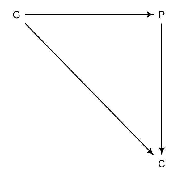
圖 49.12: Educational achievements between parents (P), grandparents (G), and children (C).
如果此時我們發現,可能有一個未被測量的變量可能同時影響父母 (P),和子女 (C),但是對祖父母的教育程度並無直接影響,例如父母和子女生活的社區的環境 (U),通常祖父母不一定和子女和孫輩生活在一個社區。那麼這個未觀察的社區變量就很可能會造成一個碰撞偏倚:
dag6.3.2_u <- dagitty( "dag{ G -> P; P -> C; G -> C ; U -> P ; U -> C U [unobserved]}" )
coordinates(dag6.3.2_u) <- list( x=c(G=0,P=1,C=1,U=1.3) , y=c(G=0,P=0,C=1,U=0.5) )
drawdag( dag6.3.2_u )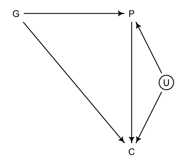
圖 49.13: Educational achievements between parents (P), grandparents (G), and children (C), with an unobserved neighborhood variable (U).
如果因果關係 49.13 成立的話,那麼 P 就是 G 和 U 之間的對撞因子。如果此時我們建立 \(G \rightarrow C\) 模型時把 \(P\) 加入預測變量中,即便我們並沒有測量這個 U 變量,對撞因子偏倚也變得不可避免。
我們實際使用計算機模擬來理解這一過程。數據模擬符合下列條件
- P 是 G, U 共同影響的結果 (common consequence)。
- C 則是 G, U, P 三者共同預測的結果。
- G 和 U 不受任一變量的影響(完全獨立)。
N <- 200  # number of grandparent-parent-child traids
b_GP <- 1 # direct effect of G on P
b_GC <- 0 # direct effect of G on C
b_PC <- 1 # direct effect of P on C
b_U <- 2  # direct effect of U on P and C
上面的模擬參數其實類似於回歸模型中的回歸係數。注意到我們假設祖父母對孫輩學習成績的影響是 0。接下來我們用這些回歸係數來採集一些符合上述設定的隨機樣本數據:
set.seed(1)
U <- 2 * rbern( N, 0.5 ) - 1
G <- rnorm( N )
P <- rnorm( N, b_GP * G + b_U * U)
C <- rnorm( N, b_PC * P + b_GC * G + b_U * U )
d <- data.frame(C = C, P = P, G = G, U = U)
那麼,該怎樣設定一個模型來分析祖父母對孫輩學習成績的影響呢?我們認為祖父母的教育程度會通過父母親這條通路,影響到子女的學習成績,所以模型中應該要控制 P。那麼下面的代碼建立的是一個簡單的線性回歸模型,結果變量是 C,預測變量是 P 和 G,注意這裡我們假裝沒有測量到,也不知道 U 變量的存在:
m6.11 <- quap(
  alist(
    C ~ dnorm( mu, sigma ),
    mu <- a + b_PC * P + b_GC * G,
    a ~ dnorm(0, 1),
    c(b_PC, b_GC) ~ dnorm(0, 1),
    sigma ~ dexp(1)
  ), data = d
)

precis(m6.11)
## mean sd 5.5% 94.5%
## a -0.11747518 0.099195743 -0.27600914 0.041058772
## b_PC 1.78689146 0.044553553 1.71568628 1.858096644
## b_GC -0.83895371 0.106140454 -1.00858666 -0.669320768
## sigma 1.40948908 0.070111393 1.29743753 1.521540626看模型 m6.11 給出的父母子女的學習成績的影響是多麼的顯著。甚至比我們設定的關係還要大兩倍。這並不奇怪,因為這裡給出的一部分 \(P \rightarrow C\) 的關係應該歸功於 \(U\),但是該模型本身不知道 \(U\) 的存在。但是更令人感到驚訝的是,本來設定的祖父母不影響子女學習成績的關係在這個模型中變得顯著呈現負相關,這是有悖常識的。再怎麼說祖父母的受教育程度越高也不能給子女的學習成績帶來負面的影響才是。這個數學模型本身並沒有錯,但是它不能被賦予一個因果關係的解釋。這裏的對撞因子偏倚是如何形成的呢?
d$G_st <- standardize(d$G)
d$C_st <- standardize(d$C)
d$P_st <- standardize(d$P)
P_45 <- quantile(d$P_st, prob = .45)
P_60 <- quantile(d$P_st, prob = .60)

with(d, plot(G_st[(P_st < P_45 | P_st > P_60) & U == -1],
             C_st[(P_st < P_45 | P_st > P_60) & U == -1],
             col = c("black"),
             xlim = c(-3,3), ylim = c(-2.5, 2.3),
             bty="n",
             main = "Parents in 45th to 60th centiles",
             xlab = "grandparent education (G)",
             ylab = "grandchild education (C)"))
with(d, points(G_st[(P_st >= P_45 & P_st <= P_60) & U == -1],
               C_st[(P_st >= P_45 & P_st <= P_60) & U == -1],
               col = c("black"),
               pch = 16))
with(d, points(G_st[(P_st < P_45 | P_st > P_60) & U == 1],
               C_st[(P_st < P_45 | P_st > P_60) & U == 1],
               col = rangi2))
with(d, points(G_st[(P_st >= P_45 & P_st <= P_60) & U == 1],
               C_st[(P_st >= P_45 & P_st <= P_60) & U == 1],
               col = rangi2,
               pch = 16))
with(d, abline(lm(C_st[(P_st >= P_45 & P_st <= P_60)] ~
                    G_st[(P_st >= P_45 & P_st <= P_60)]),
       lty = 2, lwd = 1, col = c("blue")))
text(-1.5, 2.1, "Good neighborhoods", col = rangi2)
text(0.5, -2.1, "Bad neighborhoods")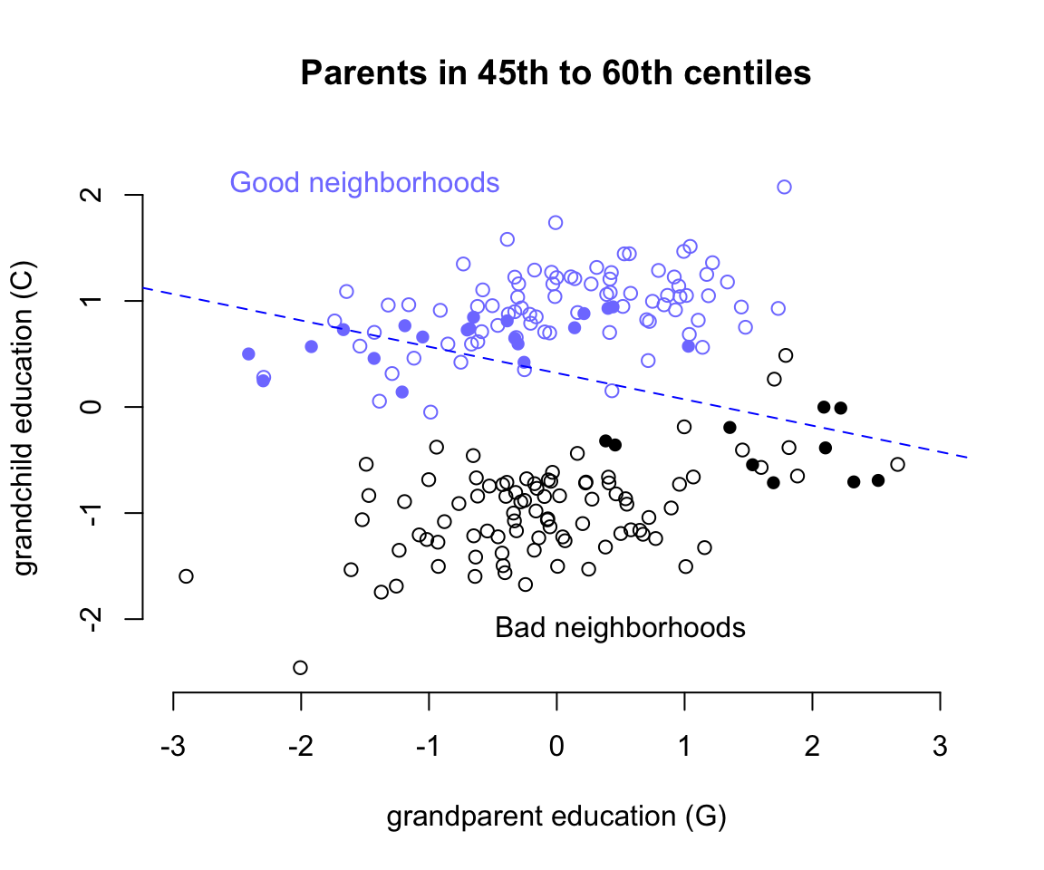
圖 49.14: Unobserved confounds and collider bias. In this example, grandparents influence grandkids only indirectly, through parents. However, unobserved neighborhood effects on parents and their children create the illusion that grand parents harm their grandkids education. Parental education is a collider: once we condition on it, grandparental education becomes negatively associated with grand child education.
繪製祖父母教育水平和子女學習成績之間的散點圖如圖 49.14 所示,橫軸是祖父母的受教育水平,縱軸是子女的學習成績。其中根據未知的變量 U ,也就是子女和父母生活的社區環境的優越與否分成了藍色和黑色兩個部分的散點雲。可以看見不論是在優越街區 (U = 1) 還是在較差的街區 (U = 2),祖父母的教育水平應該都和子女的學習成績成正相關才對。但是這一關係在我們模擬的數據中是100%通過父母親的受教育水平來體現的,因為我們一開始強制 b_GC <- 0 # direct effect of G on C,也就是 G 直接對 C 的影響的理論值是零。當模型中的預測變量加入了對撞因子,父母親的受教育水平 P 這一變量之後,我們相當於是在強制比較父母受相似教育水平的孩子之間的學習成績。如圖 49.14 中藍色和黑色實心點的部分兒童。當僅使用這些點來做回歸直線時,給出的回歸係數就是負的。這就是模型 m6.11 給出的 b_GC = -0.84 這樣的負數的回歸係屬估計的原因。之所以會出現這樣有趣的對撞因子偏倚,我們可以這樣認為:當我們已知父母親的受教育水平 P 之後,如果再了解了祖父母的受教育水平 G,等於是間接知道了子女和父母生活的街區 (U) 的一部分信息。這裡反覆需要強調的是,街區這一變量是未知未測的變量。所以,假如我們選出兩個小孩,他們的父母親有相似的受教育程度,其中一個的祖父母受教育程度低,在圖49.14的藍色區域,另一個小孩的祖父母受教育程度較高,在圖49.14的黑色區域。那麼之所以這兩個小孩的父母親受教育水平相似,只能是被不同的生活街區所影響(但是這個變量其實是未觀測變量)。所以這時候孩子之間的成績差異其實並非是由祖父母造成的,而是間接地被未知的變量 - 生活街區的優越與否給影響了的。所以我們會看見這樣神奇的現象,也就是父母親相似的教育水平時,如果祖父母受教育水平高,則他們大多生活在不怎麼樣的街區,從而間接導致了小孩學習成績不佳。看起來似乎是祖父母的受教育水平反而對子女學習成績造成了負影響一樣。
這裡,未測量的街區這一變量使得父母親受教育程度這一變量變成了對撞因子,解決對撞因子偏倚的方法其實是,認識到有未測量變量的存在,然後去獲取該變量,加入到你的模型中去:
m6.12 <- quap(
  alist(
    C ~ dnorm( mu, sigma ),
    mu <- a + b_PC * P + b_GC * G + b_U * U,
    a ~ dnorm(0, 1),
    c(b_PC, b_GC, b_U) ~ dnorm(0, 1),
    sigma ~ dexp(1)
  ), data = d
)

precis(m6.12)
## mean sd 5.5% 94.5%
## a -0.121992141 0.071924341 -0.23694113 -0.0070431518
## b_PC 1.011376124 0.065970755 0.90594212 1.1168101310
## b_GC -0.040922712 0.097285255 -0.19640334 0.1145579143
## b_U 1.996291887 0.147702000 1.76023556 2.2323482096
## sigma 1.019577262 0.050799108 0.93839048 1.1007640480這樣子模型 m6.12 就能準確地給出我們模擬他們的關係的回歸係數。
49.4 直面混雜效應
49.4.1 兩條通路
dag_6.1 <- dagitty("dag{
                   U [unobserved]
                   X -> Y
                   X <- U <- A -> C -> Y
                   U -> B <- C
}")
coordinates(dag_6.1) <- list( x=c(X = 0, Y = 1, U = 0,
                                  A = 0.5, B = 0.5, C = 1),
                              y=c(X = 0, Y = 0, U = -1,
                                  A = -1.3, B = -0.7, C = -1) )
drawdag(dag_6.1)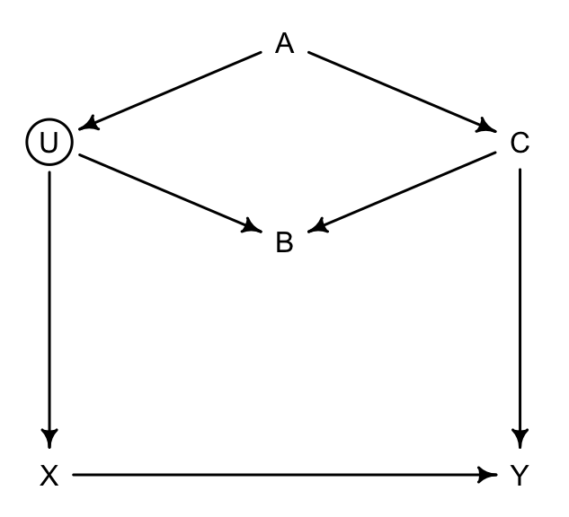
圖 49.15: Two roads DAG. Exposure of interest X, outcome of interest Y, an unbserved variable U, and three observed covariates (A, B, and C)
我們主要關心的是 \(X \rightarrow Y\) 之間的通路,也就是暴露和結果之間的直接因果關係。那在圖 49.15 這一DAG因果關係中的各種變量之間,你應該怎樣選擇加入模型中作為協變量(調整變量)呢?我們尋找一下從起點(暴露變量)到終點(結果變量)之間的所有可行通路:
- \(X \leftarrow U \leftarrow A \rightarrow C \rightarrow Y\)
- \(X \leftarrow U \rightarrow B \leftarrow C \rightarrow Y\)
- \(X \rightarrow Y\)
其中 1. 2. 都含有後門通路 (backdoor paths),這兩條通路都可能導致我們的推斷受混雜的影響。我們需要通過數學模型把可能存在的後門通路關閉。如果說某個後門通路已經被關閉了,我們則需要小心不要不經意把不該加入模型中的變量給加入然後導致其被偷偷打開。
我們看通路 1.,這條通路通過 \(A\),且沒有任何對撞因子,所以這條通路需要通過調整其變量關閉之,但是 \(U\) 是未知未測量變量,無法控制,那我們只好退而求其次,調整 \(A\) 或者 \(C\):
## { C }
## { A }
如果能調整 \(U\) 當然最好,但是它是未測量的變量。\(A\) 或者 \(C\) 二選一的話,選擇 \(C\) 會是更加理想的選擇, 因為它應該同時還能提高對 \(X\rightarrow Y\) 因果關係測量的精確度(increase precision)。
再思考通路 2.,這條通路經過 \(B\),且這個 \(B\) 很顯然是一個對撞因子。也就是說這裡的通路已經被這個對撞因子關閉掉了。所以你看計算機也並未建議調整這條通路上的變量。如果有誰不小心把這裡的 \(B\) 控制進去的話,反而會打開這條通路,造成對撞因子偏倚。於是我們應該記住這樣一個經驗教訓,在你的模型中假如增加了一個變量導致 \(X\rightarrow Y\)的關係發生了較為顯著的變化,甚至反轉關係,並不一定意味著這個增加的變量提升了你模型的準確度或者是改善了模型的預測能力,而要時時刻刻當心對撞因子偏倚存在的可能性。
49.4.2 華夫餅的後門
回到華夫餅店鋪數量這個數據 (Chapter 48.1) 上來。我們來為這個數據繪製一個 DAG 因果關係圖。我們關心的暴露變量是每個州的瓦夫餅餐廳數量,和結果變量 – 離婚率之間的總體因果關係:
dag_6.2 <- dagitty("dag{
                   A -> D
                   A -> M -> D
                   A <- S -> M
                   S -> W -> D
}")
coordinates(dag_6.2) <- list( x=c(A = 0, D = 1, M = 0.5,
                                  S = 0, W = 1),
                              y=c(A = 0, D = 0, M = -0.5,
                                  S = -1, W = -1))
drawdag(dag_6.2)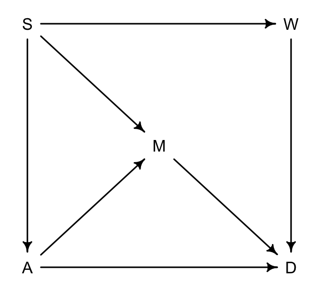
圖 49.16: The waffle backdoor DAG.
圖 49.16 中,
- S 是所在州是否屬於南方州;
- A 是所在州的結婚年齡中位數;
- M 是所在州的結婚率;
- W 是所在州的瓦夫餅餐廳數量;
- D 是所在州的離婚率。
上述DAG的涵義在於:
- 南方州的話,結婚年齡中位數較低 \(S \rightarrow A\);
- 南方州的話,結婚率較高 \(S \rightarrow M\);
- 上述 \(S \rightarrow M\) 的關係同時還經過 \(A\),也就是 \(S \rightarrow A \rightarrow M\);
- 南方州的華夫餅餐廳數量較多 \(S \rightarrow W\);
- 年齡中位數 \(A\),結婚率 \(M\),還有華夫餅餐廳數量 \(W\) 都直接影響離婚率,\(A\rightarrow D; M\rightarrow D; W \rightarrow D\)。
如果把暴露變量 \(W\) 作為通路起點,離婚率 \(D\) 作為通路通路終點的話,有三條有後門的通路:
- \(W \leftarrow S \rightarrow A \rightarrow D\)
- \(W \leftarrow S \rightarrow M \rightarrow D\)
- \(W \leftarrow S \rightarrow A \rightarrow M \rightarrow D\)
你會發現他們的共同點是都經過 \(S\)。所以很簡單地,只要控制了 \(S\),那麼全部三條後門通路就都會被關閉。
## { A, M }
## { S }
計算機也告訴我們一致的答案,但是除了單獨控制 \(S\),我們還可以選擇同時控制 \(A, M\),來關閉這些後門通路。上述DAG因果關係圖中,所蘊含的條件獨立性關係為:
## A _||_ W | S
## D _||_ S | A, M, W
## M _||_ W | S
分別表示,
- 當控制了是否是南方州(\(S\))之後,華夫餅餐廳\(W\) 和結婚年齡中位數 \(A\) 之間相互獨立。
- 當同時控制了\(A\),\(M\),\(W\)之後,\(S\) 和離婚率之間相互獨立。
- 當控制了 \(S\) 之後,\(W\) 和 結婚率 \(M\) 之間相互獨立。