第 56 章 貝葉斯多層回歸模型2 隨機斜率模型 multilevel models – varying slopes models
- We are always forced to analyze data with a model that is MISSPECIFIED: the true data-generating process is different than the model.
- Richard McElreath
56.1 模擬隨機斜率數據
前一章節中,我們使用咖啡店機器人記錄每次進入一家咖啡館,然後點咖啡到拿到咖啡的等待時間。我們從隨機截距模型中認識到,當我們把咖啡店之間人爲存在關聯性的情況下,機器人對於這樣一個實驗的學習過程更加高效且準確。假設我們第二次進行相似的實驗,並且讓機器人同時記錄該次點餐行爲是發生在上午或者下午時段。 先定義機器人可能造訪的咖啡數據人羣 (population of cafes)。我們需要定義的有早晨和下午的平均等待時間 (average wait time),還有二者之間的相關係數 (correlation coefficient)。先在 R 裏面定義這幾個關鍵的參數,然後從中採集咖啡店樣本:
a <- 3.5                # average morning wait time
b <- (-1)               # average difference afternoon wait time
sigma_a <- 1            # standard dev in intercepts
sigma_b <- 0.5          # standard dev in slopes
rho <- (-0.7)           # correlation between intercepts and slopes
使用上述的參數來模擬咖啡店數據的時候,需要把他們中的一部分整理成一個 \(2\times2\) 的2維多項式高斯分佈的方差協方差矩陣。二維高斯分佈的均值就是很簡單的向量:
方差協方差矩陣應該表達成的數學形式是:
\[ \begin{pmatrix} \text{variance of intercepts} & \text{covariance of intercepts & slopes} \\ \text{covariance of intercepts & slopes} & \text{variance of slopes} \\ \end{pmatrix} \]
簡單地說就是:
\[ \begin{pmatrix} \sigma_\alpha^2 & \sigma_\alpha\sigma_\beta\rho \\ \sigma_\alpha\sigma_\beta\rho & \sigma_\beta^2 \end{pmatrix} \]
處於該方差協方差矩陣的對角線上的分別是,隨機截距的方差 \(\sigma^2_\alpha\),和隨機斜率的方差 \(\sigma^2_\beta\)。剩下的兩個就是相同的 \(\sigma_\alpha\sigma_\beta\rho\) 部分,它是斜率和截距之間的協方差。協方差僅僅是二者的標準差乘積乘以二者之間的相關係數。
在 R 裏書寫或者計算這個方差協方差矩陣的方法最簡單的是:
cov_ab <- sigma_a * sigma_b * rho
Sigma <- matrix( c(sigma_a^2, cov_ab, cov_ab, sigma_b^2), ncol = 2 )
Sigma
## [,1] [,2]
## [1,] 1.00 -0.35
## [2,] -0.35 0.25另一種常見的方法是:
sigmas <- c(sigma_a, sigma_b) # standard deviations
Rho <- matrix( c(1, rho, rho, 1) , nrow = 2 ) # correlation matrix

# Now matrix multiply to get covariance matrix

Sigma <- diag(sigmas) %*% Rho %*% diag(sigmas)
Sigma
## [,1] [,2]
## [1,] 1.00 -0.35
## [2,] -0.35 0.25第二種方法看起來稍微複雜些,但是有助於理解我們在貝葉斯模型中對這些參數設定先驗概率分佈的方法。
接下來我們可以開始採集咖啡店數據樣本了。假設我們只想要採集20家咖啡店的等待數據,那麼先定義:
讓計算機模擬這20家咖啡店的等待時間數據,我們需要做的就是指定它們之間的關係,也就是使用上面定義好的斜率,截距之間的二維高斯分佈矩陣:
現在看看我們採集的這個20家咖啡的樣本數據 vary_effect ,它現在應該是一個有 20 行 2 列的矩陣:
##            [,1]        [,2]
##  [1,] 4.2239624 -1.60935645
##  [2,] 2.0104980 -0.75177037
##  [3,] 4.5658109 -1.94826458
##  [4,] 3.3436353 -1.19265388
##  [5,] 1.7009705 -0.58556181
##  [6,] 4.1343727 -1.14445388
##  [7,] 3.7944692 -1.62646613
##  [8,] 3.9465976 -1.71527939
##  [9,] 3.8642671 -0.90716770
## [10,] 3.4676137 -0.68040541
## [11,] 2.2428755 -0.61815155
## [12,] 4.1595055 -1.65921204
## [13,] 4.3002830 -2.11254740
## [14,] 3.5069480 -1.44064299
## [15,] 4.3820864 -1.87989834
## [16,] 3.5211329 -1.35069860
## [17,] 4.2167127 -0.91927985
## [18,] 5.9130025 -1.23136238
## [19,] 3.4773057 -0.35703411
## [20,] 3.7748988 -1.05704571
每一行就是一家咖啡店的數據。第一列是截距,第二列是斜率。我們來把他們各自提取出來命名:
下面的代碼把上面採集的截距和斜率數據之間的關係繪製成帶有橢圓形二維高斯分佈的散點關係圖:
plot( a_cafe, b_cafe, col = rangi2,
      xlab = "intercepts (a_cafe)",
      ylab = "slopes (b_cafe)")

# overlay population distribution

# library(ellipse)
for ( l in c(0.1, 0.3, 0.5, 0.8, 0.99) )
  lines(ellipse::ellipse(Sigma, centre = Mu, level = l), col = col.alpha('black', 0.2))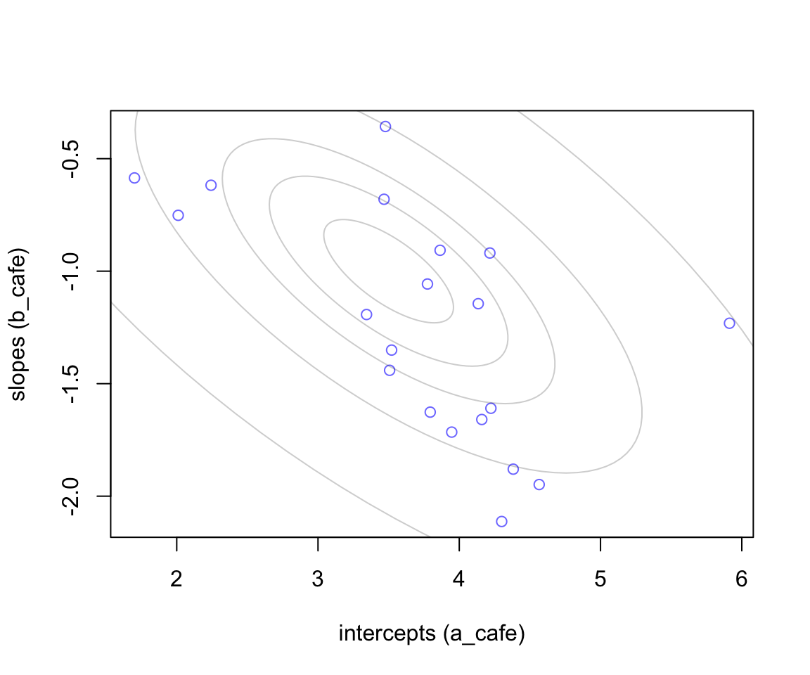
圖 56.1: 20 cafes sampled from a statistial population. The horizontal axis is the intercept (average morning wait) for each cafe. The vertical axis is the slope (average difference between afternnon and morning wait) for each cafe. The gray ellipses illustrate the multivariate Gaussian population of intercepts and slopes.
56.1.1 模擬觀察值 simulate observations
上文中的 vary_effects 模擬的是20家餐廳的特徵值(也就是參數),並非實際上午/下午等待時間的觀察值。接下來我們可以模擬採集每家咖啡店的等待時間了。我們假設派機器人去每家餐廳十次,5次上午,5次下午,記錄每次的點餐等待時間,一共200次的觀察結果:
set.seed(22)
N_visits <- 10

afternoon <- rep(0:1, N_visits * N_cafes / 2)

cafe_id <- rep( 1:N_cafes, each = N_visits )

mu <- a_cafe[cafe_id] + b_cafe[cafe_id] * afternoon
sigma <- 0.5 # std dev within cafes

wait <- rnorm( N_visits*N_cafes, mu, sigma )

d <- data.frame( cafe = cafe_id, afternoon = afternoon, wait = wait)
這時候我們可以看看剛剛設計好的 d 裏面的模擬數據實際是什麼樣的。它就是一個典型的具有多層結構的數據。該數據展示了每家咖啡店上午下午各自的等待時間的10次觀察值。在這個例子中,沒有缺失值,數據 d 的每一家咖啡店都有5次早上的等待時間,5次下午等待的時間。但是實際情況下並不一定要這樣完美的平衡數據 (balanced data)。因爲多層模型可以克服不平衡數據之間信息不均衡的問題。觀察值數量少的分層,可以從觀察值數量多的分層中獲取需要的信息。
##    cafe afternoon       wait
## 1     1         0 3.96789287
## 2     1         1 3.85719780
## 3     1         0 4.72787549
## 4     1         1 2.76101325
## 5     1         0 4.11948274
## 6     1         1 3.54365216
## 7     1         0 4.19094922
## 8     1         1 2.53322349
## 9     1         0 4.12403208
## 10    1         1 2.76488683
## 11    2         0 1.62854439
## 12    2         1 1.29970861
## 13    2         0 2.38201217
## 14    2         1 1.21671656
## 15    2         0 1.61405077
## 16    2         1 0.79765084
## 17    2         0 2.44127922
## 18    2         1 2.26019875
## 19    2         0 2.47877354
## 20    2         1 0.45086022
56.1.2 隨機斜率模型 the varying slopes model
接下來我們可以進入建立模型的階段了。前一小節的過程是,我們使用計算機隨機生成了20家咖啡廳的點餐等待時間數據,這些咖啡廳本身來自一個符合某種特徵的咖啡廳羣體 (population),這裏我們使用該數據來進一步鞏固我們對前一小節中數據產生過程的理解。
這裏的數據除了有隨機的截距,還有加入每個咖啡廳等待時間的隨機斜率,模型可以用數學表達式描述成爲:
\[ \begin{aligned} W_i & \sim \text{Normal}(\mu_i, \sigma) & \text{[likelihood]} \\ \mu_i & = \alpha_{\text{CAFE}[i]} + \beta_{\text{CAFE}[i]} A_i & \text{[linear model]} \end{aligned} \]
特別地,我們可以描述隨機截距和隨機斜率之間的協方差矩陣 (covariance matrix) 成爲:
\[ \begin{aligned} \left[ \begin{array}{c} \alpha_{\text{CAFE}[i]} \\ \beta_{\text{CAFE}[i]} \end{array} \right] & \sim \text{MVNormal}\left( \left[ \begin{array}{c} \alpha \\ \beta \end{array} \right], \textbf{S} \right) & \text{[population of varying effects]} \\ \textbf{S} & = \left( \begin{array}{cc} \sigma_\alpha & 0\\ 0 & \sigma_\beta \end{array} \right) \textbf{R} \left( \begin{array}{cc} \sigma_\alpha & 0\\ 0 & \sigma_\beta \end{array} \right) & \text{[construct covariance matrix]} \end{aligned} \]
第一行的表達式的涵義是,我們認爲該數據中的咖啡廳點餐等待時間的數據,是有規律的,每個咖啡廳有自己的隨機截距和斜率,這兩個重要參數本身的先驗概率分佈是一個二維 (two-dimensional) 正(常)態分佈。這個二維正(常)態分佈的均值是 \(\alpha, \beta\),協方差矩陣是 \(\textbf{S}\)。
第二行的表達式的涵義是進一步定義協方差矩陣 \(\textbf{S}\)。將它分解成爲兩個標準差矩陣 (standard deviations),還有一個相關性矩陣 (correlation matrix) \(\textbf{R}\)。接下來就是定義超參數的先驗概率分佈了 (hyper-priors)。我們定義上述模型中的各個參數的先驗概率分佈爲:
\[ \begin{aligned} \alpha & \sim \text{Normal}(5, 2) & \text{[prior for average intercept]} \\ \beta & \sim \text{Normal}(-1, 0.5) & \text{[prior for average slope]} \\ \sigma & \sim \text{Exponential}(1) & \text{[prior stddev within cafes]} \\ \sigma_\alpha & \sim \text{Exponential}(1) & \text{[prior stddev among intercepts]} \\ \sigma_\beta & \sim \text{Exponential}(1) & \text{[prior stddev among slopes]} \\ \textbf{R} & \sim \text{LKJcorr} (2) & \text{[prior for correlation matrix]} \end{aligned} \]
最後一行的 \(\textbf{R}\) 可能不太眼熟,但是它其實就是爲相關關係矩陣定義的先驗概率。這裏我們只有兩個參數之間存在可能的相關關係,截距和斜率,二者的相關關係矩陣就是 \(2 \times 2\) 的簡單形式:
\[ \begin{aligned} \textbf{R} = \left( \begin{array}{cc} 1 & \rho \\ \rho & 1 \end{array} \right) \end{aligned} \]
其中 \(\rho\) 就是隨機斜率和隨機截距之間的相關係數 (correlation coefficient)。那實際上 \(\text{LKJcorr}(2)\) 又是什麼涵義呢?其實它是提供了一個極爲微弱的先驗概率信息,並且儘量避免模型採集極端的相關關係取值,如 \(1, -1\)。該分佈如果使用 \(\text{LKJcorr}(1)\) 的話,則意味着我們認爲所有的相關係數從 (-1, 1) 中都有可能,包括兩端的極端情況。我們可以繪圖來理解這個分佈的特徵。
R <- rlkjcorr( 10000, K = 2, eta = 4 )
dens( R[, 1, 2], xlab = "correlation",
      bty = "n")
R <- rlkjcorr( 10000, K = 2, eta = 1 )
dens( R[, 1, 2], xlab = "correlation",
      add = TRUE)
R <- rlkjcorr( 10000, K = 2, eta = 2 )
dens( R[, 1, 2], xlab = "correlation",
      add = TRUE)

text( 0, 0.45, 'eta = 1')
text( 0, 0.8, "eta = 2")
text( 0.5, 1, "eta = 4")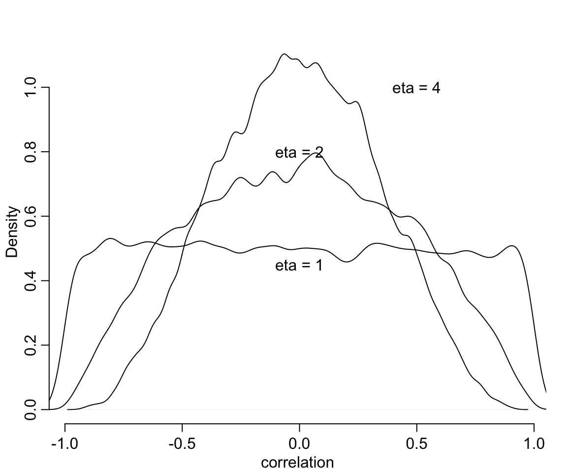
圖 56.2: LKJcorr(eta) probability density. The plot shows the distribution of correlation coefficients extracted from random 2-by-2 correlation matrices, for three values of eta. When eta = 1, all correlations are equally plausible. As eta increases, extreme correlations become less plausible.
我們終於準備好了這個模型的背景知識,現在,我們來實際寫下這個模型的代碼並運行該模型。
set.seed(867530)
m14.1 <- ulam(
  alist(
    wait  ~ normal( mu, sigma ),
    mu <- a_cafe[cafe] + b_cafe[cafe] * afternoon,
    c(a_cafe, b_cafe)[cafe] ~ multi_normal(c(a, b), Rho,
                                           sigma_cafe),
    a ~ normal(5, 2),
    b ~ normal(-1, 0.5),
    sigma_cafe ~ exponential(1),
    sigma ~ exponential(1),
    Rho ~ lkj_corr(2)
  ), data = d, chains = 4, cores = 4
)
saveRDS(m14.1, "../Stanfits/m14_1.rds")
模型花了一點時間成功運行之後,我們來直接觀察 m14.1 給出的隨機斜率和隨機截距之間的相關係數的事後樣本分佈:
m14.1 <- readRDS("../Stanfits/m14_1.rds")

post <- extract.samples( m14.1 )

dens( post$Rho[,1,2], xlim = c(-1, 1),
       bty = "n")                      # posterior

R <- rlkjcorr(10000, K = 2, eta = 2)   # prior
dens( R[,1,2], add = TRUE, lty = 2, col = rangi2, lwd = 3)
text( 0.45, 0.8 , "prior", col = rangi2)
text( -0.25, 2.0, "posterior")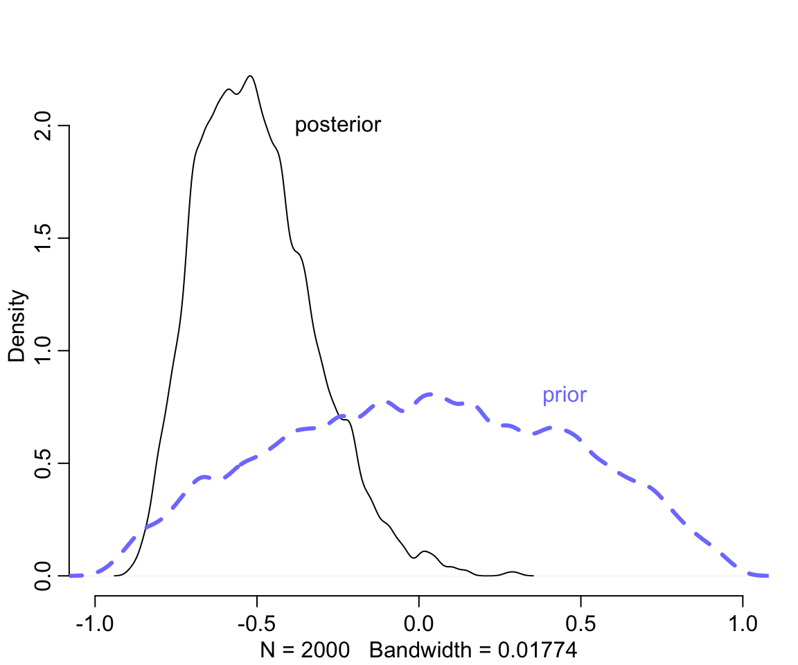
圖 56.3: Posterior distribution of the correlation between intercepts and slopes. Black: Posterior distribution of the correlation, reliably below zero. Dashed blue: prior distribution, the LKJcoor(2) density.
我們發現事後的相關係數集中在小於零的部分。因爲模型認爲斜率和截距之間的相關性是負的,符合我們產生數據的過程中使用的圖 56.1 中所示。接下來,繪製一下隨機效應部分的示意圖,並且和原始數據做一個比較。
# compute unpooled estimates directly from data

a1 <- sapply( 1:N_cafes,
              function(i) mean(wait[cafe_id == i & afternoon == 0]))
b1 <- sapply( 1:N_cafes,
              function(i) mean(wait[cafe_id == i & afternoon == 1])) - a1

# extract posterior means of partially pooled estimates
post <- extract.samples( m14.1 )
a2 <- apply( post$a_cafe, 2, mean )
b2 <- apply( post$b_cafe, 2, mean )

# plot both and connect with lines

plot(a1, b1, xlab = "intercept", ylab = "slope",
     pch = 16, col = rangi2, ylim  = c( min(b1) - 0.1, max(b1) + 0.1),
     xlim = c(min(a1) - 0.1, max(a1) + 0.1) ,
      bty = "n")

points( a2, b2, pch = 1)

for ( i in 1:N_cafes ) lines( c(a1[i], a2[i]), c(b1[i], b2[i]) )

# superimpose the contours of the population
# compute the posterior mean bivariate Gaussian

Mu_est <- c( mean(post$a), mean(post$b) )
rho_est <- mean(post$Rho[,1,2])
sa_est <- mean( post$sigma_cafe[,1] )
sb_est <- mean( post$sigma_cafe[,2] )
cov_ab <- sa_est * sb_est * rho_est
Sigma_est <- matrix( c(sa_est^2 , cov_ab, cov_ab, sb_est^2), ncol = 2 )

# draw contours
library(ellipse)
for ( l in c(0.1, 0.3, 0.5, 0.8, 0.99) )
  lines(ellipse(Sigma_est, centre = Mu_est, level = l),
        col = col.alpha("black", 0.2))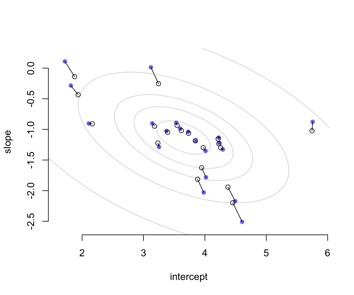
圖 56.4: Shinkage in two dimensions. Raw unpooled intercepts and slopes (filled blue) compared to partially pooled posterior means (open circles). The gray contours show the inferred population of varying effects.
圖 56.4 中藍色的點表示的是原始數據直接取平均值計算獲得的結果。空心點則是根據隨機效應模型的估計給出的各個餐廳的截距和斜率的事後概率分佈的估計平均值。二者之間用實線連接。我們發現每個空心點(模型估計值)的兩個維度都比簡單粗暴計算的原始值要更加靠近這個二維高斯分佈的中心點位置(這個現象被叫做塌陷 shrinkage)。距離中心點越遠的藍點,它的塌陷程度 (shrinkage) 越大。
相同的數據我們把它轉換到實際的觀察值尺度,並繪製成圖 56.5。橫軸表示的是早晨的每家咖啡廳點餐等待時間(分鐘),縱軸則是下午的每家咖啡廳點菜等待時間。藍色的點是未經模型擬合的簡單粗暴計算的原始值。空心點則是模型給出的時候估計預測值。虛線表示的餐廳是上午下午點餐等待時間相等的情況(就是對角線)。這裏其實展示的是,參數的塌陷現象同樣會體現在觀測值的原始尺度上。而原始觀測值尺度上,上午,下午點餐的等待時間是成正比的,也就是上午等待時間長的餐廳,下午點餐的時間也會很長。很顯然,這樣的餐廳很受歡迎,等待時間在什麼時間去都比較長。但是整體餐廳的等待時間的分佈都落在表示上午下午點餐時間等長的虛線的下方,表示總體的傾向是幾乎所有的餐廳的下午等待時間平均要短於上午的等待時間。
# Convert varying effects to waiting times
wait_morning_1 <- (a1)
wait_afternoon_1 <- (a1 + b1)
wait_morning_2 <- (a2)
wait_afternoon_2 <- (a2 + b2)

# plot both and connect with lines

plot( wait_morning_1, wait_afternoon_1, xlab = "morning wait",
      ylab = "afternoon wait", pch = 16, col = rangi2,
      ylim = c(min(wait_afternoon_1) - 0.1, max(wait_afternoon_1) + 0.1),
      xlim = c(min(wait_morning_1) - 0.1, max(wait_morning_1) + 0.1 ),
       bty = "n")

points( wait_morning_2, wait_afternoon_2, pch = 1)

for ( i in 1:N_cafes )
  lines( c(wait_morning_1[i], wait_morning_2[i]),
         c(wait_afternoon_1[i], wait_afternoon_2[i]) )

abline( a = 0, b = 1, lty = 2)

# now shrinkage distribution by simulation
v <- mvrnorm( 10000, Mu_est, Sigma_est )
v[, 2] <- v[, 1] + v[, 2]
Sigma_est2 <- cov(v)
Mu_est2 <- Mu_est
Mu_est2[2] <- Mu_est[1] + Mu_est[2]

# draw contours
library(ellipse)
for (l in c(0.1, 0.3, 0.5, 0.8, 0.99))
  lines(ellipse(Sigma_est2, centre = Mu_est2, level = l),
        col = col.alpha("black", 0.5))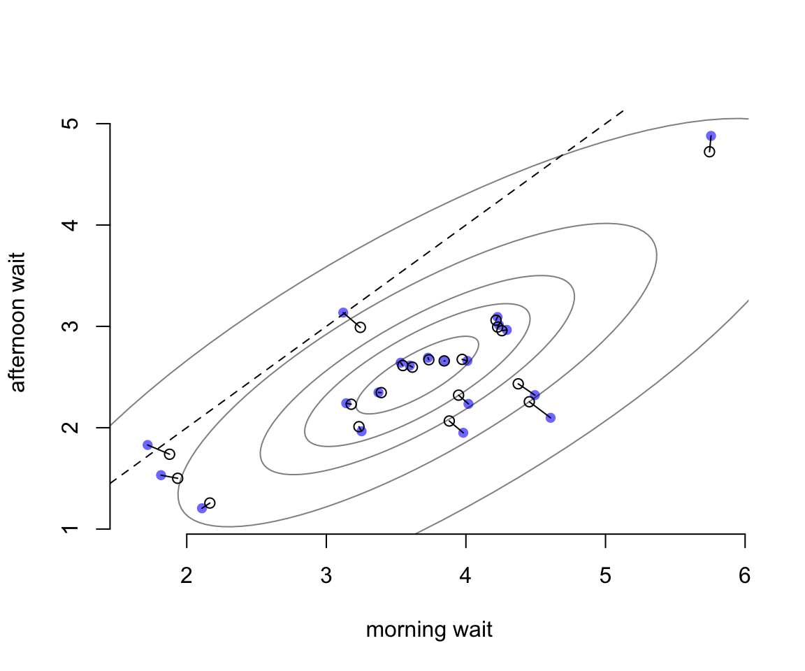
圖 56.5: The same estimates on the outcome scale.