第 48 章 多重線性回歸模型 many more variables
48.1 虛假的相關性
一起來看看一個關於結婚,離婚,和美國每個州的華夫餅餐廳的個數的數據:
data("WaffleDivorce")
d <- WaffleDivorce

head(d)
## Location Loc Population MedianAgeMarriage Marriage Marriage.SE Divorce Divorce.SE WaffleHouses
## 1 Alabama AL 4.78 25.3 20.2 1.27 12.7 0.79 128
## 2 Alaska AK 0.71 25.2 26.0 2.93 12.5 2.05 0
## 3 Arizona AZ 6.33 25.8 20.3 0.98 10.8 0.74 18
## 4 Arkansas AR 2.92 24.3 26.4 1.70 13.5 1.22 41
## 5 California CA 37.25 26.8 19.1 0.39 8.0 0.24 0
## 6 Colorado CO 5.03 25.7 23.5 1.24 11.6 0.94 11
## South Slaves1860 Population1860 PropSlaves1860
## 1 1 435080 964201 0.45
## 2 0 0 0 0.00
## 3 0 0 0 0.00
## 4 1 111115 435450 0.26
## 5 0 0 379994 0.00
## 6 0 0 34277 0.00把數據標準化:
d$D <- standardize( d$Divorce )
d$M <- standardize( d$Marriage )
d$A <- standardize( d$MedianAgeMarriage )
先粗略繪製年齡中位數和離婚率標準化之後的散點圖:
plot(d$D, d$A)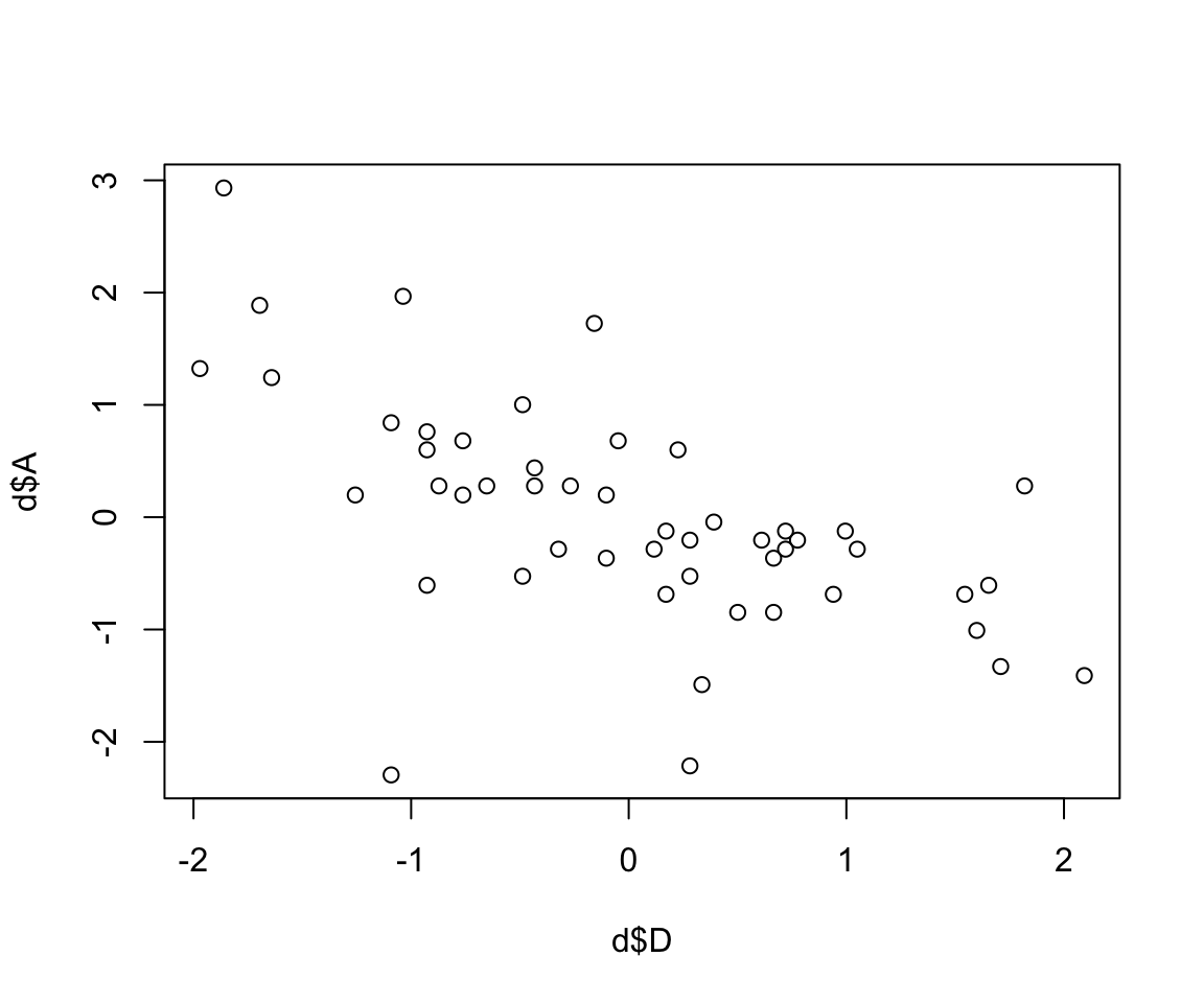
圖 48.1: Divorce rate looks inversely associated with median age at marriage.
結婚時年齡的中位數和離婚率之間的關係如果假定是線性的,那麼我們描述它的模型如下:
\[ \begin{aligned} D_i & \sim \text{Normal}(\mu_i, \sigma) \\ \mu_i & = \alpha + \beta_A A_i \\ \alpha & \sim \text{Normal}(0, 0.2) \\ \beta_A & \sim \text{Normal}(0, 0.5) \\ \sigma & \sim \text{Exponential}(1) \end{aligned} \]
其中,
- \(D_i\) 是第 \(i\) 個州的標準化後的離婚率 (均值為零,標準差為1)
- \(A_i\) 是第 \(i\) 個州的標準化後的結婚年齡中位數
由於預測變量和結果變量都被標準化了,他們組成的線型回歸函數的截距 \(\alpha\) 應該十分接近 0。至於斜率 \(\beta_A\),它的涵義是,每增加一個標準差單位的結婚年齡中位數,隨之增加的標準差離婚率。那麼一個單位的結婚年齡標準差是多少呢?
sd( d$MedianAgeMarriage )## [1] 1.2436303上述先驗概率分佈 \(\beta_A \sim \text{Normal}(0, 0.5)\) 其實暗示我們認為這個斜率大於 1 的概率很低,低於 2.275%:
1 - pnorm(1, 0, 0.5)## [1] 0.022750132實際使用二次方程近似法獲取其事後概率分佈的代碼如下:
m5.1 <- quap(
  alist(
    D ~ dnorm( mu, sigma ),
    mu <- a + bA * A,
    a ~ dnorm(0, 0.2),
    bA ~ dnorm(0, 0.5),
    sigma ~ dexp(1)
  ), data = d
)

precis(m5.1)
## mean sd 5.5% 94.5%
## a -8.7725390e-09 0.097378736 -0.15563004 0.15563002
## bA -5.6840341e-01 0.109999759 -0.74420427 -0.39260255
## sigma 7.8832536e-01 0.078011254 0.66364831 0.91300241看看我們的先驗概率分佈都會給出哪些可能性:
set.seed(10)
prior <- extract.prior( m5.1 )

mu <- link(m5.1, post = prior, data = list(A = c(-2, 2)))

plot(NULL, xlim = c(-2, 2), ylim = c(-2, 2),
      xlab = "Median age married (std)",
     ylab = "Divorce rate (std)")
for( i in 1:50) lines(c(-2, 2), mu[i, ], col = col.alpha("black", 0.4))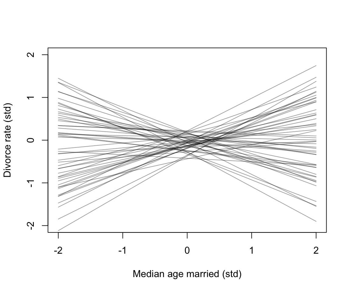
圖 48.2: Plausible regression lines implied by the priors in m5.1. These are weakly informative priors that they allow some implusbly strong relationships but generally bound the lines to possible ranges of the variables.
繪製實際事後估計的回歸直線:
# compute percentile interval of mean
A_seq <- seq(from = -3, to = 3.2, length.out = 30)
mu <- link(m5.1, data = list(A = A_seq))
mu.mean <- apply( mu, 2, mean )
mu.PI <- apply(mu, 2, PI)


# plot

plot( D ~ A, data = d, col = rangi2,
       xlab = "Median age married (std, years)",
     ylab = "Divorce rate (std, per/1000 adults)",
     xaxt = "n", yaxt = "n")
at <- c(-2, -1, 0, 1, 2, 3)
labels <- at*sd(d$MedianAgeMarriage) + mean(d$MedianAgeMarriage)
labelsy <- at*sd(d$Divorce) + mean(d$Divorce)
lines( A_seq, mu.mean, lwd = 2)
shade( mu.PI, A_seq )
axis( side = 1, at = at, labels = round(labels, 1))
axis( side =2, at = at,  labels = round(labelsy, 2))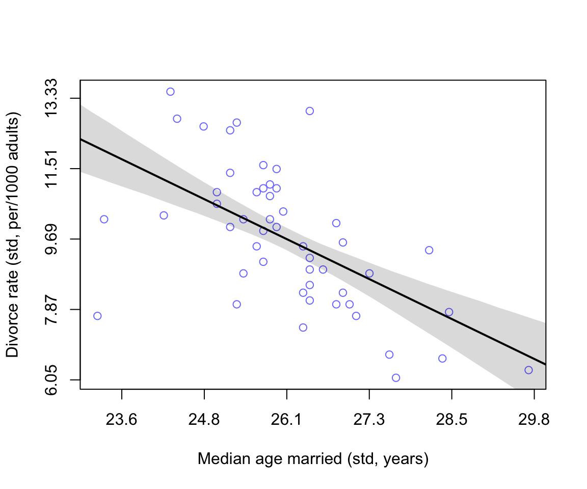
圖 48.3: Divorce rate is negatively associated with median age at marriage.
我們可以使用相似的方法計算並繪製結婚率和離婚率之間可能存在的線性關係:
m5.2 <- quap(
  alist(
    D ~ dnorm( mu, sigma ),
    mu <- a + bM * M,
    a ~ dnorm( 0, 0.2 ),
    bM ~ dnorm( 0, 0.5 ),
    sigma ~ dexp(1)
  ), data = d
)
precis(m5.2)
## mean sd 5.5% 94.5%
## a 2.9180470e-07 0.10824642 -0.17299839 0.17299897
## bM 3.5005402e-01 0.12592744 0.14879765 0.55131038
## sigma 9.1026531e-01 0.08986239 0.76664786 1.05388277# compute percentile interval of mean
M_seq <- seq(from = -3, to = 3.2, length.out = 30)
mu <- link(m5.2, data = list(M = M_seq))
mu.mean <- apply( mu, 2, mean )
mu.PI <- apply(mu, 2, PI)
# plot
plot( D ~ M, data = d, col = rangi2,
xlab = "Marriage rate (std, per/1000 adults)",
ylab = "Divorce rate (std, per/1000 adults)",
xaxt = "n", yaxt = "n")
at <- c(-2, -1, 0, 1, 2, 3)
labels <- at*sd(d$Marriage) + mean(d$Marriage)
labelsy <- at*sd(d$Divorce) + mean(d$Divorce)
lines( A_seq, mu.mean, lwd = 2)
shade( mu.PI, A_seq )
axis( side = 1, at = at, labels = round(labels, 1))
axis( side =2, at = at, labels = round(labelsy, 2))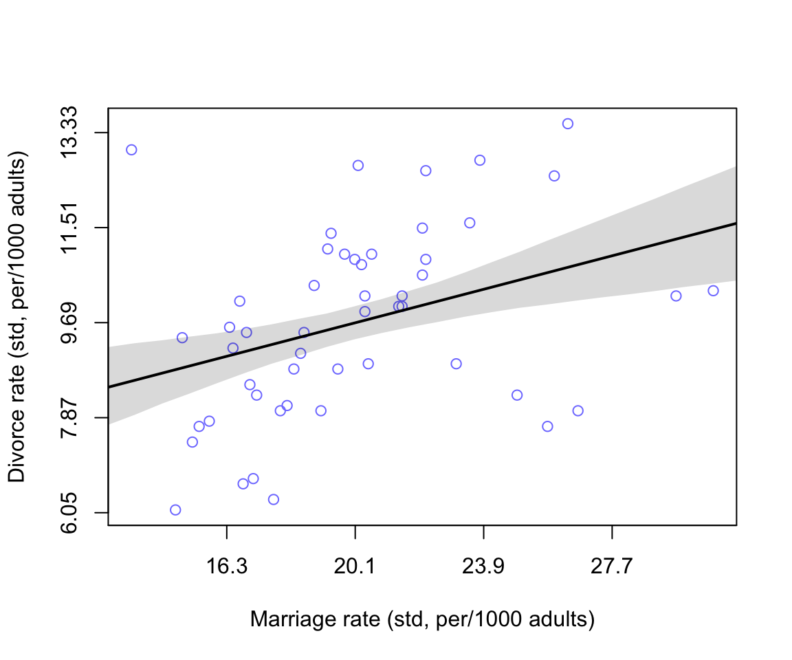
圖 48.4: Divorce rate is negatively associated with median age at marriage.
似乎結婚率和離婚率存在著正關係。
48.2 繪製輔助我們理解的有向無環圖
# library(dagitty)
dag5.1 <- dagitty( "dag{ A -> D; A -> M; M -> D }" )
coordinates(dag5.1) <- list( x=c(A=0,D=1,M=2) , y=c(A=0,D=1,M=0) )
drawdag( dag5.1 )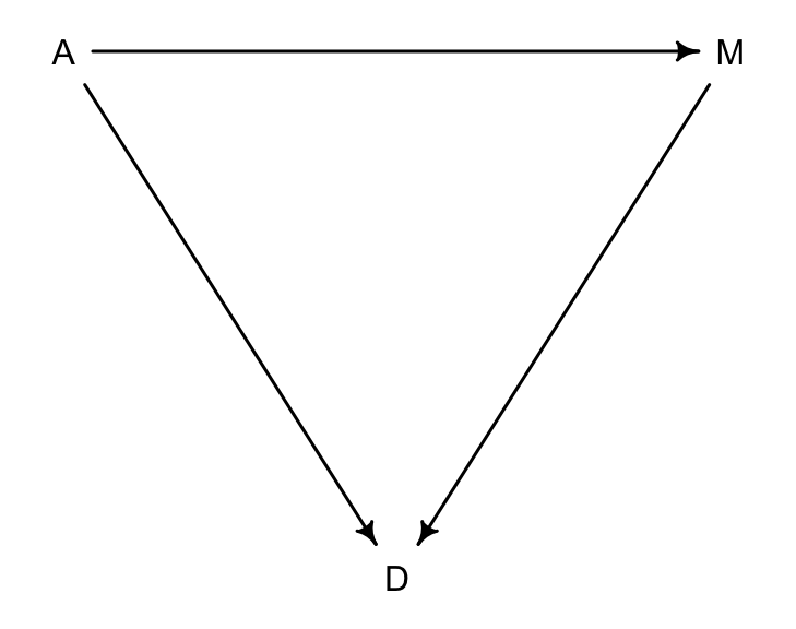
圖 48.5: A possible DAG for the divorce rate data. (A = median of age at marriage; M = marriage rate; D = divorce rate)
圖 48.5 顯示了三者之間的關係:
- A直接影響D
- M直接影響D
- A直接影響M
也就是說,A有兩個路徑可以影響到D:
- A \(\rightarrow\) D
- A \(\rightarrow\) M \(\rightarrow\) D
# library(dagitty)
dag5.1.1 <- dagitty( "dag{ A -> D; A -> M }" )
coordinates(dag5.1.1) <- list( x=c(A=0,D=1,M=2) , y=c(A=0,D=1,M=0) )
drawdag( dag5.1.1 )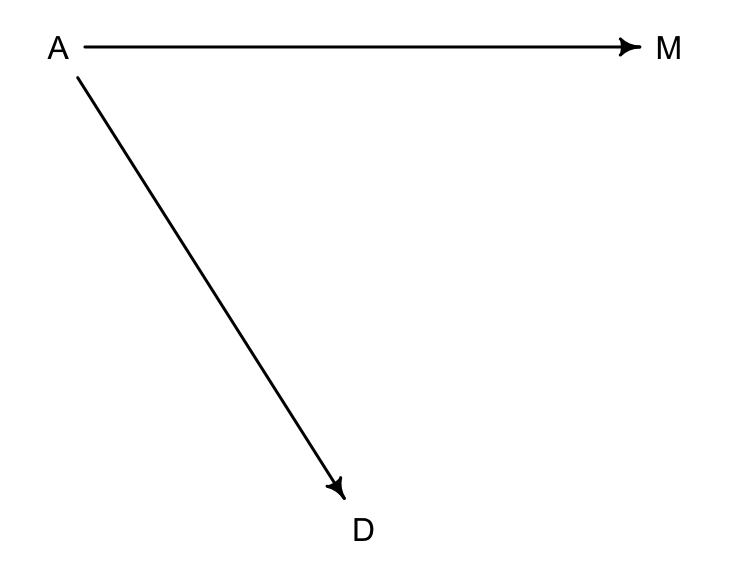
圖 48.6: Another possible DAG for the divorce rate data, M does not influence D. (A = median of age at marriage; M = marriage rate; D = divorce rate)
在第二個 DAG 圖 48.6 中,一個可以被驗證的關係是:
\[
D \perp\!\!\!\perp M |A
\]
可以通過 dagitty 的提示告訴我們相同的信息:
{r introBayes08-07, cache=TRUE} DMA_dag2 <- dagitty('dag{ D <- A -> M }') impliedConditionalIndependencies(DMA_dag2)
第一個 DAG 圖的關係如下:
DMA_dag1 <- dagitty('dag{ D <- A -> M -> D}')
impliedConditionalIndependencies(DMA_dag1)
你會看見你的計算機不給出任何結果,這是因為此時沒有條件獨立性的關係。
多重線型回歸,其實是幫我們描述這樣一個問題:
當已知的變量都已經控制了的時候,新增的一個變量,是否會對結果變量的信息還有任何額外的貢獻? Is there any additional value in knowing a variable, once I already know all of the other predictor variables?
48.3 多重線性回歸模型的表達
入果我們為離婚率數據設定結婚年齡中位數,和結婚率兩個變量作為預測變量的線性回歸模型,可以描述成;
\[ \begin{aligned} D_i & \sim \text{Normal}(\mu_i, \sigma) & \text{[Probability of data]} \\ \mu_i & = \alpha + \beta_M M_i + \beta_A A_i & \text{[Linear model]} \\ \alpha & \sim \text{Normal}(0, 0.2) & \text{[Prior for } \alpha] \\ \beta_M & \sim \text{Normal}(0, 0.5) & \text{[Prior for } \beta_M] \\ \beta_A & \sim \text{Normal}(0, 0.5) & \text{[Prior for } \beta_A] \\ \sigma & \sim \text{Exponential}(1) & \text{[Prior for } \sigma] \end{aligned} \]
實際運行這個模型:
m5.3 <- quap(
  alist(
    D ~ dnorm(mu, sigma),
    mu <- a + bM * M + bA * A,
    a ~ dnorm(0, 0.2),
    bM ~ dnorm(0, 0.5),
    bA ~ dnorm(0, 0.5),
    sigma ~ dexp(1)
  ), data = d
)
precis(m5.3)
## mean sd 5.5% 94.5%
## a 6.1457914e-06 0.097075027 -0.15513850 0.15515079
## bM -6.5398990e-02 0.150771110 -0.30636034 0.17556236
## bA -6.1352639e-01 0.150981657 -0.85482423 -0.37222854
## sigma 7.8510739e-01 0.077840766 0.66070281 0.90951197我們來比較一下 bM, bA 在不同模型中的表現:
plot( coeftab(m5.1, m5.2, m5.3), par = c("bA", "bM"),
      xlab = "Posterior with 89% credible intervals")
text(-0.8, 9, "bA", font = 2)
text(-0.3, 4, "bM", font = 2)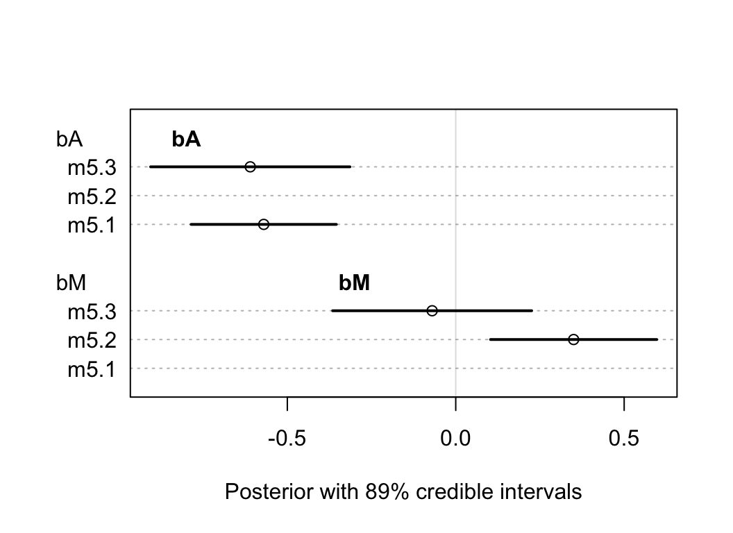
圖 48.7: The posterior distributions for parameters of bA and bM among all models.
這個圖顯示的是回歸係數 bA, bM 在不同模型中的表現。
- m5.1是只放了一個結婚率 M
- m5.2是只放了一個結婚年齡中位數 A
- m5.3是同時放入結婚率M,和年齡中位數 A
可以觀察到,年齡中位數的回歸係屬並不因為是否模型中加入了結婚率 M 這個變量有多大的變化。但是反過來,結婚率 M 和離婚率的關係的回歸係屬,只有在沒有加入年齡中位數變量的 m5.2 模型中才顯現出來,也就是說:“當我們已經知道了結婚年齡的中位數,增加結婚率這個變量並不會對我們了解離婚率有幫助。”
上面廢話了這麼多,其實就是:\(D \perp\!\!\!\perp M |A\)。所以我們探討的兩個描述這個數據的 DAG 圖 48.5 和圖 48.6 中,前者不能提供上述信息,它被排除了。保留圖 48.6 作為合理的關係圖。也就是說,事實上在 m5.2 中我們看到的結婚率(M)和離婚率(D) 之間的關係事實上是一個虛假的,帶有欺騙性的關係 (spurious)。
48.3.1 預測變量殘差圖 predictor residual plots
預測殘差圖展示的是結果變量 (outcome) 和預測變量殘差 (residual predictor)。有助於理解模型本身。
在模型 m5.3 中,我們加入了兩個預測變量一個是結婚率 M,一個是結婚時年齡中位數 A。計算預測變量殘差,就是把其中一個預測變量做另一個預測變量的結果變量:
\[ \begin{aligned} M_i & \sim \text{Normal}(\mu_i, \sigma) \\ \mu_i & = \alpha + \beta A_i\\ \alpha & \sim \text{Normal}(0, 0.2)\\ \beta & \sim \text{Normal}(0, 0.5) \\ \sigma & \sim \text{Exponential}(1) \end{aligned} \]
m5.4 <- quap(
  alist(
    M ~ dnorm( mu, sigma ),
    mu <- a + bAM * A,
    a ~ dnorm(0, 0.2),
    bAM ~ dnorm(0, 0.5),
    sigma ~ dexp(1)
  ), data = d
)
precis(m5.4)
## mean sd 5.5% 94.5%
## a 9.0545811e-08 0.086847816 -0.13879949 0.13879967
## bAM -6.9473759e-01 0.095726903 -0.84772767 -0.54174751
## sigma 6.8173667e-01 0.067580003 0.57373077 0.78974257之後,我們計算結婚率的殘差的方法就是取觀測到的結婚率和上述模型給出的預測結婚率:
mu <- link(m5.4)
mu_mean <- apply( mu, 2, mean )
mu_resid <- d$M - mu_mean
當一個州的結婚率殘差是正的,表示結婚率觀測值高於上述模型給出的已知該州結婚年齡中位數時的結婚率預測值。
d$mu_res <- mu_resid
m5.4res <- quap(
  alist(
    D ~ dnorm( mu, sigma ),
    mu <- a + bMres * mu_res,
    a ~ dnorm( 0, 0.2 ),
    bMres ~ dnorm( 0, 0.5 ),
    sigma ~ dexp(1)
  ), data = d
)

# compute percentile interval of mean
M_seq <- seq(from = -1.8, to = 1.8, length.out = 30)
mu <- link(m5.4res, data = list(mu_res = M_seq))
mu.mean <- apply( mu, 2, mean )
mu.PI <- apply(mu, 2, PI)


# plot

plot( D ~ mu_res, data = d, col = rangi2,
       xlab = "Marriage rate residuals",
     ylab = "Divorce rate (std, per/1000 adults)")
lines( M_seq, mu.mean, lwd = 2)
shade( mu.PI, M_seq )
abline(v = 0, lty = 2)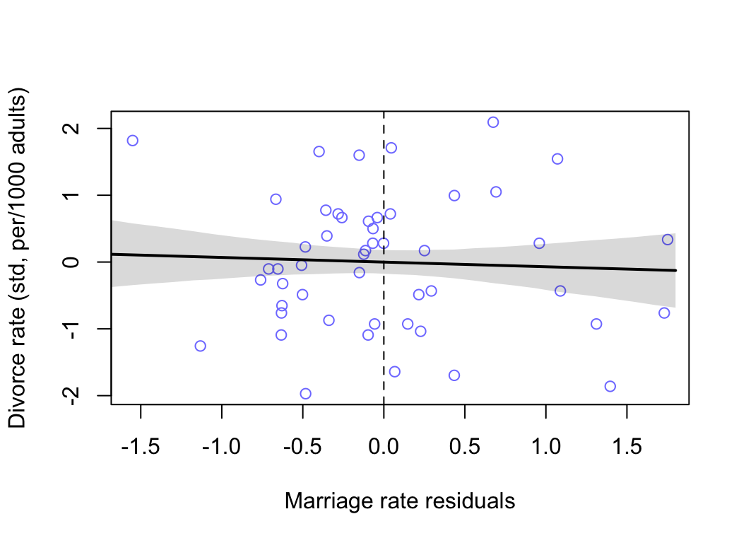
圖 48.8: Plotting marriage rate residuals against the outcome (divorce rate). Residual variation in marriage rate shows little association with divorce rate.
我們使用相同的步驟,來繪製結婚時年齡中位數的預測殘差與結果變量之間的關係圖:
# build the model A regress on M
m5.41 <- quap(
  alist(
    A ~ dnorm( mu, sigma ),
    mu <- a + bMA * M,
    a ~ dnorm(0, 0.2),
    bMA ~ dnorm(0, 0.5),
    sigma ~ dexp(1)
  ), data = d
)

# calculate the predictor residual for A
mu <- link(m5.41)
mu_mean <- apply( mu, 2, mean )
mu_resid <- d$A - mu_mean

# build model D regress on A residuals
d$muA_res <- mu_resid
m5.4Ares <- quap(
  alist(
    D ~ dnorm( mu, sigma ),
    mu <- a + bAres * muA_res,
    a ~ dnorm( 0, 0.2 ),
    bAres ~ dnorm( 0, 0.5 ),
    sigma ~ dexp(1)
  ), data = d
)


# compute percentile interval of mean
M_seq <- seq(from = -1.8, to = 2.5, length.out = 30)
mu <- link(m5.4Ares, data = list(muA_res = M_seq))
mu.mean <- apply( mu, 2, mean )
mu.PI <- apply(mu, 2, PI)


# plot

plot( D ~ muA_res, data = d, col = rangi2,
       xlab = "Age at marriage residuals",
     ylab = "Divorce rate (std, per/1000 adults)")
lines( M_seq, mu.mean, lwd = 2)
shade( mu.PI, M_seq )
abline(v = 0, lty = 2)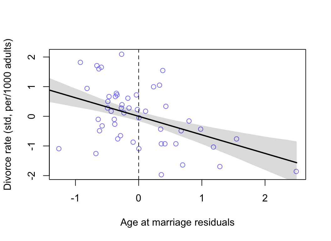
圖 48.9: Plotting age at marriage residuals against the outcome (divorce rate). Divorce rate on age at marriage residuals, showing remaining variation, and this variation is associated with divorce rate.
48.3.2 事後分佈預測圖 posterior prediction plots
# call link without specifying new data
# so it uses original data
mu <- link(m5.3)

# summarize samples across cases
mu_mean <- apply( mu, 2, mean )
mu_PI <- apply(mu, 2, PI)

# simulate observations
# again no new data, uses original data

D_sim <- sim(m5.3, n = 10000)
D_PI <- apply(D_sim, 2, PI)
繪製觀測值和預測值之間的散點圖:
plot( mu_mean ~ d$D, col = rangi2, ylim = range(mu_PI),
      xlab = "observed divorce rate",
      ylab = "predicted divorce rate")

abline(a = 0, b = 1, lty = 2)
for (i  in 1 : nrow(d)) lines( rep(d$D[i], 2), mu_PI[, i], col = rangi2)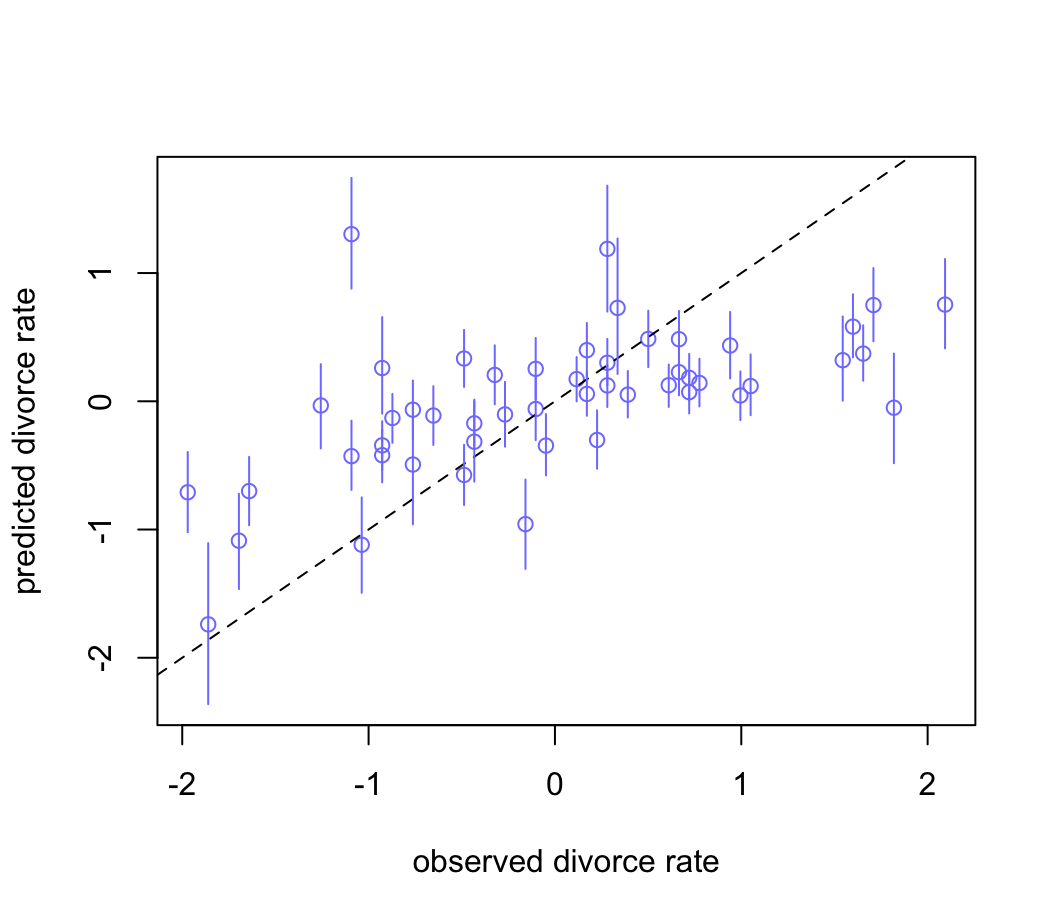
圖 48.10: Posterior predictive plot for the divorce model, m5.3. The horizontal axis is the observed divorce rate in each state. The vertical axis is the model’s posterior predicted divorce rate, given each state’s median age at marriage and marriage rate. The blue line segments are 89% compatibility intervals. The diagonal line shows where posterior predictions exactly match the sample.
48.3.3 反現實圖 counterfactual plots
m5.3_A <- quap(
  alist(
    ## A -> D <- M
    D ~ dnorm(mu, sigma),
    mu <- a + bM * M + bA * A,
    a ~ dnorm(0, 0.2),
    bM ~ dnorm(0, 0.5),
    bA ~ dnorm(0, 0.5),
    sigma ~ dexp(1),
    ## A -> M
    M ~ dnorm(mu_M, sigma_M),
    mu_M <- aM + bAM * A,
    aM ~ dnorm(0, 0.2),
    bAM ~ dnorm(0, 0.5),
    sigma_M ~ dexp(1)
  ), data = d
)

precis(m5.3_A)
## mean sd 5.5% 94.5%
## a -4.4827662e-06 0.097078564 -0.15515478 0.15514581
## bM -6.5336893e-02 0.150777954 -0.30630919 0.17563540
## bA -6.1347038e-01 0.150988641 -0.85477939 -0.37216137
## sigma 7.8514481e-01 0.077850051 0.66072539 0.90956423
## aM 4.6582007e-06 0.086850926 -0.13879990 0.13880921
## bAM -6.9473071e-01 0.095731048 -0.84772741 -0.54173400
## sigma_M 6.8176676e-01 0.067587445 0.57374897 0.78978455可以看見 bAM 是負的,-0.69, (-0.85, 0.54)。也就是說 A 和 M 之間是呈現強烈負相關的。我們來嘗試改變 A,看看會發生什麼。先定義一組A的數據:
A_seq <- seq(from = -2, to = 2, length.out = 30)然後利用 sim() 函數來獲取 simulated 數據:
# prep data
sim_dat <- data.frame( A = A_seq)

# Simulate M and then D, using A_seq

s <- sim( m5.3_A, data = sim_dat, vars = c("M", "D"))
繪製 simulated 數據的圖:
plot( sim_dat$A, colMeans(s$D), ylim = c(-2, 2), type = "l",
      xlab = "Manipulated A", ylab = "counterfactual D")
shade(apply(s$D, 2, PI), sim_dat$A)
mtext("Total counterfactual effect of A on D")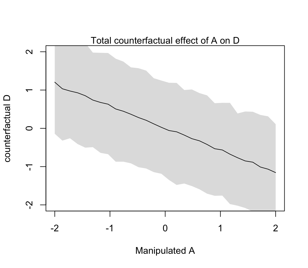
圖 48.11: Visualize the predicted effect of manipulating age at marriage A on divorce rate D. (Total causal effect of A on D, A -> D, and A -> M -> D bot effects included.
plot( sim_dat$A, colMeans(s$M), ylim = c(-2, 2), type = "l",
      xlab = "Manipulated A", ylab = "counterfactual M")
shade(apply(s$M, 2, PI), sim_dat$A)
mtext("Counterfactual A -> M")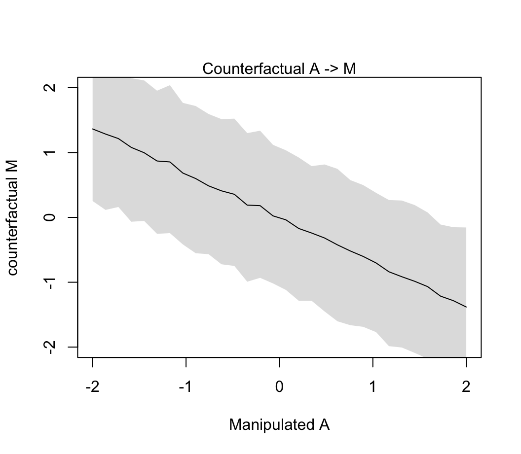
圖 48.12: Visualize the predicted effect of manipulating age at marriage A on marriage rate M. (Simulated values of M show the estimated influence A -> M.
我們之前已經知道當調整了 A 之後 M 對 D 的貢獻率幾乎可以忽略不計。所以你看到 48.11 和 48.12 相差不明顯。因為 A \(\rightarrow\) M \(\rightarrow\) D 中的第二個箭頭並無多大貢獻。
當然這樣的 simulation 也可以允許我們進行一些數據的總結運算。例如,把結婚年齡的中位數從 20 歲提高到 30 歲的話,帶來的因果效果 (causal effect) 可以這樣來計算;
mean(d$MedianAgeMarriage); sd(d$MedianAgeMarriage)## [1] 26.054## [1] 1.2436303# new data frame, standardized to mean 26.1 and sd 1.24
sim2_dat <- data.frame( A = (c(20, 30 )- 26.1 ) / 1.24)
s2 <- sim(m5.3_A, data = sim2_dat, vars = c("M", "D"))
mean(s2$D[ , 2] - s2$D[, 1])## [1] -4.5453912標準化離婚率降低了 4.5 個標準差。這是相當大的變化。
值得注意的是,當我們人為的修改了某個預測變量 \(X\),我們實際上打斷了其他所有變量對 \(X\) 的影響。這相當於是我們把 DAG 圖修改成為一個無任何變量會影響 \(X\) 的版本的 DAG:
# library(dagitty)
dag5.1.1 <- dagitty( "dag{ A -> D; M -> D }" )
coordinates(dag5.1.1) <- list( x=c(A=0,D=1,M=2) , y=c(A=0,D=1,M=0) )
drawdag( dag5.1.1 )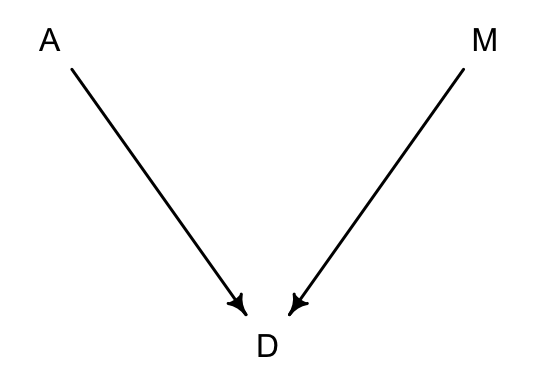
圖 48.13: Manipulating M means we break the arrow from A to M.
正如圖 48.13 顯示的那樣,當我們人為修改控制了離婚率 M,那麼 A 結婚年齡中位數就不再對 M 有任何影響。
sim_dat <- data.frame( M = seq(from = -2 , to = 2, length.out = 30), A = 0)

s <- sim(m5.3_A, data = sim_dat, vars = "D")

plot(sim_dat$M, colMeans(s), ylim = c(-2, 2), type = "l",
     xlab = "manipulated M", ylab = "counterfactual D")
shade(apply( s, 2, PI), sim_dat$M)
mtext( "Total counterfactual effect of M on D")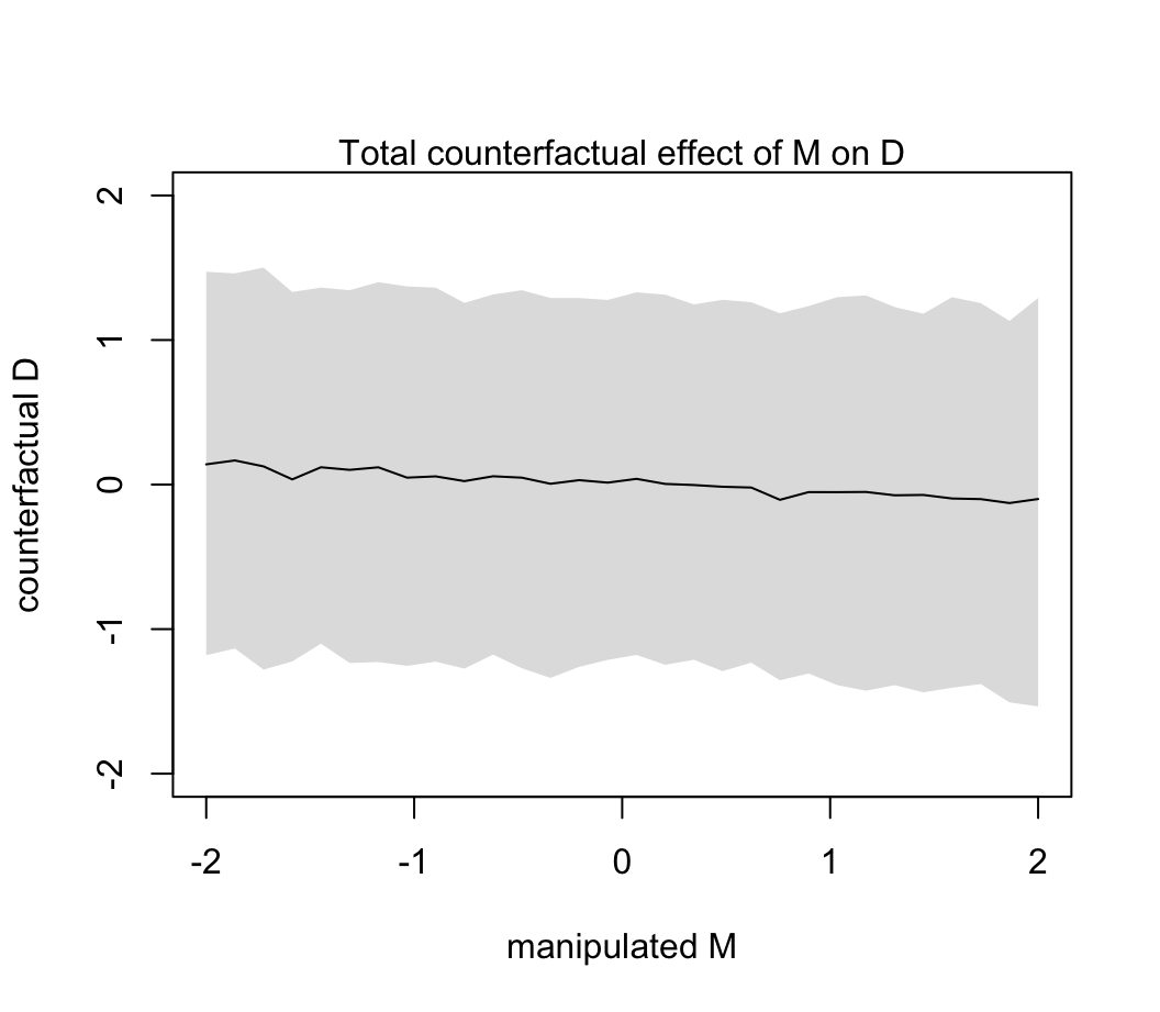
圖 48.14: The counterfactual effect of manipulating marriage rate M on divorce rate D. Since M -> D was estimated to be very small, there is no strong trend here. By manipulating M, we break the influence of A on M, and this removes the association between M and D.
48.4 被掩蓋起來的關係
從上述結婚率離婚率的例子中我們學到了,多重線性回歸可以幫助我們找出虛假的關係。另外一個使用多重線性回歸的好處是,我們可以具體的把多個變量同時對一個結果變量的影響給呈現出來。當某兩個變量之間是相關的(correlated),但是其中的每一個和結果變量之間的關係可能是相反方向的時候,問題就很突出。我們來看一個評價奶品質的數據:
data(milk)
d <- milk
str(d)
## 'data.frame': 29 obs. of 8 variables:
## $ clade : Factor w/ 4 levels "Ape","New World Monkey",..: 4 4 4 4 4 2 2 2 2 2 ...
## $ species : Factor w/ 29 levels "A palliata","Alouatta seniculus",..: 11 8 9 10 16 2 1 6 28 27 ...
## $ kcal.per.g : num 0.49 0.51 0.46 0.48 0.6 0.47 0.56 0.89 0.91 0.92 ...
## $ perc.fat : num 16.6 19.3 14.1 14.9 27.3 ...
## $ perc.protein : num 15.4 16.9 16.9 13.2 19.5 ...
## $ perc.lactose : num 68 63.8 69 71.9 53.2 ...
## $ mass : num 1.95 2.09 2.51 1.62 2.19 5.25 5.37 2.51 0.71 0.68 ...
## $ neocortex.perc: num 55.2 NA NA NA NA ...讓我們重點來看 kcal.per.g(每克奶含有的卡路里),mass(平均母體體重, kg)和 neocortex.perc(大腦新皮質neocortex百分比)這三個變量。通常地認為,腦新皮質含量高的哺乳動物產的奶含有的能量卡路里會較高,主要是為了使之後代的大腦發育更加充分和快速。這裡使用的數據希望能夠進一步了解這樣的問題:“奶的能量含量,這裡是以千卡為單位測量的,和大腦新皮質百分比之間的關係有多大”。讓我們先把這三個變量標準化:
d$K <- standardize( d$kcal.per.g )
d$N <- standardize( d$neocortex.perc )
d$M <- standardize( log(d$mass) )
第一個能想到的模型是簡單的以新皮質百分比做預測變量,奶能量做結果變量的簡單線性回歸模型:
\[ \begin{aligned} K_i & \sim \text{Normal}(\mu_i, \sigma) \\ \mu_i & = \alpha + \beta_NN_i \end{aligned} \]
讓我們來試著使用二次方近似法獲取上述簡單線性回歸模型各個參數的事後樣本分佈:
m5.5_draft <- quap(
  alist(
    K ~ dnorm( mu, sigma ),
    mu <- a + bN * N,
    a ~ dnorm( 0, 1 ),
    bN ~ dnorm( 0, 1 ),
    sigma ~ dexp( 1 )
  ), data = d
)
你會看到你的計算機給出下面的警告:
Error in quap(alist(K ~ dnorm(mu, sigma), mu <- a + bN * N, a ~ dnorm(0,  :
  initial value in 'vmmin' is not finite
The start values for the parameters were invalid. This could be caused by missing values (NA) in the data or by start values outside the parameter constraints. If there are no NA values in the data, try using explicit start values.
這主要是因為數據中的 N,是有缺失值的:
d$neocortex.perc## [1] 55.16 NA NA NA NA 64.54 64.54 67.64 NA 68.85 58.85 61.69 60.32 NA NA 69.97
## [17] NA 70.41 NA 73.40 NA 67.53 NA 71.26 72.60 NA 70.24 76.30 75.49我們暫且先把這些缺失值無視掉:
dcc <- d[ complete.cases(d$K, d$N, d$M), ]
dcc
## clade species kcal.per.g perc.fat perc.protein perc.lactose mass
## 1 Strepsirrhine Eulemur fulvus 0.49 16.60 15.42 67.98 1.95
## 6 New World Monkey Alouatta seniculus 0.47 21.22 23.58 55.20 5.25
## 7 New World Monkey A palliata 0.56 29.66 23.46 46.88 5.37
## 8 New World Monkey Cebus apella 0.89 53.41 15.80 30.79 2.51
## 10 New World Monkey S sciureus 0.92 50.58 22.33 27.09 0.68
## 11 New World Monkey Cebuella pygmaea 0.80 41.35 20.85 37.80 0.12
## 12 New World Monkey Callimico goeldii 0.46 3.93 25.30 70.77 0.47
## 13 New World Monkey Callithrix jacchus 0.71 38.38 20.09 41.53 0.32
## 16 Old World Monkey Miopithecus talpoin 0.68 40.15 18.08 41.77 1.55
## 18 Old World Monkey M mulatta 0.97 55.51 13.17 31.32 3.24
## 20 Old World Monkey Papio spp 0.84 54.31 10.97 34.72 12.30
## 22 Ape Hylobates lar 0.62 34.51 12.57 52.92 5.37
## 24 Ape Pongo pygmaeus 0.54 37.78 7.37 54.85 35.48
## 25 Ape Gorilla gorilla gorilla 0.49 27.18 16.29 56.53 79.43
## 27 Ape Pan paniscus 0.48 21.18 11.68 67.14 40.74
## 28 Ape P troglodytes 0.55 36.84 9.54 53.62 33.11
## 29 Ape Homo sapiens 0.71 50.49 9.84 39.67 54.95
## neocortex.perc K N M
## 1 55.16 -0.94004081 -2.0801960251 -0.45583571
## 6 64.54 -1.06395528 -0.5086412889 0.12744080
## 7 64.54 -0.50634016 -0.5086412889 0.14075054
## 8 67.64 1.53824860 0.0107424725 -0.30715809
## 10 68.85 1.72412031 0.2134696826 -1.07626974
## 11 58.85 0.98063348 -1.4619618059 -2.09783010
## 12 61.69 -1.12591252 -0.9861392631 -1.29379736
## 13 60.32 0.42301836 -1.2156733771 -1.52018933
## 16 69.97 0.23714666 0.4011180093 -0.59103922
## 18 70.41 2.03390648 0.4748369948 -0.15680955
## 20 73.40 1.22846242 0.9757910098 0.62883970
## 22 67.53 -0.13459675 -0.0076872739 0.14075054
## 24 71.26 -0.63025463 0.6172486713 1.25273549
## 25 72.60 -0.94004081 0.8417564908 1.72735910
## 27 70.24 -1.00199805 0.4463546595 1.33415005
## 28 76.30 -0.56829740 1.4616661415 1.21202044
## 29 75.49 0.42301836 1.3259561909 1.51036602只剩下了 17 行的數據。我們把這個數據喂到之前 m5.5_draft 模型中去試試看:
m5.5_draft <- quap(
  alist(
    K ~ dnorm( mu, sigma ),
    mu <- a + bN * N,
    a ~ dnorm( 0, 1 ),
    bN ~ dnorm( 0, 1 ),
    sigma ~ dexp( 1 )
  ), data = dcc
)
繪製我們在 m5.5_draft 中設定的先驗概率分佈中的任意 50 條回歸直線看看我們的先驗概率分佈選擇是否合理:
prior <- extract.prior( m5.5_draft )
xseq <- c(-2, 2)
mu <- link( m5.5_draft, post = prior, data = list(N = xseq))

plot(NULL, xlim = xseq, ylim = xseq, bty="n",
     xlab = "neocorrtex percent (std)",
     ylab = "kilocal per g (std)",
     main = "a ~ dnorm(0, 1) \nbN ~ dnorm(0, 1)")

for( i in 1:50){
  lines( xseq, mu[i, ], col = col.alpha("black", 0.3))
}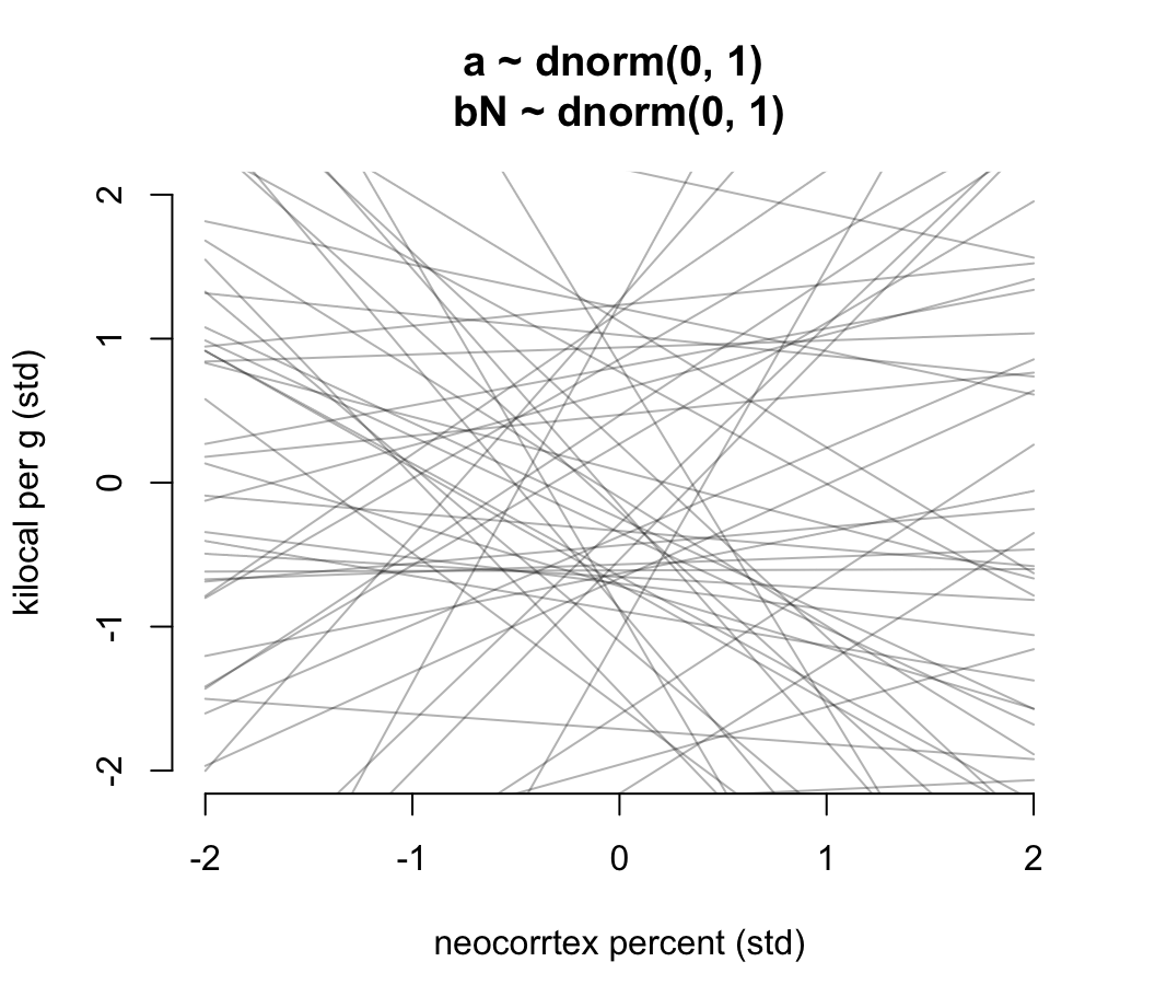
圖 48.15: Prior predictive distribution for the first primate milk model. The vague first guess of prior choices. These priors are clearly silly.
看圖 48.13 給出的先驗分佈直線是不是有點荒謬。可見無信息的先驗概率分佈不一定是合理的先驗概率分佈。值得推薦的是,我們可以把截距控制在 0 附近,因為顯然當結果變量和預測變量都是標準化的數值之後,他們之間的關係在預測變量是零的事後,結果變量也應該在零附近才合理。另外,斜率的分佈也可以控制在使之盡可能不要出現一些極端情況的斜率:
m5.5 <- quap(
  alist(
    K ~ dnorm( mu, sigma ),
    mu <- a + bN * N,
    a ~ dnorm( 0, 0.2 ),
    bN ~ dnorm( 0 , 0.5 ),
    sigma ~ dexp(1)
  ), data = dcc
)


prior <- extract.prior( m5.5 )
xseq <- c(-2, 2)
mu <- link( m5.5, post = prior, data = list(N = xseq))

plot(NULL, xlim = xseq, ylim = xseq, bty="n",
     xlab = "neocorrtex percent (std)",
     ylab = "kilocal per g (std)",
     main = "a ~ dnorm(0, 0.2) \nbN ~ dnorm(0, 0.5)")

for( i in 1:50){
  lines( xseq, mu[i, ], col = col.alpha("black", 0.3))
}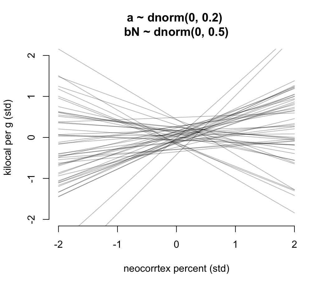
圖 48.16: Prior predictive distribution for the first primate milk model. Slightly less silly priors that at least stay within the potential space of observations.
實際 m5.5 給出的事後概率分佈估計是怎樣的呢:
precis(m5.5)## mean sd 5.5% 94.5%
## a 0.039939307 0.15449076 -0.20696676 0.28684537
## bN 0.133235968 0.22374682 -0.22435467 0.49082661
## sigma 0.999820124 0.16470797 0.73658498 1.26305527這個表格到底告訴我們什麼信息了呢?敏感的人應該看得出來,每個參數的事後概率分佈都很不精確,標準差相對均值都較大。把它的事後回歸直線及其 89% 可信區間範圍繪製成如圖 48.17 所示。可見其平均回歸線的斜率本身的確很小,且可信區間很寬,估計十分不精確,事後給出的腦皮質容量比例和每克能量含量之間的關係可能有正也有負。
xseq <- seq( from = min(dcc$N) - 0.15, to = max(dcc$N) + 0.15, length.out = 30)
mu <- link( m5.5, data = list(N = xseq))
mu_mean <- apply(mu, 2, mean)
mu_PI <- apply(mu, 2, PI)

plot( K ~ N, data = dcc , col = rangi2,
      xlab = "neocortex percent (std)",
      ylab = "kilocal per g (std)")
lines( xseq, mu_mean, lwd = 2 )
shade( mu_PI, xseq )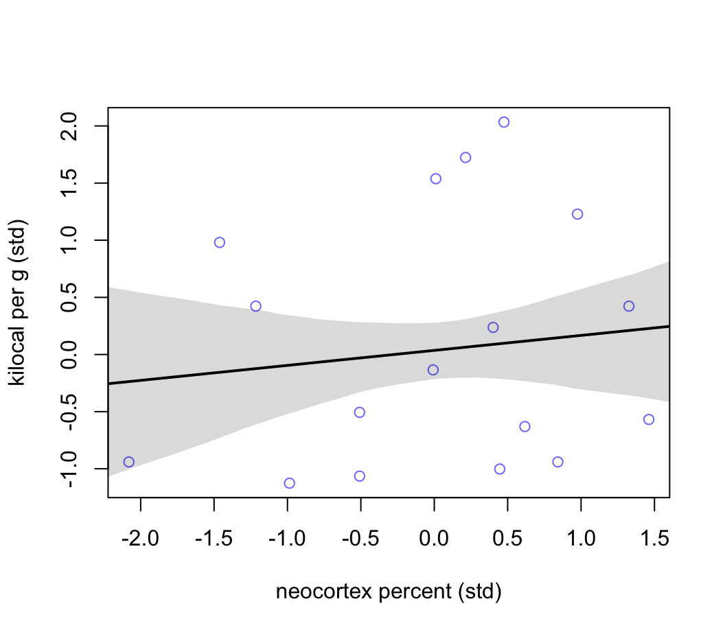
圖 48.17: Milk energy and neocortex. Weak association between standardized neocortex percent and milk energy.
現在我們思考成年母體的平均體重 mass 這一預測變量。我們使用它的對數值。據說體重這一類身體指標應該盡量使用對數值來進行一些統計學建模。因為我們通常認為取了對數以後的數值是該變量的數量級 (magnitude)。也就是說,我們認為體重的數量級 (magnitude),而不是體重的測量值 (measure) 本身和產的奶的能量密度有關。
m5.6 <- quap(
  alist(
    K ~ dnorm( mu, sigma ) ,
    mu <- a + bM * M,
    a ~ dnorm(0, 0.2),
    bM ~ dnorm( 0, 0.5 ),
    sigma ~ dexp(1)
  ), data = dcc
)
precis(m5.6)
## mean sd 5.5% 94.5%
## a 0.046621524 0.15128173 -0.19515590 0.288398949
## bM -0.282530276 0.19288794 -0.59080247 0.025741914
## sigma 0.949314068 0.15707619 0.69827598 1.200352159體重的對數,和能量密度似乎成負關係。其關係應該比大腦皮質單獨和能量密度之間的關係要強烈一些,且方向是相反的 (圖48.18)。
xseq <- seq( from = min(dcc$M) - 0.15, to = max(dcc$M) + 0.15, length.out = 30)
mu <- link( m5.6, data = list(M = xseq))
mu_mean <- apply(mu, 2, mean)
mu_PI <- apply(mu, 2, PI)

plot( K ~ M, data = dcc , col = rangi2,
      xlab = "log body mass (std)",
      ylab = "kilocal per g (std)")
lines( xseq, mu_mean, lwd = 2 )
shade( mu_PI, xseq )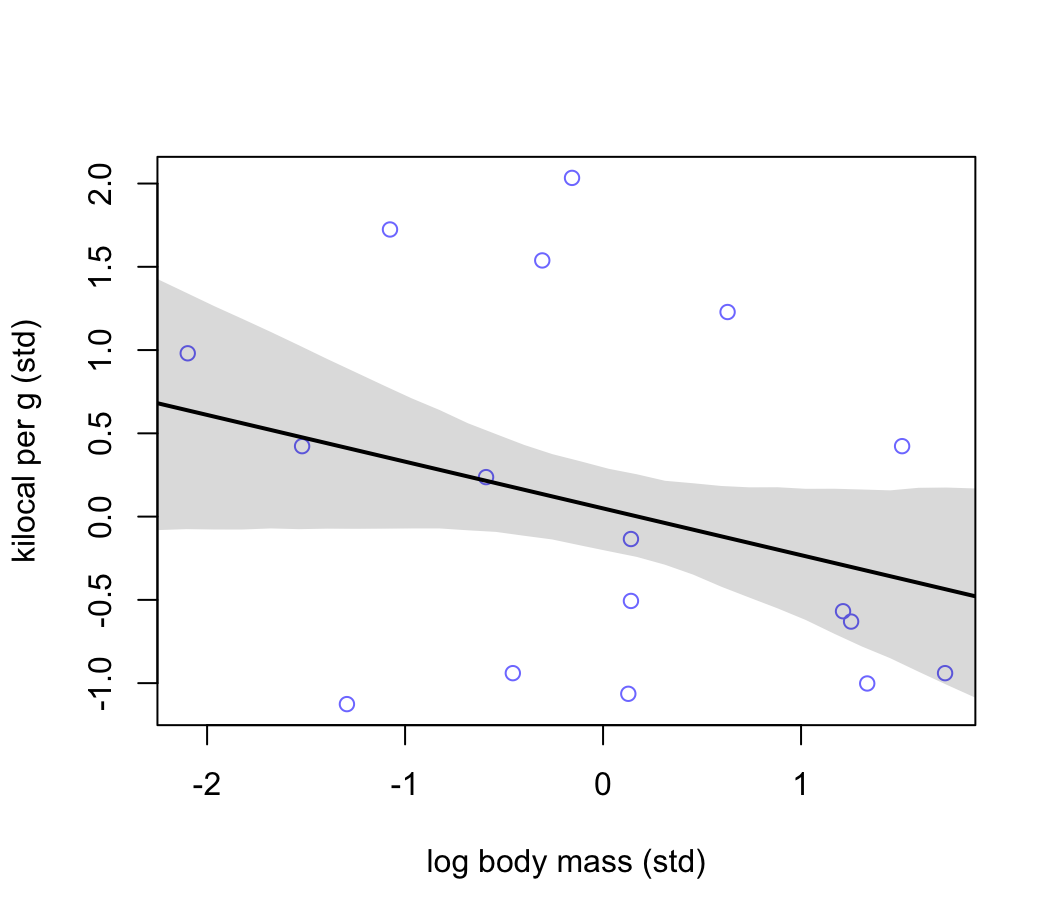
圖 48.18: Milk energy and neocortex. Seems stronger but still weak association between standardized log body mass and milk energy.
接下來,我們把兩個預測變量同時加入線性回歸模型中取看看會發生什麼。
\[ \begin{aligned} K_i & \sim \text{Normal}(\mu_i, \sigma) \\ \mu_i & = \alpha + \beta_N N_i + \beta_M M_i \\ \alpha & \sim \text{Normal}(0, 0.2) \\ \beta_N & \sim \text{Normal}(0, 0.5) \\ \beta_M & \sim \text{Normal}(0, 0.5) \\ \sigma & \sim \text{Exponential}(1) \end{aligned} \]
m5.7 <- quap(
  alist(
    K ~ dnorm( mu, sigma ) ,
    mu <- a + bN * N + bM * M,
    a ~ dnorm( 0, 0.2 ),
    bN ~ dnorm( 0 , 0.5 ),
    bM ~ dnorm( 0 , 0.5 ),
    sigma ~ dexp(1)
  ), data = dcc
)
precis(m5.7)
## mean sd 5.5% 94.5%
## a 0.067997423 0.13399955 -0.14615973 0.28215458
## bN 0.675156396 0.24829873 0.27832707 1.07198572
## bM -0.703084221 0.22078035 -1.05593386 -0.35023459
## sigma 0.738023665 0.13246646 0.52631667 0.94973066我們驚奇地發現,當兩個變量同時放入模型中時,它們各自和奶能量密度這一結果變量之間的關係都變得更加顯著了 (圖48.19)。每個參數,也就是新皮質比例,和母體重的對數值的事後均值在 m5.7,也就是同時調整了對方的情況下都更加偏離 0。
plot( coeftab(m5.5, m5.6, m5.7), par = c("bM", "bN"),
      xlab = "Posterior estimates with 89% credible intervals")
text(-0.8, 9, "bM", font = 2)
text(-0.3, 4, "bN", font = 2)
abline(v = 0, lty = 2)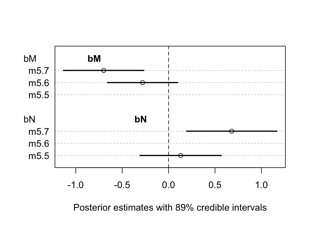
圖 48.19: The posterior distributions for parameters of bM and bN among all models.
為什麼這兩個變量同時放入模型之後,他們和結果變量,奶能量密度之間的關係均被增強了呢?在這裡,我們的上下文中其實告訴我們,這兩個預測變量同時都和結果變量是相關的,且其中一個是負相關,另一個是正相關。而同時,他們二者之間本身存在著正相關 (圖48.20)。
pairs( ~ K + M + N, col = rangi2, dcc)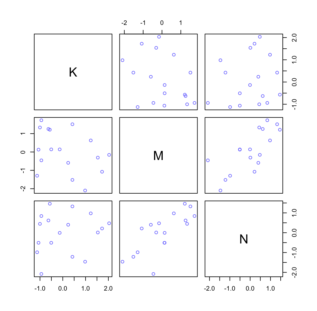
圖 48.20: Simple scatter plots between the three variables.
xseq <- seq( from = min(dcc$N) - 0.15, to = max(dcc$N) + 0.15,
             length.out = 30)

mu <- link(m5.7, data = data.frame( N = xseq, M = 0 ))

mu_mean <- apply(mu, 2, mean)
mu_PI <- apply(mu, 2, PI)

plot( NULL, xlim  = range(dcc$N), ylim = range(dcc$K) ,
      xlab = "neocortex percent (std)",
      ylab = "kilocal per g (std)",
      main = "Counterfactual holding M = 0")
lines( xseq, mu_mean, lwd = 2)
shade( mu_PI, xseq )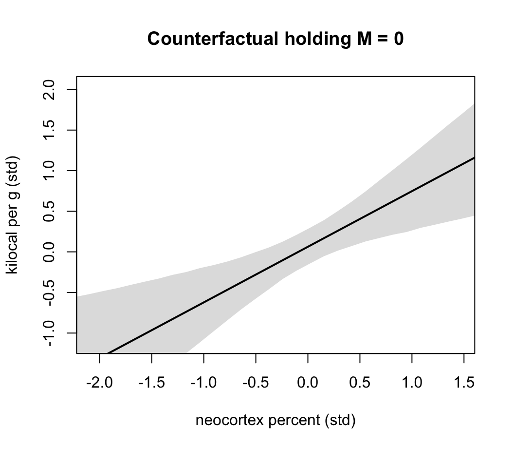
圖 48.21: Milk energy and neocortex. A model with both neocortex percent (N) and log body mass (M) shows stronger association.
xseq <- seq( from = min(dcc$M) - 0.15, to = max(dcc$M) + 0.15,
             length.out = 30)

mu <- link(m5.7, data = data.frame( M = xseq, N = 0 ))

mu_mean <- apply(mu, 2, mean)
mu_PI <- apply(mu, 2, PI)

plot( NULL, xlim  = range(dcc$M), ylim = range(dcc$K) ,
      xlab = "log body mass (std)",
      ylab = "kilocal per g (std)",
      main = "Counterfactual holding N = 0")
lines( xseq, mu_mean, lwd = 2)
shade( mu_PI, xseq )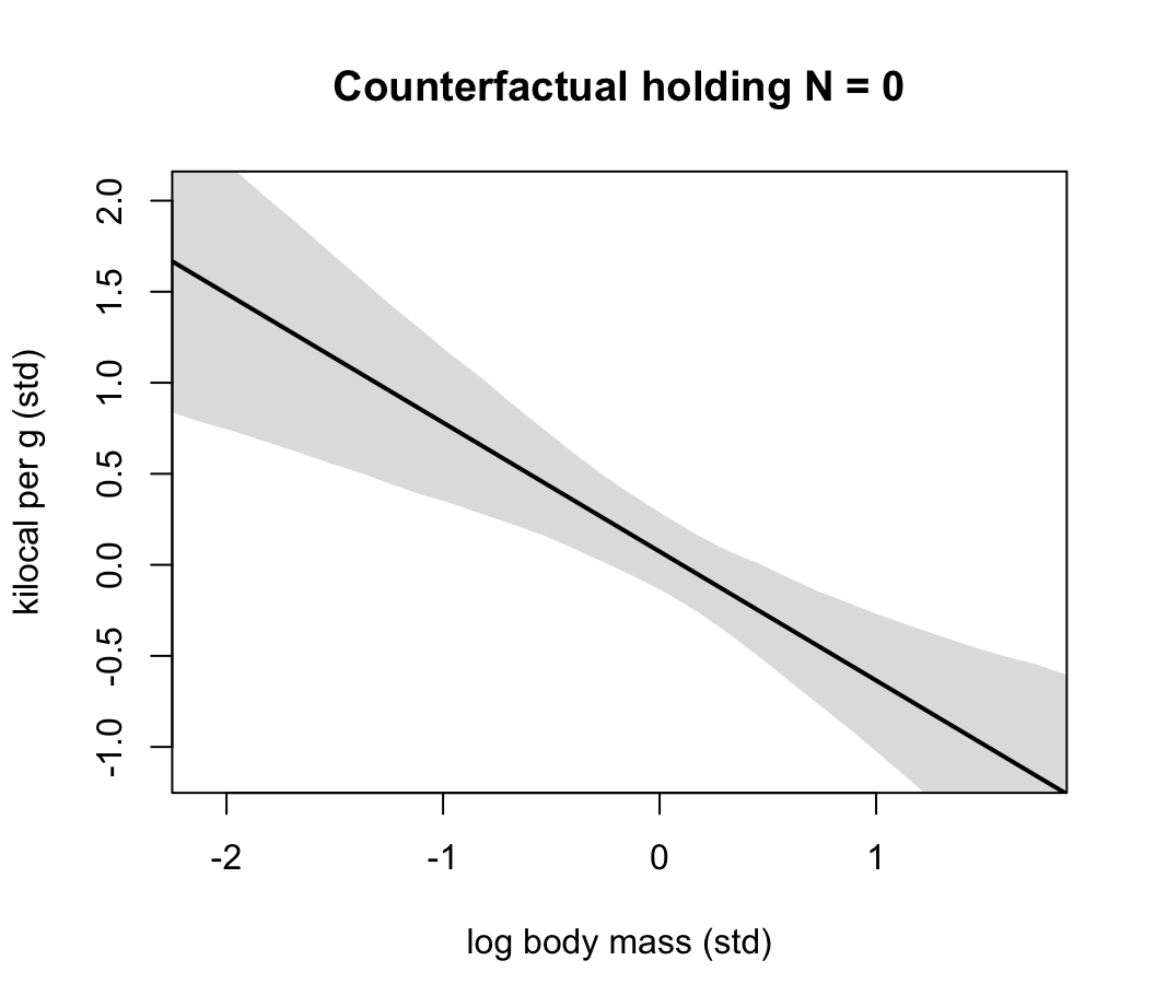
圖 48.22: Milk energy and log body mass. A model with both neocortex percent (N) and log body mass (M) shows stronger association.
48.5 分類型變量 categorical variables
48.5.1 二進制型變量
使用之前在簡單線性回歸章節介紹過的 Howell1 數據來做演示:
data("Howell1")
d <- Howell1
str(d)
## 'data.frame': 544 obs. of 4 variables:
## $ height: num 152 140 137 157 145 ...
## $ weight: num 47.8 36.5 31.9 53 41.3 ...
## $ age : num 63 63 65 41 51 35 32 27 19 54 ...
## $ male : int 1 0 0 1 0 1 0 1 0 1 ...該數據中還有一個性別的變量。這裡我們有不同的方式來使用和表達這個二進制型的預測變量。第一種是使用指示變量 (indicator variable)。先無視體重,僅僅使用性別作為身高的預測變量:
\[ \begin{aligned} h_i & \sim \text{Normal}(\mu_i, \sigma) \\ \mu_i & = \alpha + \beta_m m_i \\ \alpha & \sim \text{Normal}(178, 20) \\ \beta_m & \sim \text{Normal}(0, 10) \\ \delta & \sim \text{Uniform}(0, 50) \end{aligned} \]
這裡 \(m_i\) 被稱作是啞變量 dummy variable。當它等於 \(0\) 時,\(\mu_i = \alpha\) ,表示女性的身高。所以 \(\beta_m\) 又可以被理解為是男女的身高差的期望值(或平均值)。
我們看看這幾個先驗概率分佈本身給出的男女身高的預期值是怎樣的:
mu_female <- rnorm(10000, 178, 20)
mu_male <- rnorm(10000, 178, 20) + rnorm(10000, 0, 10)
precis( data.frame(mu_female, mu_male) )
## mean sd 5.5% 94.5% histogram
## mu_female 177.90358 19.965747 145.84333 210.01769 ▁▁▃▇▇▂▁▁
## mu_male 178.19590 22.292638 142.64384 213.83733 ▁▁▁▃▇▇▃▁▁可見使用啞變量的方法標記會導致男性的身高先驗概率分佈相對女性的方差略微增加了一些(更大的不確定性)。
但其實我們還有另外一種選擇,不使用啞變量,而是是用索引變量 (index variable)。
d$sex <- ifelse( d$male == 1, 2, 1)
str(d$sex)
## num [1:544] 2 1 1 2 1 2 1 2 1 2 ...\[ \begin{aligned} h_i & \sim \text{Normal}(\mu_i, \sigma) \\ \mu_i & = \alpha_{\text{SEX}[i]} \\ \alpha_j & \sim \text{Normal}(178, 20) & \text{for } j = 1,2\\ \sigma & \sim \text{Uniform}(0, 50) \end{aligned} \]
使用上述索引變量的好處是,我們可以放心地給兩個二進制分類變量中的分類賦予相同的先驗概率分佈。
m5.8 <- quap(
  alist(
    height ~ dnorm( mu, sigma ),
    mu <- a[sex],
    a[sex] ~ dnorm( 178, 20 ),
    sigma ~ dunif( 0, 50 )
  ), data = d
)
precis( m5.8, depth = 2)
## mean sd 5.5% 94.5%
## a[1] 134.90938 1.60696020 132.341149 137.477615
## a[2] 142.57693 1.69750109 139.863999 145.289869
## sigma 27.31043 0.82807755 25.987002 28.633858我們還可以通過事後概率分佈的樣本來計算男女的身高差估計值和範圍:
post <- extract.samples(m5.8)
post$diff_fm <- post$a[, 1] - post$a[, 2]
precis(post, depth = 2)
## mean sd 5.5% 94.5% histogram
## sigma 27.2997646 0.82765575 25.970313 28.6042160 ▁▁▁▁▃▇▇▇▃▂▁▁▁▁
## a[1] 134.8965669 1.62091656 132.307844 137.4731334 ▁▁▁▂▅▇▇▅▂▁▁▁▁
## a[2] 142.5820213 1.69425568 139.853621 145.3199440 ▁▁▁▁▂▃▇▇▇▃▂▁▁▁▁
## diff_fm -7.6854543 2.34629291 -11.430415 -3.9080347 ▁▁▁▁▃▇▇▃▁▁▁48.5.2 多於兩個分類的分類變量
當分類變量的類型數量遠遠多於兩個時,你會發現啞變量法,也就是指示變量法 (indicator variable) 並不是一個好方法。每增加一個分類,你就要增加一個啞變量。有 \(k\) 個分類,你就需要 \(k - 1\) 個啞變量。我們建議當存在多個分類的變量時,使用索引變量法會更加有效率。其優點還包括先驗概率分佈的指定變得一致且簡單明瞭。而且這種方法可以直接幫助我們把模型擴展到多層回歸模型 (multilevel models),也就是混合效應模型 (mixed effect models)。
下面使用相同的哺乳動物產奶能量密度的數據來進行多個分類別量模型的示範:
data(milk)
d <- milk
levels(d$clade)
## [1] "Ape" "New World Monkey" "Old World Monkey" "Strepsirrhine"clade 是一個有四個分類的多分類型變量。分類學上來說這個分類的範圍更加寬泛。生成一個這個變量的索引變量:
d$clade_id <- as.integer(d$clade)用數學模型描述:
\[ \begin{aligned} K_i & \sim \text{Normal}(\mu_i, \sigma) \\ \mu_i & = \alpha_{\text{CLADE}[i]} \\ \alpha_j & \sim \text{Normal}(0, 0.5) & \text{ for } j = 1,2,3,4\\ \sigma & \sim \text{Exponential}(1) \end{aligned} \]
這裡特地把 \(\alpha\) 的先驗概率分佈的方差設置的稍微寬一些些,以允許不同類別的哺乳動物的均值分佈可以有不同的方差:
d$K <- standardize( d$kcal.per.g )
m5.9 <- quap(
  alist(
    K ~ dnorm(mu, sigma),
    mu <- a[clade_id],
    a[clade_id] ~ dnorm(0, 0.5),
    sigma ~ dexp(1)
  ), data = d
)

precis(m5.9, depth = 2)
## mean sd 5.5% 94.5%
## a[1] -0.48434884 0.217639509 -0.832178807 -0.13651887
## a[2] 0.36630060 0.217056342 0.019402641 0.71319855
## a[3] 0.67530602 0.257529168 0.263724668 1.08688737
## a[4] -0.58580987 0.274507108 -1.024525248 -0.14709449
## sigma 0.71963849 0.096531092 0.565363158 0.87391382看這四個不同靈長類物種的奶能量密度的均值事後分佈:
labels <- paste("a[", 1:4, "]:", levels(d$clade), sep = "")
plot(precis(m5.9, depth = 2, pars = "a"), labels = labels,
     xlab = "expected kcal (std)")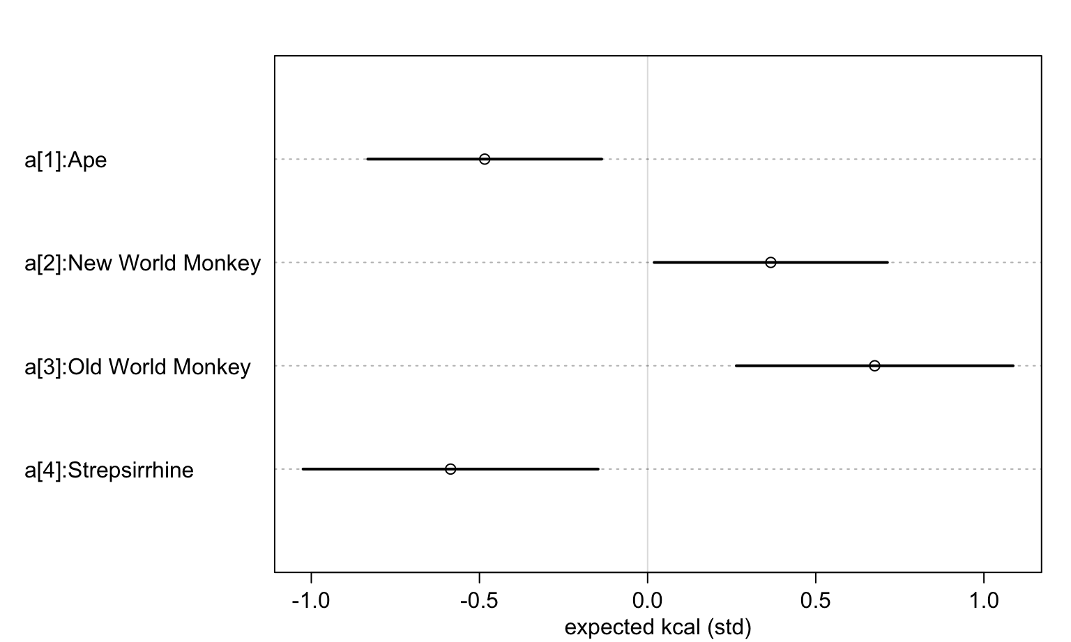
圖 48.23: Posterior distributions of the milk energy density from four different species of primate.